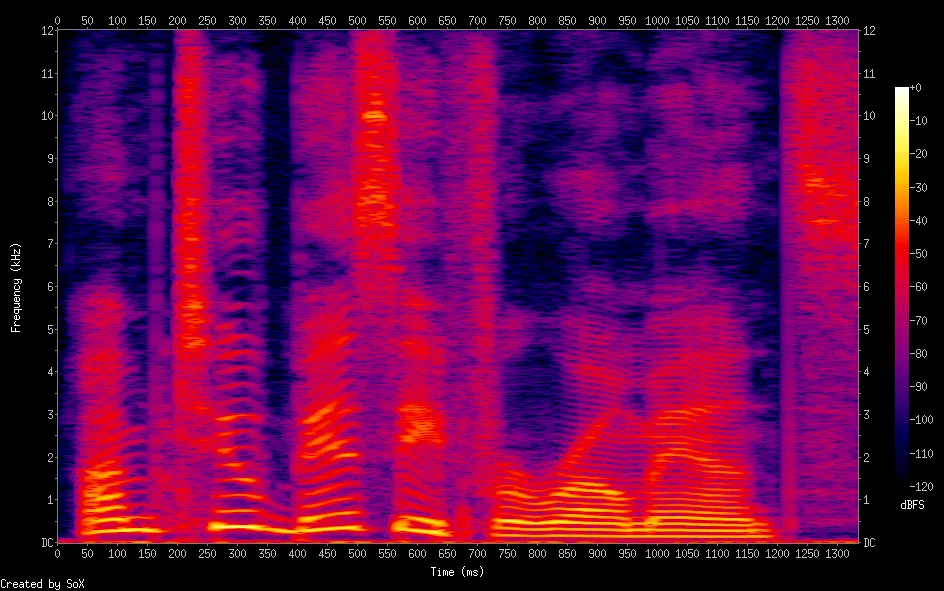
例如,我有一段包含语音的wav文件。
我可以使用sox创建漂亮的频谱可视化:
但看起来有些参数不好或某些东西出了问题: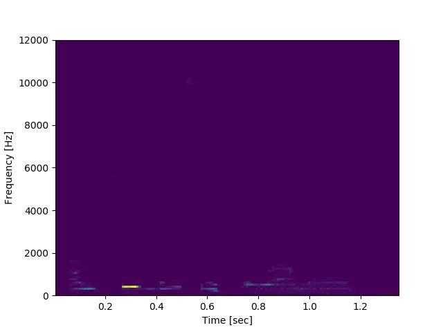
我可以使用sox创建漂亮的频谱可视化:
wget https://google.github.io/tacotron/publications/tacotron2/demos/romance_gt.wav
sox romance_gt.wav -n spectrogram -o spectrogram.png
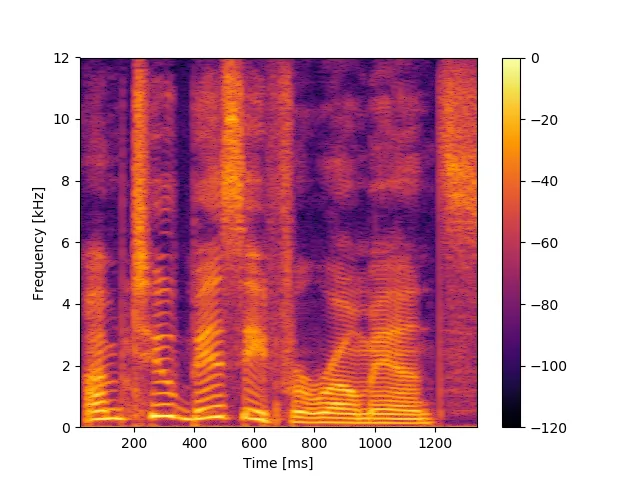
如何在Python中重现这个频谱图?
以下是使用scipy.signal.spectrogram的示例:
input_file = 'temp/romance_gt.wav'
fs, x = wavfile.read(input_file)
print('fs', fs)
print('x.shape', x.shape)

f, t, Sxx = signal.spectrogram(x, fs)
print('f.shape', f.shape)
print('t.shape', t.shape)
print('Sxx.shape', Sxx.shape)
plt.pcolormesh(t, f, Sxx)
plt.ylabel('Frequency [Hz]')
plt.xlabel('Time [sec]')
plt.savefig('spectrogram_scipy.png')
但看起来有些参数不好或某些东西出了问题: