雷达图Matplotlib Python:如何设置标签对齐

3
我试图将雷达图的标签与轴对齐,但遇到了困难。
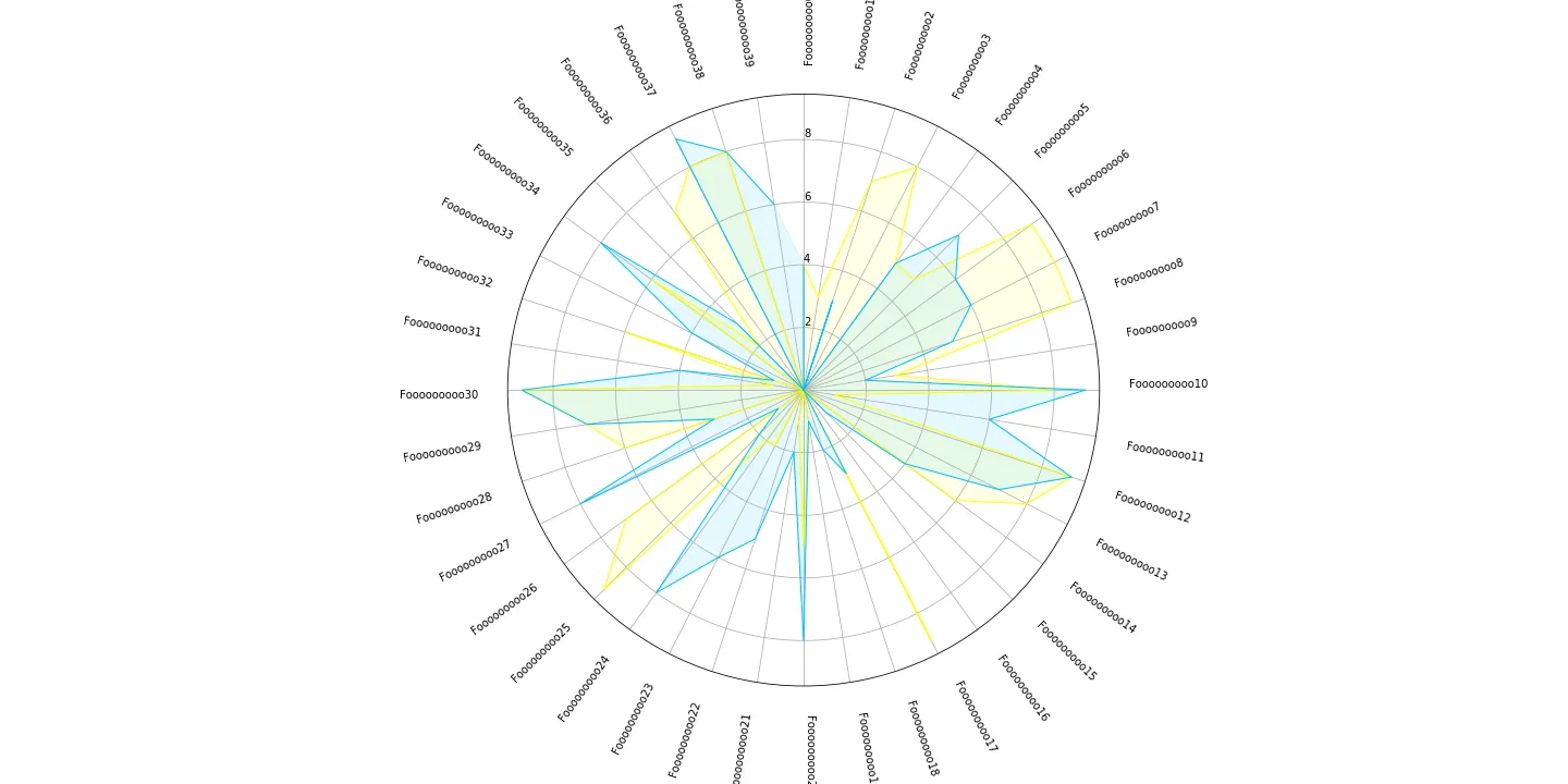
如果不进行标签对齐,我的标签会居中并超出轴线
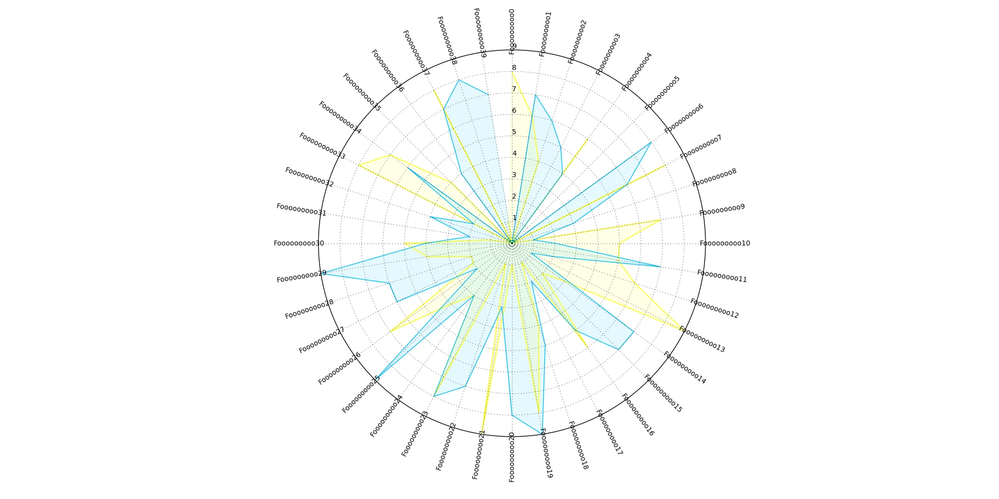
 enter image description here
当我将第一半标签(图像右侧)的对齐设置为左对齐,将第二半标签的对齐设置为右对齐时,我得到的对齐方式不是“圆形”的 enter image description here 为此,我在xticklabels中进行循环并设置水平对齐方式。
# Draw one axe per variable + add labels labels yet
plt.xticks(angles, categories)
for label,i in zip(ax.get_xticklabels(),range(0,len(angles))):
    if i<len(angles)/2:
        angle_text=angles[i]*(-180/pi)+90
        #label.set_horizontalalignment('left')

    else:
        angle_text=angles[i]*(-180/pi)-90
        #label.set_horizontalalignment('right')
    label.set_rotation(angle_text)

我猜这个问题有一个正确的解决方法,但我无法想出来,因为我不知道它是否应该考虑偏移量、翻译或如何调整极坐标来实现。

感谢您的帮助。

保罗

以下是完整的代码,以获取更多信息。

from math import pi
import matplotlib.pyplot as plt
%matplotlib inline
import pandas as pd

## Generate Data
labels_test=[]
for i in range(0,40):
    labels_test.append("Fooooooooo"+str(i))
pd_radar=pd.DataFrame(data=np.random.randint(low=0, high=10, size=(2, 40)),columns=labels_test)

# number of variable
categories=list(pd_radar)
N = len(categories)

# What will be the angle of each axis in the plot? (we divide the plot / number of variable)
angles = [n / float(N) * 2 * pi for n in range(N)]

# Initialise the spider plot
fig=plt.figure(figsize=(20,10))
ax = plt.subplot(111, polar=True)

# If you want the first axis to be on top:
ax.set_theta_offset(pi / 2)
ax.set_theta_direction(-1)

# Draw one axe per variable + add labels labels yet
plt.xticks(angles, categories)
for label,i in zip(ax.get_xticklabels(),range(0,len(angles))):
    if i<len(angles)/2:
        angle_text=angles[i]*(-180/pi)+90
        label.set_horizontalalignment('left')

    else:
        angle_text=angles[i]*(-180/pi)-90
        label.set_horizontalalignment('right')
    label.set_rotation(angle_text)
# Draw ylabels
ax.set_rlabel_position(0)


# ------- PART 2: Add plots

# Plot each line of the data 

# Ind1
values0=pd_radar.iloc[0].values.flatten().tolist()
ax.plot(angles, values0, linewidth=1, linestyle='solid', label="Label 1",color='yellow')
ax.fill(angles, values0, 'r', alpha=0.1,color='yellow')

# Ind2
values1=pd_radar.iloc[1].values.flatten().tolist()
ax.plot(angles, values1, linewidth=1, linestyle='solid', label="Label 2",color='deepskyblue')
ax.fill(angles, values1, 'r',color='deepskyblue', alpha=0.1)

# Add legend
plt.show()

好的,谢谢。希望现在更清楚了。 - undefined
是的,除了我目前无法重现这个问题。您使用的matplotlib版本是哪个? - undefined
matplotlib.version='2.0.2' - undefined
2个回答

3
我找到了一个解决方案,但似乎不太优雅。主要思路是将垂直和水平对齐都设置为角度的函数。

enter image description here

from math import pi
import matplotlib.pyplot as plt
%matplotlib inline
import pandas as pd
import numpy as np

## Generate Data
labels_test=[]
for i in range(0,40):
    labels_test.append("Fooooooooo"+str(i))
pd_radar=pd.DataFrame(data=np.random.randint(low=0, high=10, size=(2, 40)),columns=labels_test)


# number of variable
categories=list(pd_radar)
N = len(categories)

# What will be the angle of each axis in the plot? (we divide the plot / number of variable)
angles = [n / float(N) * 2 * pi for n in range(N)]

# Initialise the spider plot
fig=plt.figure(figsize=(20,10))
ax = plt.subplot(111, polar=True)

# If you want the first axis to be on top:
ax.set_theta_offset(pi / 2)
ax.set_theta_direction(-1)

# Draw one axe per variable + add labels labels yet
# idea is to add both vertical and horizontal alignment as a function of pi

plt.xticks(angles, categories)
for label,i in zip(ax.get_xticklabels(),range(0,len(angles))):

    angle_rad=angles[i]
    if angle_rad <= pi/2:
        ha= 'left'
        va= "bottom"
        angle_text=angle_rad*(-180/pi)+90
    elif pi/2 < angle_rad <= pi:
        ha= 'left'
        va= "top"
        angle_text=angle_rad*(-180/pi)+90
    elif pi < angle_rad <= (3*pi/2):
        ha= 'right'
        va= "top"  
        angle_text=angle_rad*(-180/pi)-90
    else:
        ha= 'right'
        va= "bottom"
        angle_text=angle_rad*(-180/pi)-90
    label.set_rotation(angle_text)
    label.set_verticalalignment(va)
    label.set_horizontalalignment(ha)


# Draw ylabels
ax.set_rlabel_position(0)


# ------- PART 2: Add plots

# Plot each line of the data 

# Ind1
values2=pd_radar.iloc[0].values.flatten().tolist()
ax.plot(angles, values2, linewidth=1, linestyle='solid', label="Label 1",color='yellow')
ax.fill(angles, values2, 'r', alpha=0.1,color='yellow')

# Ind2
values3=pd_radar.iloc[1].values.flatten().tolist()
ax.plot(angles, values3, linewidth=1, linestyle='solid', label="Label 2",color='deepskyblue')
ax.fill(angles, values3, 'r',color='deepskyblue', alpha=0.1)

# Add legend
plt.show()

这个脚本对我来说不起作用。 - undefined

3

这段代码目前不能与matplotlib 2.2一起运行。然而,以下解决方案可在OP使用的版本2.0.2中正常工作。有关使用更新版本的解决方法,请参见此问题

matplotlib中的文本具有旋转模式

旋转模式可以是"default",在这种情况下,文本首先被旋转,然后再对齐。

enter image description here

或者它可以是"anchor",这种情况下文本首先被对齐,然后旋转。

enter image description here

因此,为了使极坐标图中的刻度标签指向外部,您需要将文本的对齐方式设置为"left",然后将旋转模式设置为"anchor"
for label,rot in zip(ax.get_xticklabels(),ticks):
    label.set_rotation(rot*180./np.pi)
    label.set_horizontalalignment("left")
    label.set_rotation_mode("anchor")

完整示例:

import numpy as np
import matplotlib.pyplot as plt

fig=plt.figure(figsize=(5,5))
ax = plt.subplot(111, polar=True)

ticks = np.linspace(0, 2*np.pi, 20, endpoint=False)
text = lambda : "".join(np.random.choice(list("manuladefil"), size=10))
labels = [text() for _ in range(len(ticks))]

plt.xticks(ticks, labels, size=16)
for label,rot in zip(ax.get_xticklabels(),ticks):
    label.set_rotation(rot*180./np.pi)
    label.set_horizontalalignment("left")
    label.set_rotation_mode("anchor")

plt.tight_layout()
plt.show()

enter image description here


这个例子对我不起作用。 - undefined

网页内容由stack overflow 提供, 点击上面的
可以查看英文原文,
原文链接