Python Plotly 雷达图样式化

3
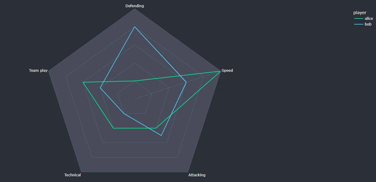
我想展示下面的图片,我认为用Python做这个很好,但我不确定。我想随机化许多足球运动员的统计数据,为每个人制作一个雷达图,并将图表保存为图像。 enter image description here 但是Plotly雷达图并不那么时尚,我真的想做些时尚的东西。如何将以下演示代码转换为参考图像,这是否可能?
这是演示代码:
import plotly.graph_objects as go

categories = ['Defending','Speed','Attacking',
              'Technical', 'Team play']

fig = go.Figure()

fig.add_trace(go.Scatterpolar(
      r=[1, 5, 2, 2, 3],
      theta=categories,
      fill='toself',
      name='Alice'
))
fig.add_trace(go.Scatterpolar(
      r=[4, 3, 2.5, 1, 2],
      theta=categories,
      fill='toself',
      name='Bob'
))

fig.update_layout(
  polar=dict(
    radialaxis=dict(
      visible=True,
      range=[0, 5]
    )),
  showlegend=False
)

fig.show()
1个回答

3
极坐标布局的文档中可以看出,当涉及到网格形状本身时,Plotly并没有提供太多选项。但是,Plotly允许您创建自己的模板/主题检查内置主题
作为起点,您应该分析plotly_dark主题,因为它具有与您的图片类似的一些特征。

使用内置模板的简单示例

enter image description here

dataset.csv
categories,player,points
Defending,alice,1
Speed,alice,5
Attacking,alice,2
Technical,alice,2
Team play,alice,3
Defending,bob,4
Speed,bob,3
Attacking,bob,2.5
Technical,bob,1
Team play,bob,2
代码
import plotly.express as px
import pandas as pd

df = pd.read_csv("dataset.csv")
fig = px.line_polar(df, r="points",
                    theta="categories",
                    color="player",
                    line_close=True,
                    color_discrete_sequence=["#00eb93", "#4ed2ff"],
                    template="plotly_dark")

fig.update_polars(angularaxis_showgrid=False,
                  radialaxis_gridwidth=0,
                  gridshape='linear',
                  bgcolor="#494b5a",
                  radialaxis_showticklabels=False
                  )

fig.update_layout(paper_bgcolor="#2c2f36")
fig.show()

通过上面的代码,我不认为可以修改每个嵌套形状的颜色。要能够这样做,可能需要创建自己的模板并单独为每个嵌套形状着色。

创建网格形状

您可能需要尝试类似下面的代码来创建您想要的网格形状。

import plotly.graph_objects as go

bgcolors = ["#353841", "#3f414d", "#494b5a", "#494b5a", "#58596a"]
fig = go.Figure(go.Scatterpolar(
    r=[42]*8,
    theta=[0, 45, 90, 135, 180, 225, 270, 315],
    marker_line_width=2,
    opacity=0.8,
    marker=dict(color=bgcolors[0])
))

for i in range(1, 5):
    fig.add_trace(go.Scatterpolar(
        r=[44-6*i]*8,
        theta=[0, 45, 90, 135, 180, 225, 270, 315],
        marker_line_width=2,
        marker=dict(color=bgcolors[i])
    ))

fig.update_polars(angularaxis_dtick='')
fig.update_traces(fill='toself')
fig.update_polars(angularaxis_showgrid=False,
                  radialaxis_showgrid=False,
                  radialaxis_gridwidth=0,
                  gridshape='linear',
                  radialaxis_showticklabels=False,
                  angularaxis_layer='above traces'

                  )
fig.show()

enter image description here

颜色有些偏差,但总体形状不错。


网页内容由stack overflow 提供, 点击上面的
可以查看英文原文,
原文链接