编辑 更新问题标题以反映此问题可以概括为“任意两行”,并且不一定需要在一条线中固定y。
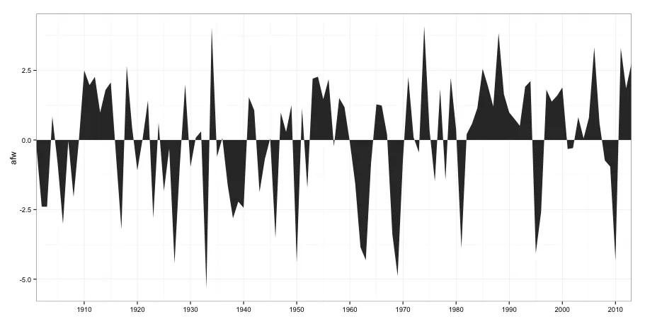
考虑以下多边形绘图:
ggplot(df, aes(x=year,y=afw)) +
  geom_polygon() +
  scale_x_continuous("", expand=c(0,0), breaks=seq(1910,2010,10)) +
  theme_bw()
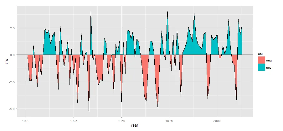
然而,我想用两种不同的颜色填充它,例如红色对于大于0的黑色区域,蓝色对于小于0的黑色区域。不幸的是,使用fill=col不能填充正确的区域。
我尝试了以下代码(为了说明填充边界位置,我添加了geom_line):
ggplot(df, aes(x=year,y=afw)) +
  geom_line() +
  geom_polygon(aes(fill=col), alpha=0.5) +
  scale_x_continuous("", expand=c(0,0), breaks=seq(1910,2010,10)) +
  theme_bw()
这会导致:
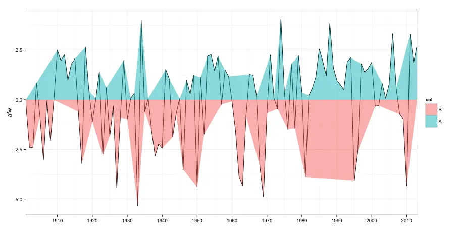
正如您所看到的,它填充的比它应该填充的要多得多。我该怎么解决?
数据:
df <- structure(list(year = c(1901, 1901, 1901, 1902, 1903, 1904, 1905, 1906, 1907, 1908, 1909, 1910, 1911, 1912, 1913, 1914, 1915, 1916, 1917, 1918, 1919, 1920, 1921, 1922, 1923, 1924, 1925, 1926, 1927, 1928, 1929, 1930, 1931, 1932, 1933, 1934, 1935, 1936, 1937, 1938, 1939, 1940, 1941, 1942, 1943, 1944, 1945, 1946, 1947, 1948, 1949, 1950, 1951, 1952, 1953, 1954, 1955, 1956, 1957, 1958, 1959, 1960, 1961, 1962, 1963, 1964, 1965, 1966, 1967, 1968, 1969, 1970, 1971, 1972, 1973, 1974, 1975, 1976, 1977, 1978, 1979, 1980, 1981, 1982, 1983, 1984, 1985, 1986, 1987, 1988, 1989, 1990, 1991, 1992, 1993, 1994, 1995, 1996, 1997, 1998, 1999, 2000, 2001, 2002, 2003, 2004, 2005, 2006, 2007, 2008, 2009, 2010, 2011, 2012, 2013, 2013, 2013), afw = c(0, 0, -0.246246074793035, -2.39463317156723, -2.39785897801884, 0.840850699400514, -0.843020268341422, -3.02043962318013, -0.033342848986583, -2.04947188124465, -0.00431059092206709, 2.49568940907793, 1.96988295746503, 2.26665715101342, 0.986011989723095, 1.79568940907793, 2.06665715101342, -0.601084784470454, -3.21076220382529, 2.65052811875535, 0.46988295746503, -1.09140736511562, 0.0505281187553526, 1.41827005423922, -2.80108478447045, 0.611818441335997, -1.83011704253497, -0.30753639737368, -4.43011704253497, -0.897858978018841, 1.98601198972309, -0.965600913502712, 0.0795603768198685, 0.308592634884385, -5.33011704253497, 4.00214102198116, -0.594633171567228, 0.0698829574650297, -1.60753639737368, -2.81398801027691, -2.21398801027691, -2.4365686554382, 1.53439908649729, 1.06665715101342, -1.87205252640594, -0.688181558664002, 0.0569797316585783, -3.51398801027691, 0.979560376819868, 0.289237796174707, 1.24085069940051, -4.39140736511562, 1.13117328004567, -1.72689123608336, 2.20214102198116, 2.27310876391664, 1.46665715101342, 2.18278618327148, -0.23011704253497, 1.50536682843277, 1.17633457036826, -0.0785041393091639, -1.54947188124465, -3.85269768769626, -4.31398801027691, -0.80753639737368, 1.27956037681987, 1.2376248929489, 0.195689409077933, -3.38172994576078, -4.88172994576078, -0.675278332857551, 2.25375392520697, 0.0924636026263199, -0.446246074793035, 4.06988295746503, 0.350528118755352, -1.48172994576078, 1.81504424778761, -1.42689123608336, 2.22472166714245, 0.376334570368256, -3.88495575221239, 0.211818441335998, 0.586011989723094, 1.14407650585213, 2.55697973165858, 1.92794747359406, 1.20214102198116, 3.83439908649729, 1.64407650585213, 0.986011989723095, 0.753753925206965, 0.508592634884385, 1.911818441336, 2.11504424778761, -4.06560091350271, -2.58495575221239, 1.80859263488438, 1.37956037681987, 1.58923779617471, 1.88601198972309, -0.323665429631744, -0.291407365115615, 0.818270054239223, 0.0569797316585783, 0.795689409077933, 3.32472166714245, 0.595689409077933, -0.733342848986583, -0.955923494147874, -4.32689123608336, 3.29891521552955, 1.85697973165858, 2.74407650585213, 0, 0), col = structure(c(1L, 2L, 1L, 1L, 1L, 2L, 1L, 1L, 1L, 1L, 1L, 2L, 2L, 2L, 2L, 2L, 2L, 1L, 1L, 2L, 2L, 1L, 2L, 2L, 1L, 2L, 1L, 1L, 1L, 1L, 2L, 1L, 2L, 2L, 1L, 2L, 1L, 2L, 1L, 1L, 1L, 1L, 2L, 2L, 1L, 1L, 2L, 1L, 2L, 2L, 2L, 1L, 2L, 1L, 2L, 2L, 2L, 2L, 1L, 2L, 2L, 1L, 1L, 1L, 1L, 1L, 2L, 2L, 2L, 1L, 1L, 1L, 2L, 2L, 1L, 2L, 2L, 1L, 2L, 1L, 2L, 2L, 1L, 2L, 2L, 2L, 2L, 2L, 2L, 2L, 2L, 2L, 2L, 2L, 2L, 2L, 1L, 1L, 2L, 2L, 2L, 2L, 1L, 1L, 2L, 2L, 2L, 2L, 2L, 1L, 1L, 1L, 2L, 2L, 2L, 2L, 1L), .Label = c("B", "A"), class = "factor")), .Names = c("year", "afw", "col"), class = c("tbl_df", "data.frame"), row.names = c(NA, -117L))
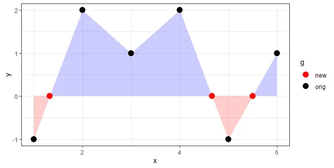
注意:从数据中可以看到,1901年和2013年都有3行。我这样做是因为我想正确填充。尽管黑色填充是正确的,但似乎我无法通过颜色得到可行的解决方案。
原始数据集:
orig <- structure(list(year = c(1901, 1902, 1903, 1904, 1905, 1906, 1907, 1908, 1909, 1910, 1911, 1912, 1913, 1914, 1915, 1916, 1917, 1918, 1919, 1920, 1921, 1922, 1923, 1924, 1925, 1926, 1927, 1928, 1929, 1930, 1931, 1932, 1933, 1934, 1935, 1936, 1937, 1938, 1939, 1940, 1941, 1942, 1943, 1944, 1945, 1946, 1947, 1948, 1949, 1950, 1951, 1952, 1953, 1954, 1955, 1956, 1957, 1958, 1959, 1960, 1961, 1962, 1963, 1964, 1965, 1966, 1967, 1968, 1969, 1970, 1971, 1972, 1973, 1974, 1975, 1976, 1977, 1978, 1979, 1980, 1981, 1982, 1983, 1984, 1985, 1986, 1987, 1988, 1989, 1990, 1991, 1992, 1993, 1994, 1995, 1996, 1997, 1998, 1999, 2000, 2001, 2002, 2003, 2004, 2005, 2006, 2007, 2008, 2009, 2010, 2011, 2012, 2013), afw = c(-0.246246074793035, -2.39463317156723, -2.39785897801884, 0.840850699400514, -0.843020268341422, -3.02043962318013, -0.033342848986583, -2.04947188124465, -0.00431059092206709, 2.49568940907793, 1.96988295746503, 2.26665715101342, 0.986011989723095, 1.79568940907793, 2.06665715101342, -0.601084784470454, -3.21076220382529, 2.65052811875535, 0.46988295746503, -1.09140736511562, 0.0505281187553526, 1.41827005423922, -2.80108478447045, 0.611818441335997, -1.83011704253497, -0.30753639737368, -4.43011704253497, -0.897858978018841, 1.98601198972309, -0.965600913502712, 0.0795603768198685, 0.308592634884385, -5.33011704253497, 4.00214102198116, -0.594633171567228, 0.0698829574650297, -1.60753639737368, -2.81398801027691, -2.21398801027691, -2.4365686554382, 1.53439908649729, 1.06665715101342, -1.87205252640594, -0.688181558664002, 0.0569797316585783, -3.51398801027691, 0.979560376819868, 0.289237796174707, 1.24085069940051, -4.39140736511562, 1.13117328004567, -1.72689123608336, 2.20214102198116, 2.27310876391664, 1.46665715101342, 2.18278618327148, -0.23011704253497, 1.50536682843277, 1.17633457036826, -0.0785041393091639, -1.54947188124465, -3.85269768769626, -4.31398801027691, -0.80753639737368, 1.27956037681987, 1.2376248929489, 0.195689409077933, -3.38172994576078, -4.88172994576078, -0.675278332857551, 2.25375392520697, 0.0924636026263199, -0.446246074793035, 4.06988295746503, 0.350528118755352, -1.48172994576078, 1.81504424778761, -1.42689123608336, 2.22472166714245, 0.376334570368256, -3.88495575221239, 0.211818441335998, 0.586011989723094, 1.14407650585213, 2.55697973165858, 1.92794747359406, 1.20214102198116, 3.83439908649729, 1.64407650585213, 0.986011989723095, 0.753753925206965, 0.508592634884385, 1.911818441336, 2.11504424778761, -4.06560091350271, -2.58495575221239, 1.80859263488438, 1.37956037681987, 1.58923779617471, 1.88601198972309, -0.323665429631744, -0.291407365115615, 0.818270054239223, 0.0569797316585783, 0.795689409077933, 3.32472166714245, 0.595689409077933, -0.733342848986583, -0.955923494147874, -4.32689123608336, 3.29891521552955, 1.85697973165858, 2.74407650585213)), .Names = c("year", "afw"), class = c("tbl_df", "data.frame"), row.names = c(NA, -113L))
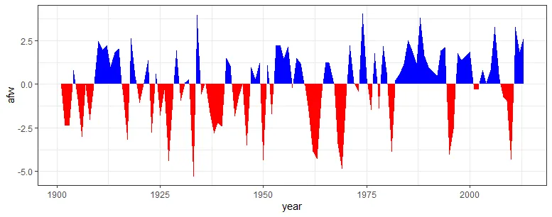
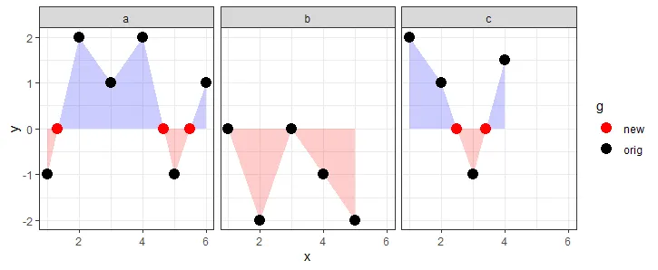


y != 0的基本绘图解决方案。 - jay.sf