我有一组标记的事件(时间序列)数据,其中事件以给定标签的随机间隔发生。我想计算组内ewma并将其添加到数据框中作为新列“X1_EWMA”。到目前为止,代码如下:
import pandas as pd
import numpy as np
import altair as alt

n = 1000
df = pd.DataFrame({
    'T': pd.date_range('20190101', periods=n, freq='H'),
    'C1': np.random.choice(list('PYTHON'), n),
    'C2': np.random.choice(list('FUN'), n),
    'X1': np.random.randn(n),
    'X2': 100 + 10 * np.random.randn(n)
})

ts = df.set_index('T')

display(df.head())
display(ts.head())
感谢SO: Pandas Groupby and apply method with custom function,我能够使用以下方法计算分组EWMA:
ewm = ts.groupby(['C1']).apply(lambda x: x['X1'].ewm(halflife=10).mean())
ewm.head()
它生成了一个按照分类变量和日期时间索引的系列。该系列的长度与原始数据帧和时间序列(df和ts)相同。
现在我认为我可以通过对行索引进行连接(假设排序顺序没有改变)将其与原始数据帧(df)结合起来,但这似乎不太正确,甚至可能是一种冒险的方法,因为groupby只在一个分类标签中-我需要仔细检查/排序/重新索引。
似乎应该有一种更容易的方法直接将时间序列列添加到数据帧(df)或时间序列(ts)中,而无需创建单独的系列或数据帧并将它们连接起来。如果我想添加滚动统计信息,例如:
ts.groupby('C1').rolling(10).mean()
非常感谢您提供的任何帮助或意见。
基于已接受答案的结果:
import pandas as pd
import numpy as np
import math
import altair as alt
alt.renderers.enable('notebook') # for rendering in the notebook
alt.data_transformers.enable('json') # for plotting data larger than 5000 points
# make a dataframe to test
n = 1000
df = pd.DataFrame({
'T': pd.date_range('20190101', periods=n, freq='H'),
'C1': np.random.choice(list('PYTHON'), n),
'C2': np.random.choice(list('FUN'), n),
'X1': np.linspace(0, 2*math.pi, n),
'X2': np.random.randn(n),
})
# add a new variable that is a function of X1, X2 + a random outlier probability
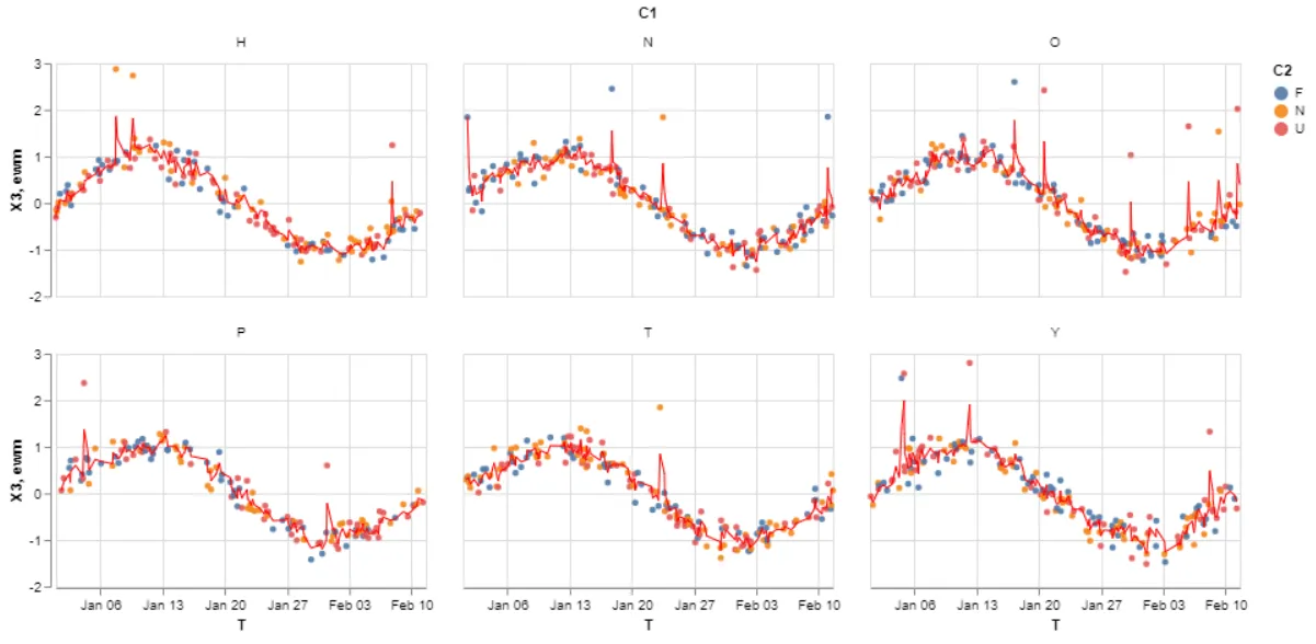
df['X3'] = 0.2 * df['X2'] + np.sin(df['X1']) + np.random.choice(a=[0, 2], size=n, p=[0.98, 0.02])
# make it a time series for later resampling use cases.
ts = df.set_index('T')
# SOLUTION: Add the ewma line with groupby().transform().
ts['ewm'] = ts.groupby(['C1'])['X3'].transform(lambda x: x.ewm(halflife=1).mean())
# plot the points and ewma using altair faceting and layering
points = alt.Chart().mark_circle(size=20, opacity=0.9).encode(
x = 'T',
y = 'X3',
color = 'C2',
).properties(width=270, height=170)
lines = alt.Chart().mark_line(size=1, color='red', opacity=1).encode(
x = 'T',
y = 'ewm'
)
alt.layer(points, lines).facet(facet='C1', data=ts.reset_index()).properties(columns=3)