改变 Seaborn 应用颜色调色板的轴

4
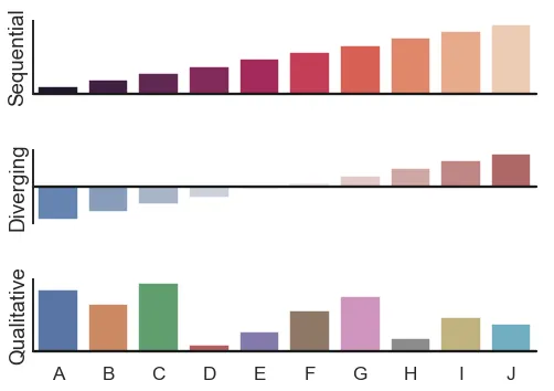
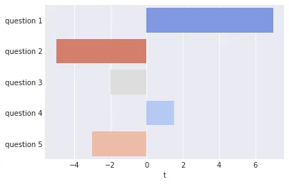
我正在尝试使用Seaborn将一维数据框呈现为水平条形图。我希望使用coolwarm调色板来着色条形以反映它们的大小和方向。
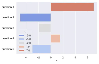
换句话说,我希望生成类似于此处第二个示例(来自Seaborn网站)的内容,但我想将其定向为水平方向:
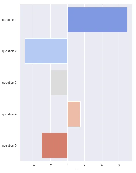
enter image description here

我已经成功将图表旋转,但是似乎无法使调色板沿着水平轴应用。我的代码如下:
import pandas as pd, seaborn as sns

sns.set()
df = pd.DataFrame([7,-5,-2,1.5,-3],
                  index=['question 1','question 2','question 3','question 4','question 5'],
                  columns=['t'])
sns.barplot(data=    df,
            x=       't', 
            y=       df.index,
            palette= 'coolwarm') 

输出:

output

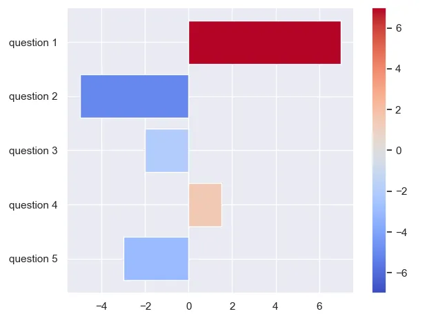
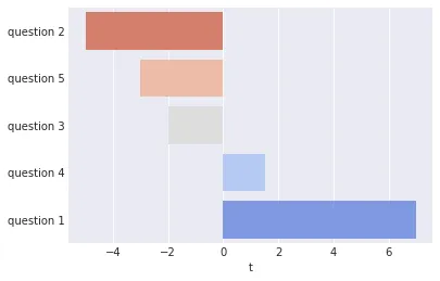
我希望随着从左到右的移动,背景颜色由蓝色变为红色(而不是从上到下)。

3个回答

5

Seaborn不执行任何真正的颜色映射。因此,如果需要进行颜色映射,则需要在外部完成。下面的每个条形图都根据其大小从颜色映射中获得其颜色。

import matplotlib.pyplot as plt
import numpy as np
import pandas as pd
import seaborn as sns

sns.set()
df = pd.DataFrame([7,-5,-2,1.5,-3],
                  index=['question 1','question 2','question 3','question 4','question 5'],
                  columns=['t'])

absmax = np.abs(df["t"].values).max()
norm = plt.Normalize(-absmax, absmax)
cmap = plt.get_cmap("coolwarm")
colors = cmap(norm(df["t"].values))
plt.barh("index", "t", data=df.reset_index(), color=colors)

plt.colorbar(plt.cm.ScalarMappable(norm, cmap))

plt.gca().invert_yaxis()
plt.tight_layout()
plt.show()

enter image description here


这正是我在寻找的。感谢您的回复。 - Max

3
如果您不介意按照递增值的顺序提出问题,可以执行以下操作:
df2 = df.sort_values('t')

sns.barplot(data=df2,
            x='t',
            y=df2.index
            palette='coolwarm_r')

应该产生:

enter image description here

如果您想按照原始顺序提出问题,可以使用palette关键字参数指定自定义调色板(RGBA值列表)来为绘图设置颜色:

val_order = df['t'].rank(method='max').astype(int) # rank ordered values in column 't'
val_index = val_order - 1 # convert for use as a list index
colors = sns.color_palette('coolwarm_r', len(df.index)) # list of N colors spaced along coolwarm
palette = [colors[x] for x in val_index] # re-order colors with increasing value of 't'

sns.barplot(data=df, x='t', y=df.index, palette=palette)

产生:

enter image description here

制作完图片后,我意识到我不小心使用了 coolwarm_r 而不是 coolwarm。添加 _r 后缀将使用一个反转的颜色映射。哦,好吧。

谢谢!不过,在这两个解决方案中,似乎颜色的深浅与项目在排序中的位置相对应,而不是它们实际的大小。由于我的实际数据并非如此均匀分布,我想让颜色的深浅反映它们的大小(例如,问题3和问题4应该都显示为灰色)。 - Max
第二个选项是基于列“'t'”中的值选择颜色。您也可以使用数据框中的任何其他列,例如分配一个大小列,并使用它来选择颜色:df.assign(magnitude=lambda x: abs(x['t'])) - jonchar
你确定吗?在进一步尝试后,它看起来确实是基于排名 t 值而不是 t 值本身选择颜色。请注意,行colors = sns.color_palette('coolwarm_r', len(df.index))生成一个列表,其中包含均匀间隔的颜色,然后将其分配给以下行中的调色板。 - Max
我明白你的意思。你是正确的。在这种情况下,我认为你可以使用matplotlib colormap来生成传递给palette关键字参数的RGBA值。另请参阅颜色映射规范化 - jonchar

1
这是一个非常晚的回复,但是...
最简单的方法是将hue参数设置为您希望设置为轴的列进行着色:
sns.barplot(data=df,x='t',y=df.index,palette='coolwarm', hue='t', dodge=False)

非常重要的是将dodge设置为True,否则你会得到极其细小、类似于线条的框。

你将得到这样的输出:

输出


网页内容由stack overflow 提供, 点击上面的
可以查看英文原文,
原文链接