为什么seaborn图表的颜色与调色板指定的颜色不同?
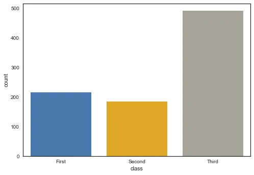
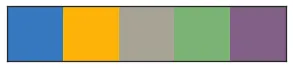
下面两张图表展示了柱状图中颜色的差异和调色板图中颜色的差异。如果你仔细观察,你会发现在柱状图上的颜色略微暗淡/饱和。
为什么它们不同,我如何让柱状图具有与调色板中指定的完全相同的颜色?
下面两张图表展示了柱状图中颜色的差异和调色板图中颜色的差异。如果你仔细观察,你会发现在柱状图上的颜色略微暗淡/饱和。
为什么它们不同,我如何让柱状图具有与调色板中指定的完全相同的颜色?
import seaborn as sns
sns.set(style="white")
titanic = sns.load_dataset("titanic")

colors = ["windows blue", "amber", "greyish", "faded green", "dusty
purple"]

ax = sns.countplot(x="class", data=titanic,
palette=sns.xkcd_palette(colors))
sns.palplot(sns.xkcd_palette(colors))
条形图
调色板图
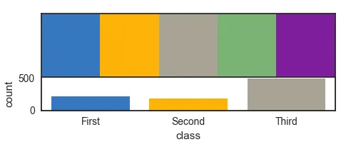
seaborn.apionly时,这不会受到影响。似乎也没有sns.set(style="white", saturation=1)这样的东西。总的来说,我认为将样式固定到实际绘图命令是不好的风格。 - ImportanceOfBeingErnest