假设你要绘制一组数据:
plt.plot(x,y, marker='.', label='something')
plt.legend()
. something ,但是你要如何将它更改为 - something ,以便出现在图例中的标记是一条线而不是一个点?假设你要绘制一组数据:
plt.plot(x,y, marker='.', label='something')
plt.legend()
. something ,但是你要如何将它更改为 - something ,以便出现在图例中的标记是一条线而不是一个点?import matplotlib.pyplot as plt
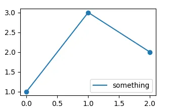
line, = plt.plot([1,3,2], marker='o', label='something')
plt.legend(handles = [plt.plot([],ls="-", color=line.get_color())[0]],
labels=[line.get_label()])
plt.show()
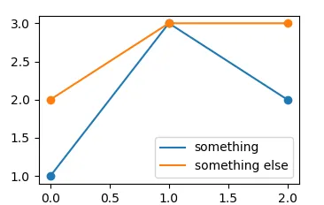
import matplotlib.pyplot as plt
from matplotlib.legend_handler import HandlerLine2D

plt.plot([1,3,2], marker='o', label='something')
plt.plot([2,3,3], marker='o', label='something else')

def update_prop(handle, orig):
    handle.update_from(orig)
    handle.set_marker("")

plt.legend(handler_map={plt.Line2D:HandlerLine2D(update_func=update_prop)})

plt.show()
对于3D图,它的工作方式略有不同:
import matplotlib.pyplot as plt
import matplotlib.patches as mpatches

ax = plt.gca()
handles, labels =  ax.get_legend_handles_labels()
updated_handles = []

for handle in handles:
   updated_handles.append(mpatches.Patch(
   color=handle.get_markerfacecolor(),
   label=handle.get_label()))

by_label = dict(sorted(dict(zip(labels,
                updated_handles)).items()))

ax.legend(by_label.values(), by_label.keys())
为了提供更多信息。如果您想在使用plt.scatter()时使图例中的标记更加可见,您可以执行以下操作来自动化标记更改过程。
import matplotlib.pyplot as plt
import matplotlib.patches as mpatches

handles, labels, plt.gca().get_legend_handles_labels()
updated_handles = []
for handle in handles:
  updated_handles.append(mpatches.Patch(color=handle.get_facecolor(), label=handle.get_label()))
by_label = dict(sorted(dict(zip(all_labels, updated_handles)).items()))
plt.figlegend(by_label.values(), by_label.keys(), ...)
plt.gca()更改为您自己的。另外,在第8行,我对图例进行了排序,这是您可以选择不做的事情。