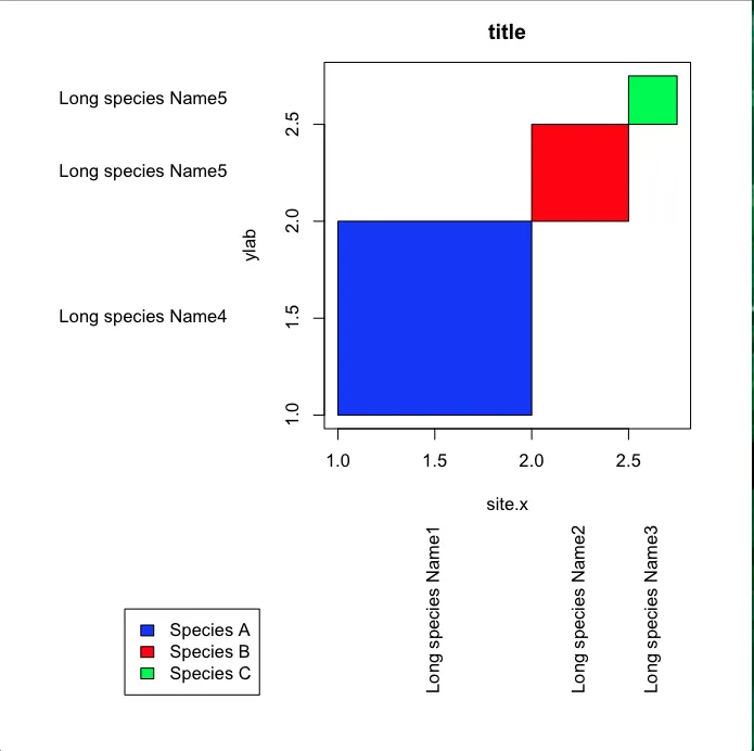
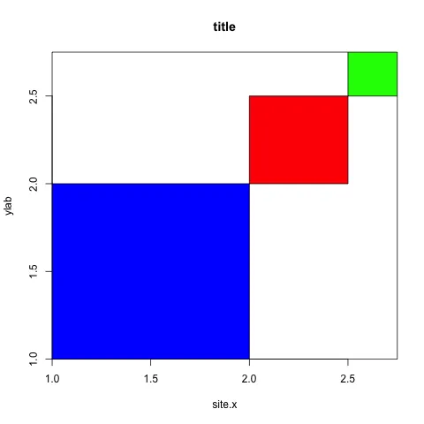
当我创建以下绘图时,我发现绘图区域和坐标轴之间有不需要的空格(即蓝色框和x轴之间的白色空间)。如何去除这个空格,并使绘图区域与绘图轴对齐?谢谢。
xleft<-c(1,2,2.5)
xright<-c(2,2.5,2.75)
ybottom<-c(1,2,2.5)
ytop<-c(2,2.5,2.75)

par(mar = c(15,15,2.75,2.75) + 0.1)
plot(c(1,2.75),c(1,2.75),type="n",main="title",xlab="site.x",ylab="ylab")
rect(xleft,ybottom,xright,ytop,col=c("blue","red","green"))

#Label position along  axes
x.label.position<-(xleft+xright)/2
y.label.position<-(ybottom+ytop)/2

 #Labels
 x.label<-c("Long species Name1","Long species Name2","Long species Name3")
 y.label<-c("Long species Name4","Long species Name5","Long species Name5")

 text(par()$usr[1]-0.5,y.label.position,y.label,xpd=TRUE,adj=1)
 text(y=par()$usr[3]-0.5,x=x.label.position,x.label,xpd=TRUE,adj=1,srt=90)

 par(xpd=TRUE)
 legend(-0.1,0,legend=c("Species A","Species B","Species C"),fill=c("blue", "red", "green"))
更新 我尝试了plannapus的建议,但仅能让y轴表现良好,是否在这段代码中还有其他内容会向绘图区域的两侧添加空间?
quartz("colour.plot")
par(mar=c(15,15,4,2)+0.1)#sets margins of plotting area

#create the data plot
    plot(c(0,100), c(0,100), type = "n", main = paste(x,"vs",y," -",depth),xlab=paste("Species composition in remainder ",x),ylab=paste("Species composition in remainder ",y),asp=1,xaxs="i",yaxs="i")

#Add the rectangles
rect(mdf$xleft,mdf$ybottom,mdf$xright,mdf$ytop,col=mdf$colour)
生成
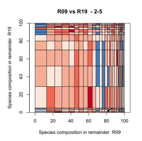
asp=1。使用此代码将强制使x轴和y轴相等,这可能与您的绘图区域大小存在冲突。 - plannapusplot之前添加par(pty="s")应该会强制绘图区域为正方形(因此是"s"),而不是矩形,从而纠正asp的“故障”。 - plannapusxlim,ylim以匹配你想要绘制的区域。虽然@Alan的解决方案给出了正确的外观,但从概念上讲,它并不适合你在这里想要做的事情。可以说,它只是“治标不治本”。 - Backlin