使用这个FrameLayout,可以绘制阴影和这个渐变的 drawable xml:
public class DrawShadowFrameLayout extends FrameLayout {
    private Drawable mShadowDrawable;
    private final int mShadowElevation = 8;
    private int mWidth;
    private int mHeight;
    private boolean mShadowVisible = true;

    public DrawShadowFrameLayout(Context context) {
        this(context, null, 0);
    }

    public DrawShadowFrameLayout(Context context, AttributeSet attrs) {
        this(context, attrs, 0);
    }

    public DrawShadowFrameLayout(Context context, AttributeSet attrs, int defStyleAttr) {
        super(context, attrs, defStyleAttr);
        init();
    }

    private void init() {
        mShadowDrawable = ContextCompat.getDrawable(getContext(), R.drawable.shadow);
        if (mShadowDrawable != null) {
            mShadowDrawable.setCallback(this);
        }
        setWillNotDraw(!mShadowVisible);
    }

    @Override
    protected void onSizeChanged(int w, int h, int oldw, int oldh) {
        super.onSizeChanged(w, h, oldw, oldh);
        mWidth = w;
        mHeight = h;
        updateShadowBounds();
    }


    private void updateShadowBounds() {
        if (mShadowDrawable != null) {
            mShadowDrawable.setBounds(0, 0, mWidth, mShadowElevation);
        }
        ViewCompat.postInvalidateOnAnimation(this);
    }

    @Override
    public void draw(Canvas canvas) {
        super.draw(canvas);
        if (mShadowDrawable != null && mShadowVisible) {
            getBackground().setBounds(0, mShadowDrawable.getBounds().bottom, mWidth, mHeight);
            mShadowDrawable.draw(canvas);
        }
    }

    public void setShadowVisible(boolean shadowVisible) {
        setWillNotDraw(!mShadowVisible);
        updateShadowBounds();
    }

    int getShadowElevation() {
        return mShadowVisible ? mShadowElevation : 0;
    }

}
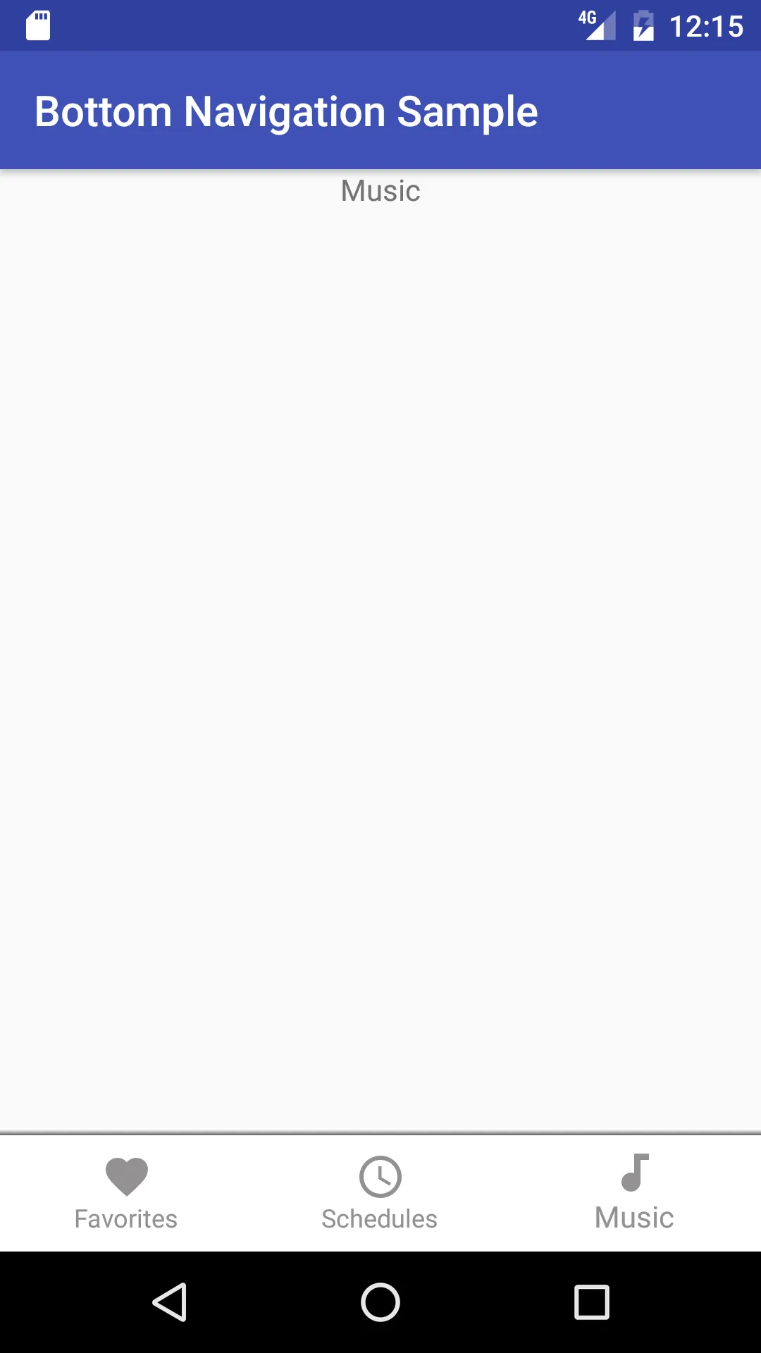
将您的BottomNavigationView包装在此布局中,如下所示:
<DrawShadowFrameLayout>
  <BottomNavigationView />
</DrawShadowFrameLayout>
很不幸,本地阴影是在视图下面绘制的,我们必须自己模仿这个向上的阴影。
别忘了为 DrawShadowFrameLayout 添加 android:elevation="8dp"。
另一种方法是扩展 BottomNavigationView 并重写 draw() 来完成相同的工作。这将帮助您减少视图层次结构中的一个 FrameLayout。