如何在R中实现Streamgraphs?
Streamgraphs是一种堆叠图的变体,改进了Havre等人的ThemeRiver的基线选择、图层顺序和颜色选择。
示例:
如何在R中实现Streamgraphs?
Streamgraphs是一种堆叠图的变体,改进了Havre等人的ThemeRiver的基线选择、图层顺序和颜色选择。
示例:
plot.stacked 的函数,可能可以帮你解决问题。plot.stacked <- function(x,y, ylab="", xlab="", ncol=1, xlim=range(x, na.rm=T), ylim=c(0, 1.2*max(rowSums(y), na.rm=T)), border = NULL, col=rainbow(length(y[1,]))){
plot(x,y[,1], ylab=ylab, xlab=xlab, ylim=ylim, xaxs="i", yaxs="i", xlim=xlim, t="n")
bottom=0*y[,1]
for(i in 1:length(y[1,])){
top=rowSums(as.matrix(y[,1:i]))
polygon(c(x, rev(x)), c(top, rev(bottom)), border=border, col=col[i])
bottom=top
}
abline(h=seq(0,200000, 10000), lty=3, col="grey")
legend("topleft", rev(colnames(y)), ncol=ncol, inset = 0, fill=rev(col), bty="0", bg="white", cex=0.8, col=col)
box()
}
这是一个数据集和一个图表的示例:
set.seed(1)
m <- 500
n <- 15
x <- seq(m)
y <- matrix(0, nrow=m, ncol=n)
colnames(y) <- seq(n)
for(i in seq(ncol(y))){
    mu <- runif(1, min=0.25*m, max=0.75*m)
    SD <- runif(1, min=5, max=30)
    TMP <- rnorm(1000, mean=mu, sd=SD)
    HIST <- hist(TMP, breaks=c(0,x), plot=FALSE)
    fit <- smooth.spline(HIST$counts ~ HIST$mids)
    y[,i] <- fit$y
}

    plot.stacked(x,y)
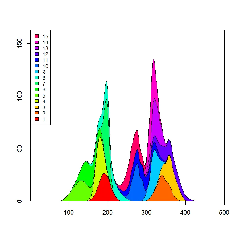
我可以想象,你只需要调整多边形“bottom”的定义,就可以得到你想要的图。
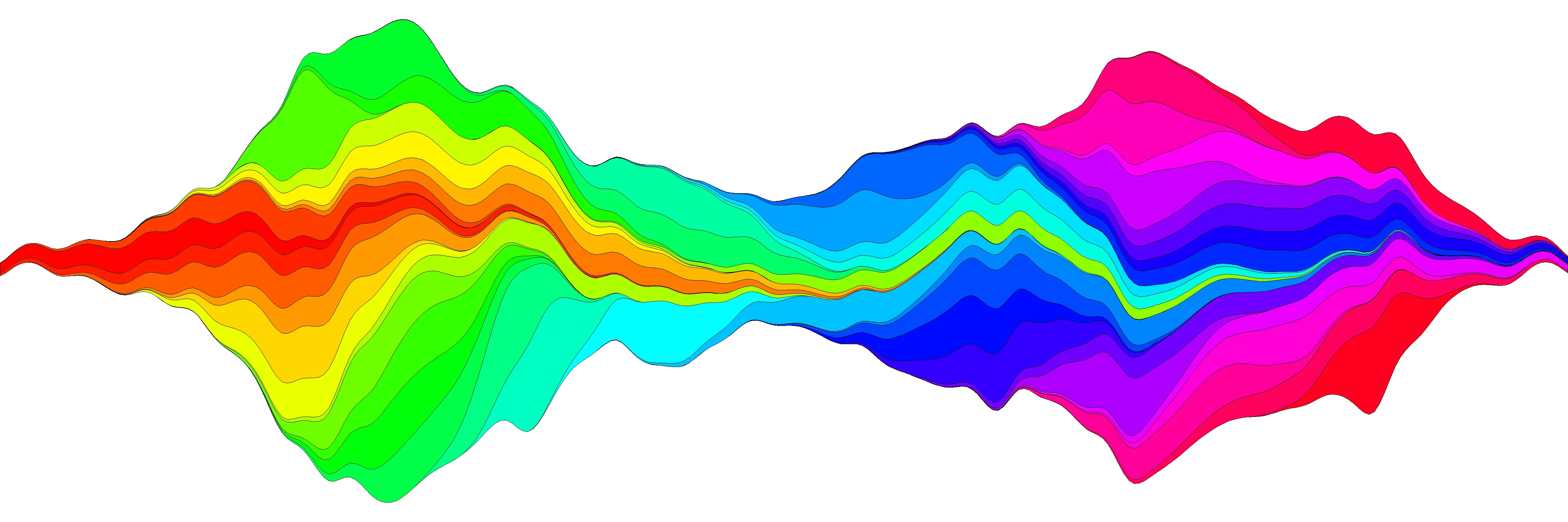
我尝试了一下生成数据流图,并相信我已经在函数plot.stream中更多或者少地复制了这个想法,该函数可在这个代码片段中找到,也可以在本帖子底部复制。在这个链接上,我展示了它的使用细节,但这里是一个基本的例子:
library(devtools)
source_url('https://gist.github.com/menugget/7864454/raw/f698da873766347d837865eecfa726cdf52a6c40/plot.stream.4.R')

set.seed(1)
m <- 500
n <- 50
x <- seq(m)
y <- matrix(0, nrow=m, ncol=n)
colnames(y) <- seq(n)
for(i in seq(ncol(y))){
    mu <- runif(1, min=0.25*m, max=0.75*m)
    SD <- runif(1, min=5, max=30)
    TMP <- rnorm(1000, mean=mu, sd=SD)
    HIST <- hist(TMP, breaks=c(0,x), plot=FALSE)
    fit <- smooth.spline(HIST$counts ~ HIST$mids)
    y[,i] <- fit$y
}
y <- replace(y, y<0.01, 0)

#order by when 1st value occurs
ord <- order(apply(y, 2, function(r) min(which(r>0))))
y2 <- y[, ord]
COLS <- rainbow(ncol(y2))

png("stream.png", res=400, units="in", width=12, height=4)
par(mar=c(0,0,0,0), bty="n")
plot.stream(x,y2, axes=FALSE, xlim=c(100, 400), xaxs="i", center=TRUE, spar=0.2, frac.rand=0.1, col=COLS, border=1, lwd=0.1)
dev.off()
#plot.stream makes a "stream plot" where each y series is plotted
#as stacked filled polygons on alternating sides of a baseline.
#
#Arguments include:
#'x' - a vector of values
#'y' - a matrix of data series (columns) corresponding to x
#'order.method' = c("as.is", "max", "first")
#  "as.is" - plot in order of y column
#  "max" - plot in order of when each y series reaches maximum value
#  "first" - plot in order of when each y series first value > 0
#'center' - if TRUE, the stacked polygons will be centered so that the middle,
#i.e. baseline ("g0"), of the stream is approximately equal to zero.
#Centering is done before the addition of random wiggle to the baseline.
#'frac.rand' - fraction of the overall data "stream" range used to define the range of
#random wiggle (uniform distrubution) to be added to the baseline 'g0'
#'spar' - setting for smooth.spline function to make a smoothed version of baseline "g0"
#'col' - fill colors for polygons corresponding to y columns (will recycle)
#'border' - border colors for polygons corresponding to y columns (will recycle) (see ?polygon for details)
#'lwd' - border line width for polygons corresponding to y columns (will recycle)
#'...' - other plot arguments
plot.stream <- function(
    x, y,
    order.method = "as.is", frac.rand=0.1, spar=0.2,
    center=TRUE,
    ylab="", xlab="",
    border = NULL, lwd=1,
    col=rainbow(length(y[1,])),
    ylim=NULL,
    ...
){

if(sum(y < 0) > 0) error("y cannot contain negative numbers")

if(is.null(border)) border <- par("fg")
border <- as.vector(matrix(border, nrow=ncol(y), ncol=1))
col <- as.vector(matrix(col, nrow=ncol(y), ncol=1))
lwd <- as.vector(matrix(lwd, nrow=ncol(y), ncol=1))

if(order.method == "max") {
    ord <- order(apply(y, 2, which.max))
    y <- y[, ord]
    col <- col[ord]
    border <- border[ord]
}

if(order.method == "first") {
    ord <- order(apply(y, 2, function(x) min(which(r>0))))
    y <- y[, ord]
    col <- col[ord]
    border <- border[ord]
}

bottom.old <- rep(0, length(x))
top.old <- rep(0, length(x))
polys <- vector(mode="list", ncol(y))
for(i in seq(polys)){
    if(i %% 2 == 1){ #if odd
        top.new <- top.old + y[,i]
        polys[[i]] <- list(x=c(x, rev(x)), y=c(top.old, rev(top.new)))
        top.old <- top.new
    }
    if(i %% 2 == 0){ #if even
        bottom.new <- bottom.old - y[,i]
        polys[[i]] <- list(x=c(x, rev(x)), y=c(bottom.old, rev(bottom.new)))
        bottom.old <- bottom.new
    }
}

ylim.tmp <- range(sapply(polys, function(x) range(x$y, na.rm=TRUE)), na.rm=TRUE)
outer.lims <- sapply(polys, function(r) rev(r$y[(length(r$y)/2+1):length(r$y)]))
mid <- apply(outer.lims, 1, function(r) mean(c(max(r, na.rm=TRUE), min(r, na.rm=TRUE)), na.rm=TRUE))

#center and wiggle
if(center) {
    g0 <- -mid + runif(length(x), min=frac.rand*ylim.tmp[1], max=frac.rand*ylim.tmp[2])
} else {
    g0 <- runif(length(x), min=frac.rand*ylim.tmp[1], max=frac.rand*ylim.tmp[2])
}

fit <- smooth.spline(g0 ~ x, spar=spar)

for(i in seq(polys)){
    polys[[i]]$y <- polys[[i]]$y + c(fitted(fit), rev(fitted(fit)))
}

if(is.null(ylim)) ylim <- range(sapply(polys, function(x) range(x$y, na.rm=TRUE)), na.rm=TRUE)
plot(x,y[,1], ylab=ylab, xlab=xlab, ylim=ylim, t="n", ...)
for(i in seq(polys)){
    polygon(polys[[i]], border=border[i], col=col[i], lwd=lwd[i])
}

}
RColorBrewer 来选择比 rainbow 更自然的颜色调色板。 - Simon O'HanlonRColorBrewer中预制颜色调色板的优点 - 即基于颜色理论。我会再次检查它。干杯 - Marc in the box现在有一个流图的HTML小部件:
https://hrbrmstr.github.io/streamgraph/
devtools::install_github("hrbrmstr/streamgraph")

library(streamgraph)

streamgraph(data, key, value, date, width = NULL, height = NULL,
  offset = "silhouette", interpolate = "cardinal", interactive = TRUE,
  scale = "date", top = 20, right = 40, bottom = 30, left = 50)
 编辑
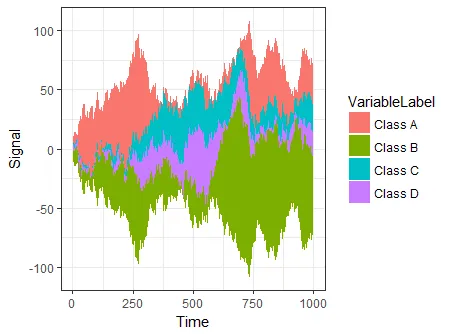
另一个选择是使用ggTimeSeries,它使用ggplot2的语法:
编辑
另一个选择是使用ggTimeSeries,它使用ggplot2的语法:# creating some data
library(ggTimeSeries)
library(ggplot2)
set.seed(10)
dfData = data.frame(
Time = 1:1000,
Signal = abs(
c(
cumsum(rnorm(1000, 0, 3)),
cumsum(rnorm(1000, 0, 4)),
cumsum(rnorm(1000, 0, 1)),
cumsum(rnorm(1000, 0, 2))
)
),
VariableLabel = c(rep('Class A', 1000),
rep('Class B', 1000),
rep('Class C', 1000),
rep('Class D', 1000))
)
# base plot
ggplot(dfData,
aes(x = Time,
y = Signal,
group = VariableLabel,
fill = VariableLabel)) +
stat_steamgraph() +
theme_bw()
## reorder the columns so each curve first appears behind previous curves
## when it first becomes the tallest curve on the landscape
y <- y[, unique(apply(y, 1, which.max))]

## Use plot.stacked() from Marc's post
plot.stacked(x,y)
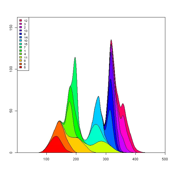
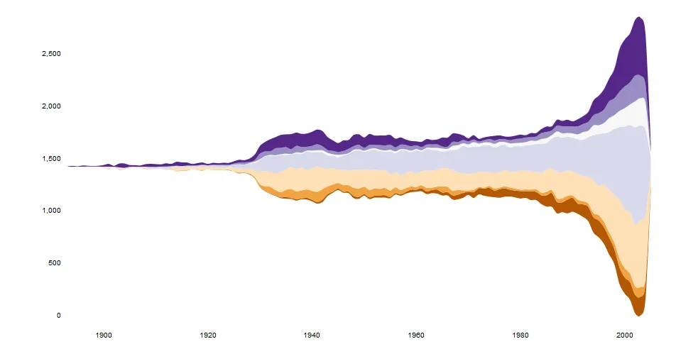
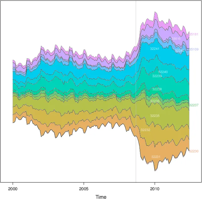
lattice::xyplot 来编写一个解决方案。代码在我的spacetimeVis存储库中。library(lattice)
library(zoo)
library(colorspace)
nCols <- ncol(unemployUSA)
pal <- rainbow_hcl(nCols, c=70, l=75, start=30, end=300)
myTheme <- custom.theme(fill=pal, lwd=0.2)
xyplot(unemployUSA, superpose=TRUE, auto.key=FALSE,
panel=panel.flow, prepanel=prepanel.flow,
origin='themeRiver', scales=list(y=list(draw=FALSE)),
par.settings=myTheme)
它产生了这张图片。
xyplot需要两个函数才能工作: panel.flow和prepanel.flow:
panel.flow <- function(x, y, groups, origin, ...){
  dat <- data.frame(x=x, y=y, groups=groups)
  nVars <- nlevels(groups)
  groupLevels <- levels(groups)

  ## From long to wide
  yWide <- unstack(dat, y~groups)
  ## Where are the maxima of each variable located? We will use
  ## them to position labels.
  idxMaxes <- apply(yWide, 2, which.max)

  ##Origin calculated following Havr.eHetzler.ea2002
  if (origin=='themeRiver') origin= -1/2*rowSums(yWide)
  else origin=0
  yWide <- cbind(origin=origin, yWide)
  ## Cumulative sums to define the polygon
  yCumSum <- t(apply(yWide, 1, cumsum))
  Y <- as.data.frame(sapply(seq_len(nVars),
                            function(iCol)c(yCumSum[,iCol+1],
                                            rev(yCumSum[,iCol]))))
  names(Y) <- levels(groups)
  ## Back to long format, since xyplot works that way
  y <- stack(Y)$values

  ## Similar but easier for x
  xWide <- unstack(dat, x~groups)
  x <- rep(c(xWide[,1], rev(xWide[,1])), nVars)
  ## Groups repeated twice (upper and lower limits of the polygon)
  groups <- rep(groups, each=2)

  ## Graphical parameters
  superpose.polygon <- trellis.par.get("superpose.polygon")
  col = superpose.polygon$col
  border = superpose.polygon$border
  lwd = superpose.polygon$lwd

  ## Draw polygons
  for (i in seq_len(nVars)){
    xi <- x[groups==groupLevels[i]]
    yi <- y[groups==groupLevels[i]]
    panel.polygon(xi, yi, border=border,
                  lwd=lwd, col=col[i])
  }

  ## Print labels
  for (i in seq_len(nVars)){
    xi <- x[groups==groupLevels[i]]
    yi <- y[groups==groupLevels[i]]
    N <- length(xi)/2
    ## Height available for the label
    h <- unit(yi[idxMaxes[i]], 'native') -
      unit(yi[idxMaxes[i] + 2*(N-idxMaxes[i]) +1], 'native')
    ##...converted to "char" units
    hChar <- convertHeight(h, 'char', TRUE)
    ## If there is enough space and we are not at the first or
    ## last variable, then the label is printed inside the polygon.
    if((hChar >= 1) && !(i %in% c(1, nVars))){
      grid.text(groupLevels[i],
                xi[idxMaxes[i]],
                (yi[idxMaxes[i]] +
                 yi[idxMaxes[i] + 2*(N-idxMaxes[i]) +1])/2,
                gp = gpar(col='white', alpha=0.7, cex=0.7),
                default.units='native')
    } else {
      ## Elsewhere, the label is printed outside

      grid.text(groupLevels[i],
                xi[N],
                (yi[N] + yi[N+1])/2,
                gp=gpar(col=col[i], cex=0.7),
                just='left', default.units='native')
    }
  }
}

prepanel.flow <- function(x, y, groups, origin,...){
  dat <- data.frame(x=x, y=y, groups=groups)
  nVars <- nlevels(groups)
  groupLevels <- levels(groups)
  yWide <- unstack(dat, y~groups)
  if (origin=='themeRiver') origin= -1/2*rowSums(yWide)
  else origin=0
  yWide <- cbind(origin=origin, yWide)
  yCumSum <- t(apply(yWide, 1, cumsum))

  list(xlim=range(x),
       ylim=c(min(yCumSum[,1]), max(yCumSum[,nVars+1])),
       dx=diff(x),
       dy=diff(c(yCumSum[,-1])))
}
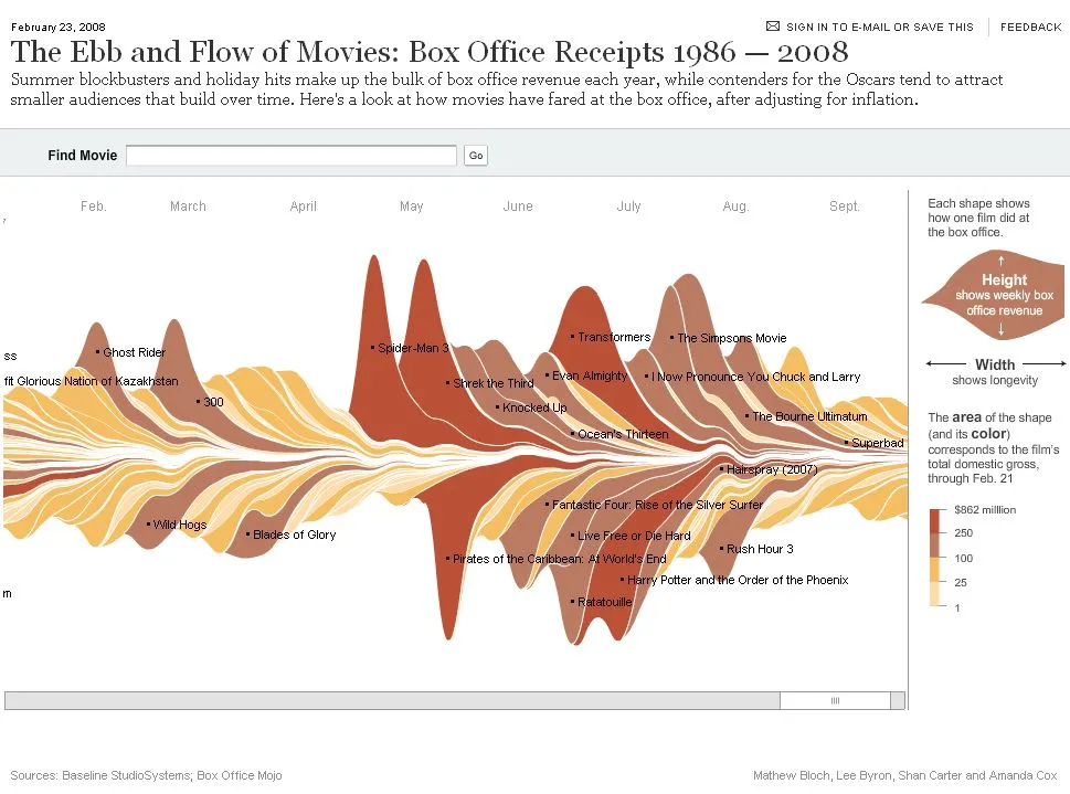
ggplot2制作类似于这样的图表。我稍后会进行编辑,也会将csv数据上传到合适的地方。googleVis。
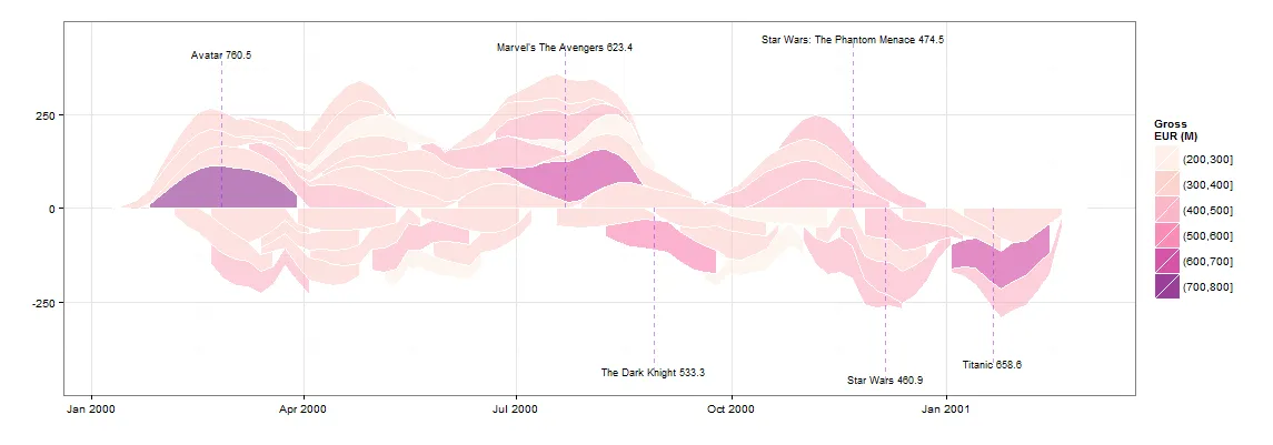
## PRE-REQS
require(plyr)
require(ggplot2)

## GET SOME BASIC DATA
films<-read.csv("box.csv")

## ALL OF THIS IS FAKING DATA
get_dist<-function(n,g){

  dist<-g-(abs(sort(g-abs(rnorm(n,g,g*runif(1))))))
  dist<-c(0,dist-min(dist),0)
  dist<-dist*g/sum(dist)
  return(dist)
}

get_dates<-function(w){
  start<-as.Date("01-01-00",format="%d-%m-%y")+ceiling(runif(1)*365)
  return(start+w)
}

films$WEEKS<-ceiling(runif(1)*10)+6
f<-ddply(films,.(RANK),function(df)expand.grid(RANK=df$RANK,WEEKGROSS=get_dist(df$WEEKS,df$GROSS)))
weekly<-merge(films,f,by=("RANK"))


## GENERATE THE PLOT DATA
plot.data<-ddply(weekly,.(RANK),summarise,NAME=NAME,WEEKDATE=get_dates(seq_along(WEEKS)*7),WEEKGROSS=ifelse(RANK %% 2 == 0,-WEEKGROSS,WEEKGROSS),GROSS=GROSS)

g<-ggplot() +

  geom_area(data=plot.data[plot.data$WEEKGROSS>=0,],
            aes(x=WEEKDATE,
                ymin=0,
                y=WEEKGROSS,
                group=NAME,
                fill=cut(GROSS,c(seq(0,1000,100),Inf)))
            ,alpha=0.5,
            stat="smooth", fullrange=T,n=1000,
            colour="white",
            size=0.25,alpha=0.5) +

  geom_area(data=plot.data[plot.data$WEEKGROSS<0,],
            aes(x=WEEKDATE,
                ymin=0,
                y=WEEKGROSS,
                group=NAME,
                fill=cut(GROSS,c(seq(0,1000,100),Inf)))
            ,alpha=0.5,
            stat="smooth", fullrange=T,n=1000,
            colour="white",
            size=0.25,alpha=0.5) +

  theme_bw() +
  scale_fill_brewer(palette="RdPu",name="Gross\nEUR (M)") +
  ylab("") + xlab("")

b<-ggplot_build(g)$data[[1]]
b.ymax<-max(b$y)


## MAKE LABELS FOR GROSS > 450M
labels<-ddply(plot.data[plot.data$GROSS>450,],.(RANK,NAME),summarise,x=median(WEEKDATE),y=ifelse(sum(WEEKGROSS)>0,b.ymax,-b.ymax),GROSS=max(GROSS))
labels<-ddply(labels,.(y>0),transform,NAME=paste(NAME,GROSS),y=(y*1.1)+((seq_along(y)*20*(y/abs(y)))))

## PLOT
g +
  geom_segment(data=labels,aes(x=x,xend=x,y=0,yend=y,label=NAME),size=0.5,linetype=2,color="purple",alpha=0.5) +
  geom_text(data=labels,aes(x,y,label=NAME),size=3)
如果有人想要尝试,这里是电影数据框的 dput():
structure(list(RANK = 1:50, NAME = structure(c(2L, 45L, 18L,
                                               33L, 32L, 29L, 34L, 23L, 4L, 21L, 38L, 46L, 15L, 36L, 26L, 49L,
                                               16L, 8L, 5L, 31L, 17L, 27L, 41L, 3L, 48L, 40L, 28L, 1L, 6L, 24L,
                                               47L, 13L, 10L, 12L, 39L, 14L, 30L, 20L, 22L, 11L, 19L, 25L, 35L,
                                               9L, 43L, 44L, 37L, 7L, 42L, 50L), .Label = c("Alice in Wonderland",
                                                                                            "Avatar", "Despicable Me 2", "E.T.", "Finding Nemo", "Forrest Gump",
                                                                                            "Harry Potter and the Deathly Hallows Part 1", "Harry Potter and the Deathly Hallows Part 2",
                                                                                            "Harry Potter and the Half-Blood Prince", "Harry Potter and the Sorcerer's Stone",
                                                                                            "Independence Day", "Indiana Jones and the Kingdom of the Crystal Skull",
                                                                                            "Iron Man", "Iron Man 2", "Iron Man 3", "Jurassic Park", "LOTR: The Return of the King",
                                                                                            "Marvel's The Avengers", "Pirates of the Caribbean", "Pirates of the Caribbean: At World's End",
                                                                                            "Pirates of the Caribbean: Dead Man's Chest", "Return of the Jedi",
                                                                                            "Shrek 2", "Shrek the Third", "Skyfall", "Spider-Man", "Spider-Man 2",
                                                                                            "Spider-Man 3", "Star Wars", "Star Wars: Episode II -- Attack of the Clones",
                                                                                            "Star Wars: Episode III", "Star Wars: The Phantom Menace", "The Dark Knight",
                                                                                            "The Dark Knight Rises", "The Hobbit: An Unexpected Journey",
                                                                                            "The Hunger Games", "The Hunger Games: Catching Fire", "The Lion King",
                                                                                            "The Lord of the Rings: The Fellowship of the Ring", "The Lord of the Rings: The Two Towers",
                                                                                            "The Passion of the Christ", "The Sixth Sense", "The Twilight Saga: Eclipse",
                                                                                            "The Twilight Saga: New Moon", "Titanic", "Toy Story 3", "Transformers",
                                                                                            "Transformers: Dark of the Moon", "Transformers: Revenge of the Fallen",
                                                                                            "Up"), class = "factor"), YEAR = c(2009L, 1997L, 2012L, 2008L,
                                                                                                                               1999L, 1977L, 2012L, 2004L, 1982L, 2006L, 1994L, 2010L, 2013L,
                                                                                                                               2012L, 2002L, 2009L, 1993L, 2011L, 2003L, 2005L, 2003L, 2004L,
                                                                                                                               2004L, 2013L, 2011L, 2002L, 2007L, 2010L, 1994L, 2007L, 2007L,
                                                                                                                               2008L, 2001L, 2008L, 2001L, 2010L, 2002L, 2007L, 1983L, 1996L,
                                                                                                                               2003L, 2012L, 2012L, 2009L, 2010L, 2009L, 2013L, 2010L, 1999L,
                                                                                                                               2009L), GROSS = c(760.5, 658.6, 623.4, 533.3, 474.5, 460.9, 448.1,
                                                                                                                                                 436.5, 434.9, 423.3, 422.7, 415, 409, 408, 403.7, 402.1, 395.8,
                                                                                                                                                 381, 380.8, 380.2, 377, 373.4, 370.3, 366.9, 352.4, 340.5, 336.5,
                                                                                                                                                 334.2, 329.7, 321, 319.1, 318.3, 317.6, 317, 313.8, 312.1, 310.7,
                                                                                                                                                 309.4, 309.1, 306.1, 305.4, 304.4, 303, 301.9, 300.5, 296.6,
                                                                                                                                                 296.3, 295, 293.5, 293), WEEKS = c(9, 9, 9, 9, 9, 9, 9, 9, 9,
                                                                                                                                                                                    9, 9, 9, 9, 9, 9, 9, 9, 9, 9, 9, 9, 9, 9, 9, 9, 9, 9, 9, 9, 9,
                                                                                                                                                                                    9, 9, 9, 9, 9, 9, 9, 9, 9, 9, 9, 9, 9, 9, 9, 9, 9, 9, 9, 9)), .Names = c("RANK",
                                                                                                                                                                                                                                                             "NAME", "YEAR", "GROSS", "WEEKS"), row.names = c(NA, -50L), class = "data.frame")