R中的现金流图?

4
现金流图常用于金融工程中解释衍生品。它显示了不同时间的支付。我在网上找不到一个很好的例子,但它看起来像这样:
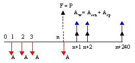
alt text 
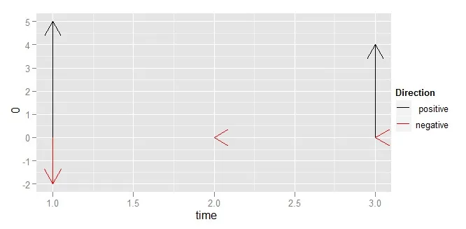
我想使用ggplot2制作类似的东西。我的想法是使用堆积条形图,其中零轴位于中间某处。有人知道如何做吗?
以下是一些示例数据:
data.frame(time=c(1, 2, 3), positive=c(5, 0, 4), negative=c(-2, 0, 0))

编辑:

感谢 Hadley 的回答;生成的图片如下:

alt text

加上方框之后,图片如下:

alt text

2个回答

2

这里有一个尝试。

ggplot(df, aes(time, xend = time)) + 
  geom_segment(aes(y = 0, yend = positive, colour = "positive"),
    position = "stack", arrow = arrow()) + 
  geom_segment(aes(y = 0, yend = negative, colour = "negative"), 
    position = "stack", arrow = arrow()) + 
  scale_colour_manual("Direction", 
    values = c("negative" = "red", "positive" = "black"))

但我认为你需要自己堆叠数值,因为使用ggplot2无法获得足够的控制力。


太好了!谢谢Hadley。其实我想要“条形图”,尽管我没有表达清楚,但我刚刚改变了你的解决方案,使用
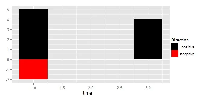
geom_rect,它很有效!ggplot(df, aes(time, xend = time)) + geom_rect(aes(xmin=time, xmax=time+1, ymin = 0, ymax = positive, fill = "positive")) + geom_rect(aes(xmin=time, xmax=time+1, ymin = 0, ymax = negative, fill = "negative")) + scale_fill_manual("Direction", values = c("negative" = "red", "positive" = "black")) - Shane

1

我曾向 Khanh 建议过 RQuantLib。这现在可能是你的第一个补丁:)

我认为有一个问题,就是您可能不希望两边都有完整的轴 - 长期零息会在x轴上有太少的东西,而对于标准债券,票息和票面金额之间的差异可能看起来很奇怪。

但另一方面,这是 R ,fortune("yoda")仍然适用。


好主意。让我们看看我们能想出什么,然后再考虑补丁。 - Shane

网页内容由stack overflow 提供, 点击上面的
可以查看英文原文,
原文链接