考虑以下例子:
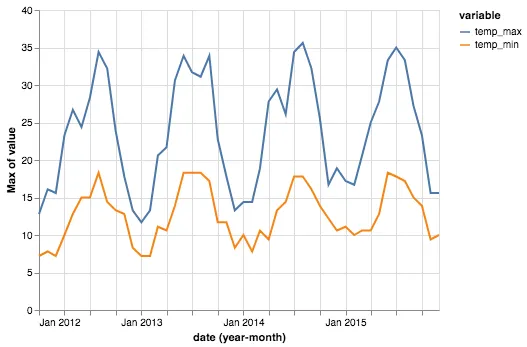
在生成的图表中,我想添加一个图例,显示蓝线表示最高温度,红线表示最低温度。最简单的方法是什么?
我看到(例如在这个问题的解决方案中:Labelling Layered Charts in Altair (Python)),altair只有在编码中设置了颜色或大小等属性时才会添加图例,通常使用分类列,但在这里不可能,因为我正在绘制整个列,标签应该是列名(现在显示在y轴标签中)。
    import altair as alt
    from vega_datasets import data

    df = data.seattle_weather()

    temp_max = alt.Chart(df).mark_line(color='blue').encode(
        x='yearmonth(date):T',
        y='max(temp_max)',
    )

    temp_min = alt.Chart(df).mark_line(color='red').encode(
        x='yearmonth(date):T',
        y='max(temp_min)',
    )

    temp_max + temp_min
在生成的图表中,我想添加一个图例,显示蓝线表示最高温度,红线表示最低温度。最简单的方法是什么?
我看到(例如在这个问题的解决方案中:Labelling Layered Charts in Altair (Python)),altair只有在编码中设置了颜色或大小等属性时才会添加图例,通常使用分类列,但在这里不可能,因为我正在绘制整个列,标签应该是列名(现在显示在y轴标签中)。