为嵌套饼图添加图例

4

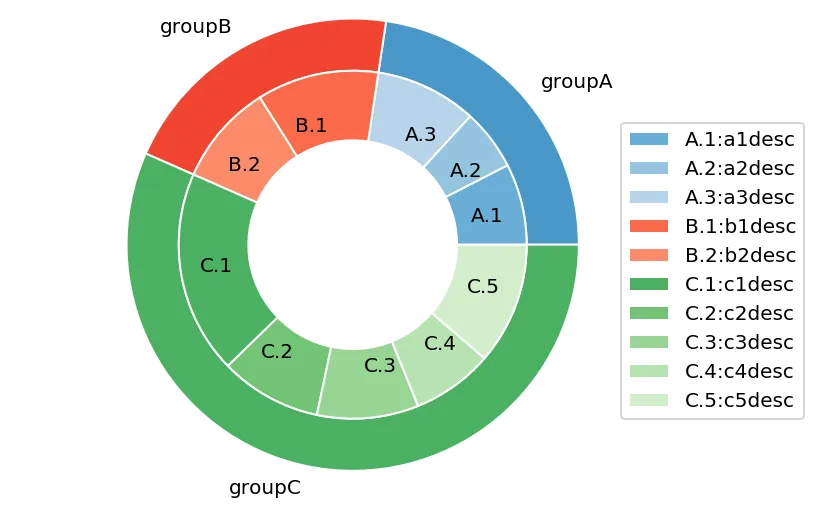
我想在嵌套饼图绘制的内部饼图中添加一个图例:

import matplotlib.pyplot as plt

# Make data: I have 3 groups and 7 subgroups
group_names=['groupA', 'groupB', 'groupC']
group_size=[12,11,30]
subgroup_names=['A.1', 'A.2', 'A.3', 'B.1', 'B.2', 'C.1', 'C.2', 'C.3', 
'C.4', 'C.5']
subgroup_size=[4,3,5,6,5,10,5,5,4,6]

# Create colors
a, b, c=[plt.cm.Blues, plt.cm.Reds, plt.cm.Greens]

# First Ring (outside)
fig, ax = plt.subplots()
ax.axis('equal')
mypie, _ = ax.pie(group_size, radius=1.3, labels=group_names, colors= 
[a(0.6), b(0.6), c(0.6)] )
plt.setp( mypie, width=0.3, edgecolor='white')

# Second Ring (Inside)
mypie2, _ = ax.pie(subgroup_size, radius=1.3-0.3, 
labels=subgroup_names, labeldistance=0.7, colors=[a(0.5), a(0.4), 
a(0.3), b(0.5), b(0.4), c(0.6), c(0.5), c(0.4), c(0.3), c(0.2)])
plt.setp( mypie2, width=0.4, edgecolor='white')
plt.margins(0,0)

subgroup_names_legs=['A.1:a1desc', 'A.2:a2desc', 'A.3:a3desc', 
'B.1:b1desc', 'B.2:b2desc', 'C.1:c1desc', 'C.2:c2desc', 'C.3:c3desc', 
'C.4:c4desc', 'C.5:c5desc']
plt.legend(subgroup_names_legs,loc='best')

# show it
plt.show()

所以我得到了这个结果:

enter image description here

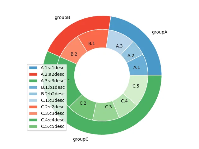
我想在图例中正确引用颜色(例如,A1、A2和A3是不同种类的蓝色等)

另外,如何以不重叠图表的方式显示图例?


关于图例放置的问题,请参阅图例与饼图重叠 - ImportanceOfBeingErnest
1个回答

5
问题在于你首先使用labels=subgroup_names给传说分配了值,然后又使用plt.legend(subgroup_names_legs,loc='best')重新分配值。这样就会覆盖现有的值,从而破坏顺序。这就是为什么你看到不匹配的颜色。
要避免图例框与图形重叠,可以将其位置指定为loc=(0.9, 0.1) 如果您想从外部饼图中去除图例,请抓取图例处理程序和标签,然后排除前三个条目,以便仅获得内部饼图的图例。
# First Ring (outside)
fig, ax = plt.subplots()
ax.axis('equal')
mypie, _ = ax.pie(group_size, radius=1.3, labels=group_names, colors= 
[a(0.6), b(0.6), c(0.6)] )
plt.setp( mypie, width=0.3, edgecolor='white')

# Second Ring (Inside)
mypie2, _ = ax.pie(subgroup_size, radius=1.3-0.3, 
labels=subgroup_names, labeldistance=0.7, colors=[a(0.5), a(0.4), 
a(0.3), b(0.5), b(0.4), c(0.6), c(0.5), c(0.4), c(0.3), c(0.2)])
plt.setp( mypie2, width=0.4, edgecolor='white')
plt.margins(0,0)

plt.legend(loc=(0.9, 0.1))
handles, labels = ax.get_legend_handles_labels()

ax.legend(handles[3:], subgroup_names_legs, loc=(0.9, 0.1))
plt.show()

enter image description here


我看,问题在于子组中写入的空间非常小,因此我想使用图例来描述每个A1、A2、A3等。另一方面,我不想在图例中使用Group A、B、C之类的文字,因为这会在圆圈附近占据很大的空间。 - Laura
感谢@Bazingaa!我不需要在图例中重复与内部饼图相同的内容。我需要为每个子组添加更多的文本到图例中。这就是我创建subgroup_names_legs的原因。例如,在内圆中,我有“A.1”,但图例应该说“ A.1:A.1的描述”。我决定这样做是因为在绘图中写下每个子组的描述的空间非常小。 - Laura
1
还有一个问题@Bazingaa:您知道如何在外圆中放置百分比吗? - Laura
@Laura:那需要一些工作。我可以请求您发布一个新问题,因为这可能会引起许多人的兴趣。 - Sheldore
好的,我会做到。我以为只需添加参数“autopct”就可以完成,但是当我这样做时,内部圆圈消失了。 - Laura
显示剩余3条评论

网页内容由stack overflow 提供, 点击上面的
可以查看英文原文,
原文链接