这是对一个交叉验证问题的延续,我询问了可能的方法来解决这个问题。这个问题更加偏向于编程方面,所以我在Stack Overflow上发布了它。
背景
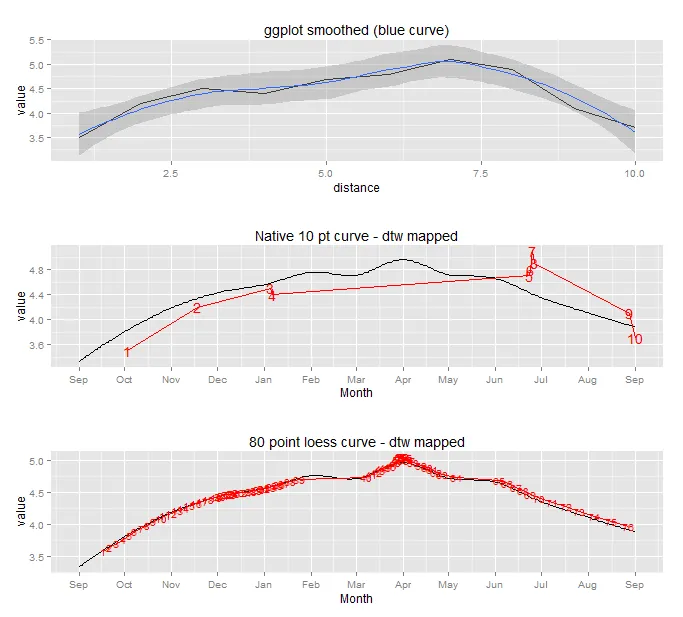
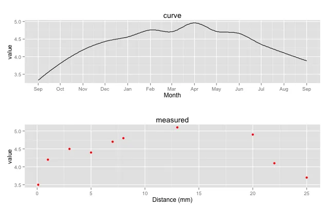
我有一条曲线,其日期已知,跨越了一年。这条曲线的y值是从每日温度和盐度记录计算出来的d18O值的预测。我还有从碳酸钙组成的贝壳中测量得到的d18O值。这些值沿着距离轴进行测量,其中第一个和最后一个测量大约(但不完全)在曲线的开头和结尾时进行。
It is known that d18O values match with the predicted values in the curve within some unknown random error. I want to get the best fit for the measured values to the curve by changing the x-axis for the measured values (or at least by matching the index with the index in the curve). In this way I can get estimates for the dates of the measured values and can further estimate the growth rate for the shell over the year. The growth rate is expected to be variable and there might be a growth hiatus (i.e. the growth stops). However, the growth between the measured values has to be > 0 (a constraint).Example data
Here are the example datasets (curve and measured):
meas <- structure(list(index = 1:10, distance = c(0.1, 1, 3, 5, 7, 8,
13, 20, 22, 25), value = c(3.5, 4.2, 4.5, 4.4, 4.7, 4.8, 5.1,
4.9, 4.1, 3.7)), .Names = c("index", "distance", "value"), class = "data.frame",
row.names = c(NA, -10L))

curve <- structure(list(date = structure(c(15218, 15219, 15220, 15221,
15222, 15223, 15224, 15225, 15226, 15227, 15228, 15229, 15230,
15231, 15232, 15233, 15234, 15235, 15236, 15237, 15238, 15239,
15240, 15241, 15242, 15243, 15244, 15245, 15246, 15247, 15248,
15249, 15250, 15251, 15252, 15253, 15254, 15255, 15256, 15257,
15258, 15259, 15260, 15261, 15262, 15263, 15264, 15265, 15266,
15267, 15268, 15269, 15270, 15271, 15272, 15273, 15274, 15275,
15276, 15277, 15278, 15279, 15280, 15281, 15282, 15283, 15284,
15285, 15286, 15287, 15288, 15289, 15290, 15291, 15292, 15293,
15294, 15295, 15296, 15297, 15298, 15299, 15300, 15301, 15302,
15303, 15304, 15305, 15306, 15307, 15308, 15309, 15310, 15311,
15312, 15313, 15314, 15315, 15316, 15317, 15318, 15319, 15320,
15321, 15322, 15323, 15324, 15325, 15326, 15327, 15328, 15329,
15330, 15331, 15332, 15333, 15334, 15335, 15336, 15337, 15338,
15339, 15340, 15341, 15342, 15343, 15344, 15345, 15346, 15347,
15348, 15349, 15350, 15351, 15352, 15353, 15354, 15355, 15356,
15357, 15358, 15359, 15360, 15361, 15362, 15363, 15364, 15365,
15366, 15367, 15368, 15369, 15370, 15371, 15372, 15373, 15374,
15375, 15376, 15377, 15378, 15379, 15380, 15381, 15382, 15383,
15384, 15385, 15386, 15387, 15388, 15389, 15390, 15391, 15392,
15393, 15394, 15395, 15396, 15397, 15398, 15399, 15400, 15401,
15402, 15403, 15404, 15405, 15406, 15407, 15408, 15409, 15410,
15411, 15412, 15413, 15414, 15415, 15416, 15417, 15418, 15419,
15420, 15421, 15422, 15423, 15424, 15425, 15426, 15427, 15428,
15429, 15430, 15431, 15432, 15433, 15434, 15435, 15436, 15437,
15438, 15439, 15440, 15441, 15442, 15443, 15444, 15445, 15446,
15447, 15448, 15449, 15450, 15451, 15452, 15453, 15454, 15455,
15456, 15457, 15458, 15459, 15460, 15461, 15462, 15463, 15464,
15465, 15466, 15467, 15468, 15469, 15470, 15471, 15472, 15473,
15474, 15475, 15476, 15477, 15478, 15479, 15480, 15481, 15482,
15483, 15484, 15485, 15486, 15487, 15488, 15489, 15490, 15491,
15492, 15493, 15494, 15495, 15496, 15497, 15498, 15499, 15500,
15501, 15502, 15503, 15504, 15505, 15506, 15507, 15508, 15509,
15510, 15511, 15512, 15513, 15514, 15515, 15516, 15517, 15518,
15519, 15520, 15521, 15522, 15523, 15524, 15525, 15526, 15527,
15528, 15529, 15530, 15531, 15532, 15533, 15534, 15535, 15536,
15537, 15538, 15539, 15540, 15541, 15542, 15543, 15544, 15545,
15546, 15547, 15548, 15549, 15550, 15551, 15552, 15553, 15554,
15555, 15556, 15557, 15558, 15559, 15560, 15561, 15562, 15563,
15564, 15565, 15566, 15567, 15568, 15569, 15570, 15571, 15572,
15573, 15574, 15575, 15576, 15577, 15578, 15579, 15580, 15581,
15582, 15583, 15584), class = "Date"), index = 1:367, value = c(3.33,
3.35, 3.36, 3.38, 3.4, 3.42, 3.43, 3.45, 3.47, 3.48, 3.5, 3.52,
3.53, 3.55, 3.56, 3.58, 3.6, 3.61, 3.63, 3.64, 3.66, 3.67, 3.69,
3.7, 3.72, 3.73, 3.75, 3.76, 3.78, 3.79, 3.81, 3.82, 3.83, 3.85,
3.86, 3.88, 3.89, 3.9, 3.92, 3.93, 3.94, 3.96, 3.97, 3.98, 3.99,
4.01, 4.02, 4.03, 4.04, 4.06, 4.07, 4.08, 4.09, 4.1, 4.11, 4.13,
4.14, 4.15, 4.16, 4.17, 4.18, 4.19, 4.2, 4.21, 4.22, 4.23, 4.24,
4.25, 4.26, 4.27, 4.28, 4.28, 4.29, 4.3, 4.31, 4.32, 4.33, 4.33,
4.34, 4.35, 4.36, 4.36, 4.37, 4.38, 4.38, 4.39, 4.4, 4.41, 4.41,
4.42, 4.42, 4.43, 4.44, 4.44, 4.45, 4.45, 4.46, 4.46, 4.47, 4.47,
4.47, 4.48, 4.48, 4.49, 4.49, 4.49, 4.5, 4.5, 4.5, 4.51, 4.51,
4.51, 4.52, 4.52, 4.53, 4.53, 4.53, 4.54, 4.54, 4.54, 4.55, 4.55,
4.56, 4.57, 4.57, 4.58, 4.58, 4.59, 4.6, 4.61, 4.61, 4.62, 4.63,
4.64, 4.64, 4.65, 4.66, 4.67, 4.67, 4.68, 4.69, 4.7, 4.7, 4.71,
4.72, 4.72, 4.73, 4.74, 4.74, 4.75, 4.75, 4.75, 4.76, 4.76, 4.76,
4.76, 4.76, 4.76, 4.76, 4.76, 4.76, 4.75, 4.75, 4.75, 4.75, 4.74,
4.74, 4.73, 4.73, 4.73, 4.72, 4.72, 4.72, 4.71, 4.71, 4.71, 4.71,
4.7, 4.7, 4.7, 4.71, 4.71, 4.71, 4.71, 4.72, 4.72, 4.73, 4.74,
4.75, 4.75, 4.76, 4.78, 4.79, 4.8, 4.81, 4.82, 4.83, 4.84, 4.85,
4.86, 4.88, 4.89, 4.9, 4.91, 4.92, 4.92, 4.93, 4.94, 4.95, 4.95,
4.95, 4.96, 4.96, 4.96, 4.96, 4.96, 4.95, 4.95, 4.95, 4.94, 4.93,
4.92, 4.92, 4.91, 4.9, 4.89, 4.88, 4.87, 4.86, 4.85, 4.84, 4.83,
4.82, 4.8, 4.79, 4.78, 4.77, 4.76, 4.75, 4.75, 4.74, 4.73, 4.72,
4.72, 4.71, 4.71, 4.71, 4.7, 4.7, 4.7, 4.7, 4.7, 4.7, 4.7, 4.7,
4.7, 4.7, 4.7, 4.7, 4.7, 4.69, 4.69, 4.69, 4.69, 4.69, 4.69,
4.69, 4.69, 4.68, 4.68, 4.68, 4.67, 4.67, 4.67, 4.66, 4.65, 4.65,
4.64, 4.63, 4.62, 4.61, 4.6, 4.59, 4.58, 4.57, 4.56, 4.55, 4.54,
4.53, 4.51, 4.5, 4.49, 4.48, 4.47, 4.46, 4.45, 4.43, 4.42, 4.41,
4.4, 4.39, 4.38, 4.37, 4.36, 4.35, 4.34, 4.33, 4.32, 4.32, 4.31,
4.3, 4.29, 4.28, 4.28, 4.27, 4.26, 4.25, 4.24, 4.24, 4.23, 4.22,
4.21, 4.21, 4.2, 4.19, 4.18, 4.17, 4.17, 4.16, 4.15, 4.14, 4.14,
4.13, 4.12, 4.12, 4.11, 4.1, 4.09, 4.08, 4.08, 4.07, 4.06, 4.05,
4.05, 4.04, 4.03, 4.02, 4.02, 4.01, 4, 4, 3.99, 3.98, 3.97, 3.97,
3.96, 3.95, 3.94, 3.94, 3.93, 3.92, 3.92, 3.91, 3.9, 3.9, 3.89,
3.88)), .Names = c("date", "index", "value"), row.names = c(NA,
-367L), class = "data.frame")
...这是它的外观:
library(ggplot2)
library(scales)
library(gridExtra)

p.curve <- ggplot() + geom_line(data = curve, aes(x = date, y = value)) + scale_x_date(name = "Month", breaks = date_breaks("months"), labels = date_format("%b")) + labs(title = "curve")
p.meas <- ggplot(meas, aes(x = distance, y = value)) + geom_point(color = "red") + labs(title = "measured", x = "Distance (mm)")

grid.arrange(p.curve, p.meas, ncol = 1)
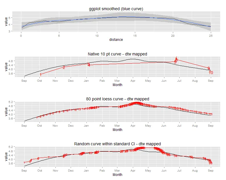
实践中的问题
我希望找到一种数学/统计方法,使用R语言将meas拟合到curve上,通过改变meas的x轴。此外,我想获得某种拟合优度统计量,以比较不同约束条件下拟合的“x轴”(如果我运行具有不同约束条件的多个模型)。我把“x轴模型”称为增长模型,因为本质上就是这样。我想通过指定meas值之间的距离必须大于0来限制拟合。即index == 2的Meas值必须在index == 1的值之后出现。我还希望能够限制增长率(即相邻两个索引点之间的最大距离)。为了演示这一点,我将手动完成它:
ggplot() + geom_line(data = curve, aes(x = index, y = value)) + geom_line(data = meas, aes(x = index, y = value), color = "red", linetype = 2) + scale_x_continuous(breaks = seq(0,370,10)) + scale_y_continuous(breaks = seq(3,5,0.1))
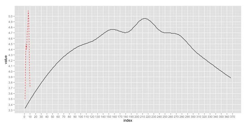
首先,meas(红色虚线)中的一些指数必须锚定到curve(黑线)的指数上。我选择将第一个和最后一个点以及最高值的点作为锚点。
anchor <- data.frame(meas.index = c(1,7,10), curve.index = c(11,215,367))

example.fit <- merge(meas, anchor, by.x = "index", by.y = "meas.index", all = T, sort = F)
example.fit <- example.fit[with(example.fit, order(distance)),]
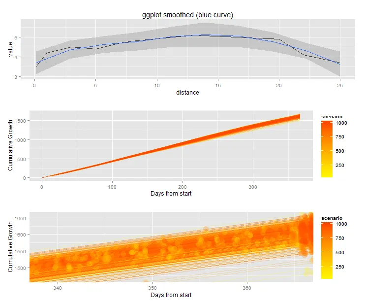
然后,我假设在这些锚定点之间有线性增长。增长将沿着曲线索引进行。每天曲线只有一个值。因此,增长将在日度尺度上进行。
library(zoo)
example.fit$curve.index <- round(na.approx(example.fit$curve.index),0)
在此之后,我将指数替换为日期,并绘制结果。
library(plyr)

example.fit$date <- as.Date(mapvalues(example.fit$curve.index, from = curve$index, to = as.character(curve$date)))

a <- ggplot() + geom_line(data = curve, aes(x = date, y = value)) + geom_point(data = example.fit, aes(x = date, y = value), color = "red") + scale_x_date(limits = range(curve$date), name = "Month", breaks = date_breaks("months"), labels = date_format("%b"))

b <- ggplot(example.fit, aes(x = date, y = distance)) + geom_line() + scale_x_date(limits = range(curve$date), name = "Month", breaks = date_breaks("months"), labels = date_format("%b"))

grid.arrange(a,b)
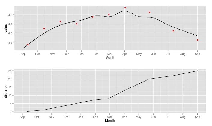
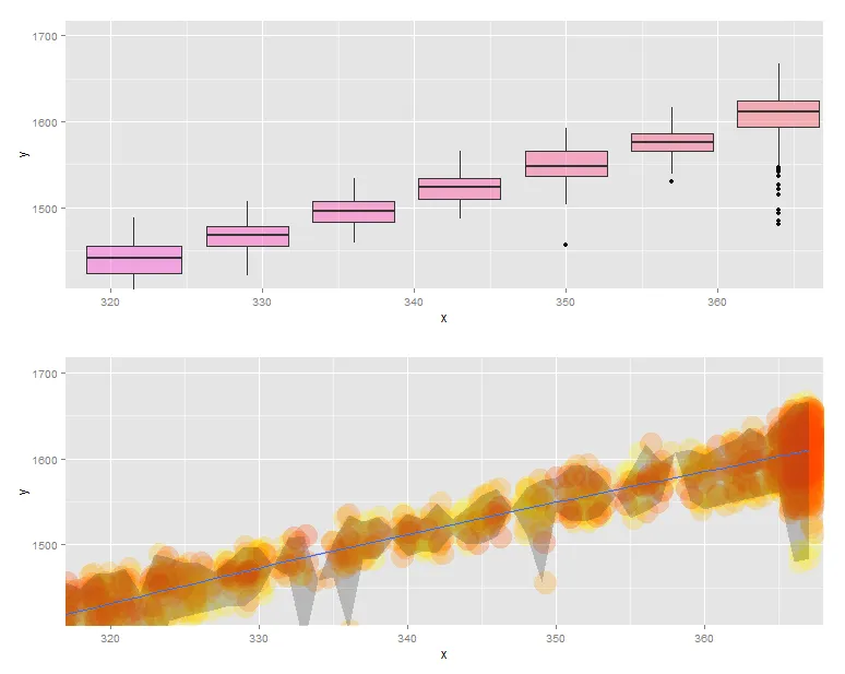
上面的图显示了基于三个锚点的拟合结果。下面的图显示了每天的时间间隔内建模的增长情况。在三月初的增长曲线中的弯曲是由于zoo包中的na.approx函数引起的某些有趣的数学现象,我不理解。
我尝试过什么
从我的上一个问题中,我了解到动态时间规整可能是一种解决方案。我还发现了一个包含dtw函数的R软件包。很好。实际上,动态时间规整已经在我的那个问题的示例数据集中起作用了(除了设置约束条件),但我无法将其应用于这个数据集,因为curve比meas(在先前的问题中称为points)具有更多的数据点。我会尝试节省一些空间,不会在此处复制代码/图像。您可以在我对该问题的回答中看到我尝试过的内容。问题似乎是除了最简单的步骤模式之外,没有任何步骤模式可以处理这些类型的数据。最简单的步骤模式多次匹配测量值和曲线,这是我想避免的,因为我需要每个测量点的定义日期。此外,设置生长率必须在测量点之间>0的约束条件似乎很困难。
问题
我的问题有两个方面:首先,是否有比动态时间规整更好的方法来解决这个问题?其次,在R中如何实践?编辑 2013年12月9日 我试图让问题更清晰。