Pandas绘图不叠加。

4
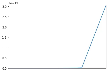
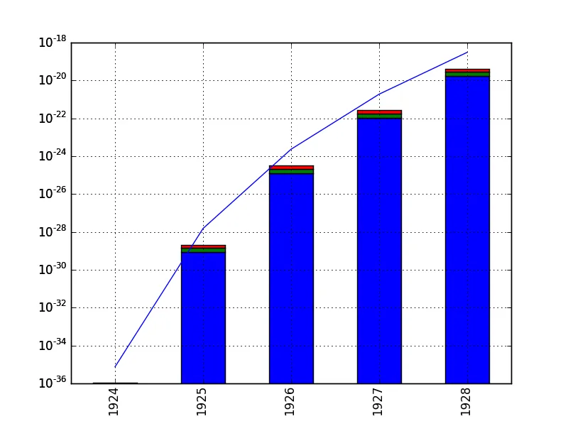
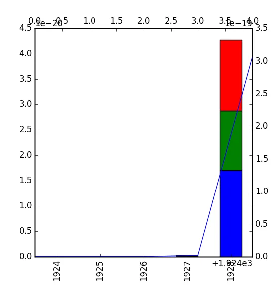
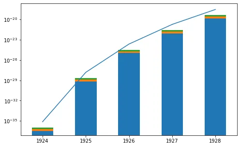
我正在尝试将堆叠条形图与线性图叠加,就像下面的示例一样,但只显示第二个图,不明白为什么。
import pandas as pd
from matplotlib import pyplot as plt
df=pd.DataFrame({'yarding, mobile cable yarder on trailer': {1928: 1.4027824821879459e-20, 1924: 3.4365045943961052e-37, 1925: 6.9939032596152882e-30, 1926: 1.0712940173393567e-25, 1927: 8.6539917152671678e-23},
                 'yarding and processing, mobile cable yarder on truck': {1928: 1.1679873528237404e-20, 1924: 2.8613089094435456e-37, 1925: 5.8232768671842113e-30, 1926: 8.9198283644271726e-26, 1927: 7.2055027953028907e-23},
                 'delimbing, with excavator-based processor': {1928: 1.6998969986716558e-20, 1924: 4.1643685881703105e-37, 1925: 8.4752370448040848e-30, 1926: 1.2981979323251926e-25, 1927: 1.0486938381883222e-22}})
df2=pd.Series({1928: 3.0638184091973243e-19, 1924: 7.5056562764093482e-36, 1925: 1.5275356821475311e-28, 1926: 2.3398091372066067e-24, 1927: 1.8901157781841223e-21})

ax=df.plot(kind='bar',stacked=True,legend=False)
df2.plot(kind='line',ax=ax)
plt.show()

enter image description here


你看不到条形图,是因为它的最大值为4.5 x 10^-20。 - Serenity
我尝试过将df=df1e+26和df2=df21e+26作为测试,但问题仍然存在。无论如何,如果我分别绘制这两个数据框,是可以的,问题在于它们不重叠。 - Giuseppe Cardellini
3个回答

7
线形图将数值数据相互绘制。
条形图将数值数据与分类数据绘制在一起。因此,即使条形图中的x值是数字,它们所绘制的刻度并不对应这些数字,而是对应某个索引。

这意味着条形图的x轴刻度总是从0到N,其中N是条形的数量(粗略地说,实际上是-0.5到N-0.5)。

如果您现在在该范围内添加一些超过1000的值,则条形将缩小直至完全看不见(因此您可能认为它们根本不存在)。

为了避免这个问题,您可以使用两个不同的轴。一个用于线形图,一个用于条形图,并共享相同的y轴。

以下是可能的解决方案(非常类似于Martin添加的解决方案,他是在我打字时添加的):

import pandas as pd
from matplotlib import pyplot as plt
df=pd.DataFrame({'yarding, mobile cable yarder on trailer': {1928: 1.4027824821879459e-20, 1924: 3.4365045943961052e-37, 1925: 6.9939032596152882e-30, 1926: 1.0712940173393567e-25, 1927: 8.6539917152671678e-23},
                 'yarding and processing, mobile cable yarder on truck': {1928: 1.1679873528237404e-20, 1924: 2.8613089094435456e-37, 1925: 5.8232768671842113e-30, 1926: 8.9198283644271726e-26, 1927: 7.2055027953028907e-23},
                 'delimbing, with excavator-based processor': {1928: 1.6998969986716558e-20, 1924: 4.1643685881703105e-37, 1925: 8.4752370448040848e-30, 1926: 1.2981979323251926e-25, 1927: 1.0486938381883222e-22}})
df2=pd.Series({1928: 3.0638184091973243e-19, 1924: 7.5056562764093482e-36, 1925: 1.5275356821475311e-28, 1926: 2.3398091372066067e-24, 1927: 1.8901157781841223e-21})

fig, ax = plt.subplots()
# optionally make log scale
ax.set_yscale("log", nonposy='clip')
# create shared y axes
ax2 = ax.twiny()
df.plot(kind='bar',stacked=True,legend=False, ax=ax)
df2.plot(kind='line',ax=ax2)
ax2.xaxis.get_major_formatter().set_useOffset(False)
# remove upper axis ticklabels
ax2.set_xticklabels([])
# set the limits of the upper axis to match the lower axis ones
ax2.set_xlim(1923.5,1928.5)
plt.show()

enter image description here


4
你可以按照以下方式使用 ax.twiny()secondary_y=True:
import pandas as pd
from matplotlib import pyplot as plt

df = pd.DataFrame({'yarding, mobile cable yarder on trailer': {1928: 1.4027824821879459e-20, 1924: 3.4365045943961052e-37, 1925: 6.9939032596152882e-30, 1926: 1.0712940173393567e-25, 1927: 8.6539917152671678e-23},
                 'yarding and processing, mobile cable yarder on truck': {1928: 1.1679873528237404e-20, 1924: 2.8613089094435456e-37, 1925: 5.8232768671842113e-30, 1926: 8.9198283644271726e-26, 1927: 7.2055027953028907e-23},
                 'delimbing, with excavator-based processor': {1928: 1.6998969986716558e-20, 1924: 4.1643685881703105e-37, 1925: 8.4752370448040848e-30, 1926: 1.2981979323251926e-25, 1927: 1.0486938381883222e-22}})
df2 = pd.Series({1928: 3.0638184091973243e-19, 1924: 7.5056562764093482e-36, 1925: 1.5275356821475311e-28, 1926: 2.3398091372066067e-24, 1927: 1.8901157781841223e-21})

fig, ax = plt.subplots()
ax2 = ax.twiny()
df.plot(kind='bar', stacked=True, legend=False, ax=ax)
df2.plot(kind='line', secondary_y=True)
plt.show()    

这将给你:

two shared pandas plots

您可能需要调整标签以满足您的需求,例如:

ax2.get_xaxis().set_visible(False)

2

在ImportanceOfBeingErnest的回答中已经解释了根本问题。您可以通过在Pandas折线图中设置参数use_index=False来解决此问题,这将使折线图使用与条形图相同的x轴单位。不需要任何matplotlib函数:

import pandas as pd    # v 1.1.3

df = pd.DataFrame({'yarding, mobile cable yarder on trailer': {1928: 1.4027824821879459e-20, 1924: 3.4365045943961052e-37, 1925: 6.9939032596152882e-30, 1926: 1.0712940173393567e-25, 1927: 8.6539917152671678e-23},
                   'yarding and processing, mobile cable yarder on truck': {1928: 1.1679873528237404e-20, 1924: 2.8613089094435456e-37, 1925: 5.8232768671842113e-30, 1926: 8.9198283644271726e-26, 1927: 7.2055027953028907e-23},
                   'delimbing, with excavator-based processor': {1928: 1.6998969986716558e-20, 1924: 4.1643685881703105e-37, 1925: 8.4752370448040848e-30, 1926: 1.2981979323251926e-25, 1927: 1.0486938381883222e-22}})
df2 = pd.Series({1928: 3.0638184091973243e-19, 1924: 7.5056562764093482e-36, 1925: 1.5275356821475311e-28, 1926: 2.3398091372066067e-24, 1927: 1.8901157781841223e-21})

# Create pandas bar plot overlaid with line plot
ax = df.sort_index().plot.bar(stacked=True, legend=False, figsize=(8,5))
df2.sort_index().plot(use_index=False, ax=ax)

# Optionally use a log scale with appropriate y-axis limits
ax.set_yscale("log")
ax.set_ylim((min(df2)/100));

pd_line_bar_plot


网页内容由stack overflow 提供, 点击上面的
可以查看英文原文,
原文链接