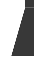
带有孔洞的半透明覆盖层/遮罩

3
如何制作类似这样的东西?

enter image description here

我尝试使用三个带有“position: absolute”属性的div(其中两个带有“transformation: skew(...)”属性)。它可以工作,但不是完美的。例如,在IE中,顶部和底部的div之间有一些空隙(我无法将一个放在另一个上面,因为颜色会变暗),左侧和右侧也会倾斜(虽然这可能可以通过添加两个白色的div来修复)。

enter image description here

<!DOCTYPE html>
<html lang="en">
<head>
    <meta charset="UTF-8">
    <meta http-equiv="X-UA-Compatible" content="IE=edge">
    <style type="text/css">
        html {
            display: table;
            margin: auto;
        }
        body{
            display: table-cell;
        }

        .container {
            padding: 15px;
            margin-bottom: 30px;
            position: relative;
        }

        .mask {
            background: rgba(0, 0, 0, 0.78);
            position: absolute;
            z-index: 99;
        }

        .mask-top {
            top: 0;
            left: 0;
            width: 100%;
            height: 70%;
        }

        .mask-left {
            width: 43%;
            height: 30%;
            left: 0;
            bottom: 0;
            margin-left: -24px;
            transform: skew(-16deg);
        }

        .mask-right {
            width: 43%;
            height: 30%;
            right: 0;
            bottom: 0;
            margin-right: -24px;
            transform: skew(16deg);
        }
    </style>
</head>
<body>
    <div class="container">
        <img src="http://i.imgur.com/cnvTRdz.png"/>

        <div class="mask mask-top"></div>
        <div class="mask mask-left"></div>
        <div class="mask mask-right"></div>
    </div>
</body>
</html>

http://jsfiddle.net/sw4tr5bc/2/

除了不支持IE的CSS遮罩外,还有更好的方法吗?

更新:

这是可行的解决方案(使用SVG,如答案中建议的)

<!DOCTYPE html>
<html lang="en">
<head>
    <meta charset="UTF-8">
    <meta http-equiv="X-UA-Compatible" content="IE=edge">
    <style type="text/css">
        html {
            display: table;
            margin: auto;
        }
        body{
            display: table-cell;
        }

        .container {
            padding: 15px;
            margin-bottom: 30px;
            position: relative;
        }

        .mask {
            position: absolute;
            z-index: 99;
            top: 0;
            left: 0;
        }
    </style>
</head>
<body>
    <div class="container">
        <img src="http://i.imgur.com/JlWbC0z.png"/>

        <svg class="mask" width="100%" height="100%" viewbox="0 0 798 798">
            <path d="M0 0 L0 798 L270 798 L340 570 L455 570 L520 798 L798 798 L798 0 L0 0 Z" fill="black" opacity="0.78"></path>
        </svg>
    </div>
</body>
</html>

http://jsfiddle.net/sw4tr5bc/3/

1个回答

3

只需制作一个内联SVG并将其放在您的图像上方,例如,请查看此SVG

<svg width="200" height="200">
  <path d="M0 0 L200 0 L200 200 L150 200 L150 150 L100 150 L100 200 L0 200 L0 0 Z" fill="black" />
</svg>

这应该可以在IE9中工作(当然,在所有现代浏览器中都可以工作)。
这似乎并不直接是您想要实现的结果,但这只是一个方向。 实际上,要成功地将其应用于您的情况,您只需要更改SVG中的几个数字。
关于过程的一些说明:
M0 0 - put the start of your path to x=0 y=0
L200 0 - line to x=200 y=0; then with some more lines you just draw your figure until you return by L0 0 to the beginning
fill="black" sets the color of the figure

最终,您可以使用这个简单的符号来构建任何路径。然后,您可以在SVG上使用不透明度来使背景图片可见。

此外,为了改进您的代码并避免污染HTML,您可以将此SVG作为数据URI放入您的CSS中,例如 查看我的另一个答案,该答案也使用SVG解决CSS问题以了解如何实现。只需记住,如果您还想在IE9中使用此CSS方法,则需要将其编码为URL。无论如何,这只是一小部分糖果,它也可以作为内联HTML SVG正常工作,没有任何问题。


网页内容由stack overflow 提供, 点击上面的
可以查看英文原文,
原文链接