我正在寻找一种方法来创建一个包含多个子图的图表,例如:
fig, (ax0, ax1) = plt.subplots(nrows=2, sharex=True)
在 matplotlib 中可以做到这一点,然后可以通过 ax0 和 ax1 进行访问。那么,在 Bokeh 中有类似的方法吗?在 Bokeh 的 示例 图库中,我只找到了单个图。
我正在寻找一种方法来创建一个包含多个子图的图表,例如:
fig, (ax0, ax1) = plt.subplots(nrows=2, sharex=True)
在 matplotlib 中可以做到这一点,然后可以通过 ax0 和 ax1 进行访问。那么,在 Bokeh 中有类似的方法吗?在 Bokeh 的 示例 图库中,我只找到了单个图。
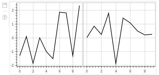
我认为你可以找到的最简单的例子是:
import numpy as np
import bokeh.plotting as bk_plotting
import bokeh.models as bk_models

# for the ipython notebook
bk_plotting.output_notebook()

# a random dataset
data = bk_models.ColumnDataSource(data=dict(x=np.arange(10),
                                            y1=np.random.randn(10),
                                            y2=np.random.randn(10)))

# defining the range (I tried with start and end instead of sources and couldn't make it work)
x_range = bk_models.DataRange1d(sources=[data.columns('x')])
y_range = bk_models.DataRange1d(sources=[data.columns('y1', 'y2')])

# create the first plot, and add a the line plot of the column y1
p1 = bk_models.Plot(x_range=x_range,
                    y_range=y_range,
                    title="",
                    min_border=2,
                    plot_width=250,
                    plot_height=250)
p1.add_glyph(data,
             bk_models.glyphs.Line(x='x',
                                   y='y1',
                                   line_color='black',
                                   line_width=2))

# add the axes
xaxis = bk_models.LinearAxis()
p1.add_layout(xaxis, 'below')
yaxis = bk_models.LinearAxis()
p1.add_layout(yaxis, 'left')

# add the grid
p1.add_layout(bk_models.Grid(dimension=1, ticker=xaxis.ticker))
p1.add_layout(bk_models.Grid(dimension=0, ticker=yaxis.ticker))

# add the tools
p1.add_tools(bk_models.PreviewSaveTool())

# create the second plot, and add a the line plot of the column y2
p2 = bk_models.Plot(x_range=x_range,
                    y_range=y_range,
                    title="",
                    min_border=2,
                    plot_width=250,
                    plot_height=250)
p2.add_glyph(data,
             bk_models.glyphs.Line(x='x',
                                   y='y2',
                                   line_color='black',
                                   line_width=2))


# add the x axis
xaxis = bk_models.LinearAxis()
p2.add_layout(xaxis, 'below')

# add the grid
p2.add_layout(bk_models.Grid(dimension=1, ticker=xaxis.ticker))
p2.add_layout(bk_models.Grid(dimension=0, ticker=yaxis.ticker))

# add the tools again (it's only displayed if added to each chart)
p2.add_tools(bk_models.PreviewSaveTool())

# display both
gp = bk_plotting.GridPlot(children=[[p1, p2]])
bk_plotting.show(gp)
生成以下输出:
GridPlot在 HTML 表格中创建独立的图表,因此如果您在其上进行预览/保存,则会为每个单独的子图表生成一个预览。计划还提供一个布局在单个画布上的网格图,这样预览将包含所有子图表。Bokeh 0.8 将是此功能的估计版本。 - bigreddot