ggplot轴更改总长度

4

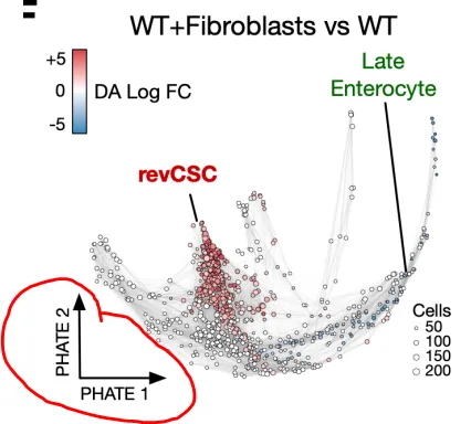
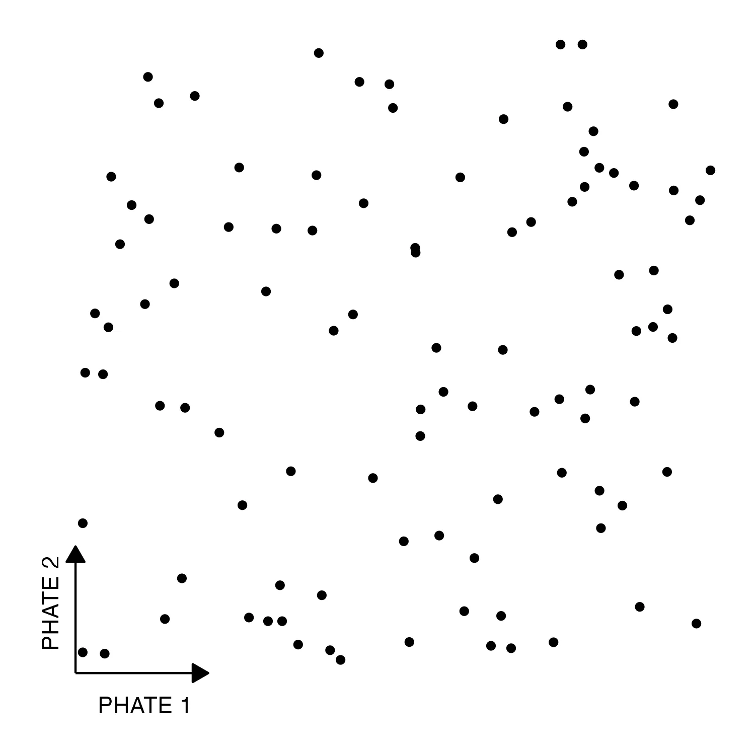
我正在尝试修改我的ggplot主题,使其看起来像这里的图片: enter image description here

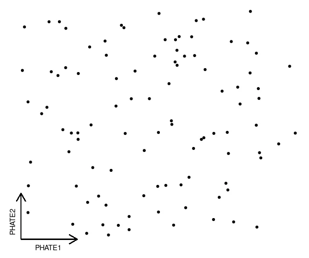
我已经做到了一切,除了轴部分要短得多。我无法在element_line中找到任何可以控制其长度的参数,但因为我认为这不是一个罕见的事情,我一定错过了什么......

到目前为止,这是主题:

library(ggplot2)

x<-runif(100)
y<-runif(100)
df <- data.frame(x=x,y=y)

ggplot(df, aes(x,y))+
  geom_point()+
  theme(panel.grid.major = element_blank(), 
        panel.grid.minor = element_blank(),
        axis.title = element_text(face = "bold",size = 10),
        plot.title = element_text(size=13),
        axis.ticks = element_blank(),
        axis.text = element_blank(),
        panel.background = element_rect(colour = "white"),
        plot.background = element_rect(colour = "white"),
        axis.line = element_line(colour="black", arrow = grid::arrow(length = unit(0.3, "cm"))))

非常感谢您的帮助!

3个回答

3

为了完整起见——更改轴的长度并不困难。

coord_...中添加限制,关闭剪辑,并在绘图中添加边距。

library(ggplot2)

x<-runif(100)
y<-runif(100)
df <- data.frame(x=x,y=y)

ggplot(df, aes(x,y))+
  geom_point()+
  ## limit the coordinates and turn clipping off
  coord_cartesian(xlim = c(0, .25), ylim = c(0, .25), clip = "off") +
  ## add a margin to your plot
  theme(
    plot.margin = margin(t = 2.6, r = 3.7, unit = "inch"),
    panel.grid.major = element_blank(), 
        panel.grid.minor = element_blank(),
        axis.ticks = element_blank(),
        axis.text = element_blank(),
        panel.background = element_rect(fill = "white"),
        axis.line = element_line(colour="black", arrow = grid::arrow(length = unit(0.3, "cm"))))

使用 reprex v2.0.2 在2023年4月24日创建


你的第一象限中有一个点似乎在y轴上被切断了,这是因为plot.margin吗?如果是这样,即使你设置了clip = "off",我们如何确保没有任何点被切断?非常感谢您在我的答案中的评论!+1! - benson23
1
@benson23,以上方法的主要缺陷在于找到正确的边距需要一些手动微调。幸运的是,通常只需要做一次,因为根据我的经验,这种可视化可能需要高度定制的要求适用于一个特定的图形,因此这种方法应该是可以接受的。我选择的有趣值是基于我的会话数据,但是使用reprex并没有使用种子导致修改了数据,因此这里的边距并不是完全正确的。 - tjebo

3
我们可以使用 geom_segment() 来实现:
ggplot(df, aes(x, y)) +
  geom_point() +
  geom_segment(aes(x=0, y=0, xend=0.2, yend=0), arrow = arrow(length=unit(.5, 'cm')))+
  geom_segment(aes(x=0, y=0, xend=0, yend=0.2), arrow = arrow(length=unit(.5, 'cm')))+
  labs(x = "PHATE1", y = "PHATE2")+
  theme_void()+
  theme(axis.title.x = element_text(hjust = 0.1, vjust = 4),
        axis.title.y = element_text(hjust = 0.07, vjust = -4, angle=90)
  )

enter image description here

如果我们想要封闭箭头:

ggplot(df, aes(x, y)) +
  geom_point() +
  geom_segment(aes(x=0, y=0, xend=0.2, yend=0), arrow = arrow(length=unit(.5, 'cm'), type = "closed"))+
  geom_segment(aes(x=0, y=0, xend=0, yend=0.2), arrow = arrow(length=unit(.5, 'cm'), type = "closed"))+
  labs(x = "PHATE1", y = "PHATE2")+
  theme_void()+
  theme(axis.title.x = element_text(hjust = 0.1, vjust = 4),
        axis.title.y = element_text(hjust = 0.07, vjust = -4, angle=90)
  )

enter image description here

或者使用ggarchery包:

library(ggarchery)
library(ggplot2)

ggplot(df, aes(x, y)) +
  geom_point() +
  geom_arrowsegment(aes(x=0, y=0, xend=0.2, yend=0), arrows = arrow(type = "closed"))+
  geom_arrowsegment(aes(x=0, y=0, xend=0, yend=0.2), arrows = arrow(type = "closed"))+
  labs(x = "PHATE1", y = "PHATE2")+
  theme_void()+
  theme(axis.title.x = element_text(hjust = 0.1, vjust = 4),
        axis.title.y = element_text(hjust = 0.07, vjust = -4, angle=90)
  )

enter image description here


非常感谢您提供如此详尽的答案,对我非常有帮助。您是否有什么想法可以“动态”地将箭头放置在左下角?因为箭头的坐标目前是“硬编码”的。 - nhaus

2
据我所知,没有简单的方法可以修改ggplot轴的长度。您可以完全移除轴线,并手动添加箭头来模拟轴线的效果。
library(ggplot2)

ggplot(df, aes(x,y))+
  geom_point()+
  annotate("segment", x = -0.01, xend = 0.2, y = 0, yend = 0, arrow = arrow(length = unit(0.3, "cm"), type = "closed")) + 
  annotate("text", x = 0.1, y = -0.05, label = "PHATE 1") +
  annotate("segment", x = -0.01, xend = -0.01, y = 0, yend = 0.2, arrow = arrow(length = unit(0.3, "cm"), type = "closed")) + 
  annotate("text", x = -0.05, y = 0.11, label = "PHATE 2", angle = 90) +
  theme(panel.grid.major = element_blank(), 
        panel.grid.minor = element_blank(),
        axis.title = element_blank(),
        plot.title = element_text(size=13),
        axis.ticks = element_blank(),
        axis.text = element_blank(),
        panel.background = element_rect(colour = "white", fill = "white"),
        plot.background = element_rect(colour = "white"),
        axis.line = element_blank())

ggplot_annotate


网页内容由stack overflow 提供, 点击上面的
可以查看英文原文,
原文链接