R ggplot使用facet_wrap创建不同y轴标签的图表,一个显示数值,一个显示百分比

10
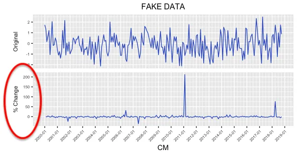
我正在使用ggplot中的facet_wrap绘制时间序列值及其百分比。对于下面的图,上面的图表是值,下面的图表是百分比变化。我想让下面图表的y轴为"%"。在ggplot中通常会这样做:
+ scale_y_continuous(labels = scales::percent)

但是由于我使用了facet_wrap,如何指定我只想要两个图表中一个的y轴标签为百分比?
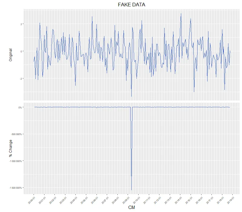
enter image description here

附:此处是生成该图表所需的代码:

library(data.table)
library(ggplot2)
library(scales)
library(dplyr)

pct <- function(x) {x/lag(x)-1}
Dates = seq(from = as.Date("2000-01-01"), 
            to =as.Date("2018-10-01"), 
            by = "1 month")
set.seed(1024)
this_raw = data.frame(CM = Dates,
                      value = rnorm(n = length(Dates)),
                      variable = rep("FAKE",length(Dates)))
this_diff = na.omit(as.data.table(this_raw %>% 
                                    group_by(variable) %>%
                                    mutate_each(funs(pct), c(value))))
this_diff$type = "PerCng"
this_raw$type = "RAW"
plot_all = rbindlist(list(this_raw,this_diff))
plot_all$type = factor(plot_all$type, levels = c("RAW", "PerCng"))

out_gg = plot_all %>%
  ggplot(aes(x=CM, y=value)) + 
  geom_line(color = "royalblue3") +
  theme(legend.position='bottom')+
  ggtitle("FAKE DATA") + 
  facet_wrap(~ type, scale = "free_y", nrow = 2,
             strip.position = "left", 
             labeller = as_labeller(c(RAW = "Original", PerCng = "% Change") ) )+
  scale_x_date(date_breaks = "12 month", date_labels = "%Y-%m", 
               date_minor_breaks = "3 month")+
  ylab("")+
  theme(plot.title = element_text(hjust = 0.5,size = 12),  
        axis.text.x = element_text(size = 6,angle = 45, hjust = 1),
        axis.text.y = element_text(size = 6),  
        axis.title.y = element_text(size = 6)) + 
  theme(strip.background = element_blank(),
        strip.placement = "outside")+
  theme(legend.title=element_blank())
print(out_gg)

1
我同意Gregor在这个SO问题上的评论。制作单独的图并将它们排列在一起会更容易,或者转换第二个facet的数据。我认为facet是相当固定的,就每个图的自定义而言。 - Anonymous coward
1
在 Github 上有一个看起来很有前途的软件包:https://github.com/zeehio/facetscales - markus
1个回答

8

我同意以上评论,facets 确实不适用于此用例。对齐单独的绘图是传统的方法。

话虽如此,如果您已经拥有一堆格式良好的 ggplot 对象,并且真的不想为轴标签重构代码,您可以将它们转换为 grob 对象并深入了解:

library(grid)

# Convert from ggplot object to grob object
gp <- ggplotGrob(out_gg)

# Optional: Plot out the grob version to verify that nothing has changed (yet)
grid.draw(gp)

# Also optional: Examine the underlying grob structure to figure out which grob name 
# corresponds to the appropriate y-axis label. In this case, it's "axis-l-2-1": axis 
# to the left of plot panels, 2nd row / 1st column of the facet matrix.
gp[["layout"]]
gtable::gtable_show_layout(gp)

# Some of gp's grobs only generate their contents at drawing time.
# Using grid.force replaces such grobs with their drawing time content (if you check 
# your global environment, the size of gp should increase significantly after running 
# the grid.force line).
# This step is necesary in order to use gPath() to generate the path to nested grobs 
# (& the text grob for y-axis labels is nested rather deeply inside the rabbit hole).
gp <- grid.force(gp)
path.to.label <- gPath("axis-l-2", "axis", "axis", "GRID.text")

# Get original label
old.label <- getGrob(gTree = gp,
                     gPath = path.to.label,
                     grep = TRUE)[["label"]]

# Edit label values
new.label <- percent(as.numeric(old.label))

# Overwrite ggplot grob, replacing old label with new
gp = editGrob(grob = gp,
              gPath = path.to.label,
              label = new.label,
              grep = TRUE)

# plot
grid.draw(gp)

modified grob


网页内容由stack overflow 提供, 点击上面的
可以查看英文原文,
原文链接