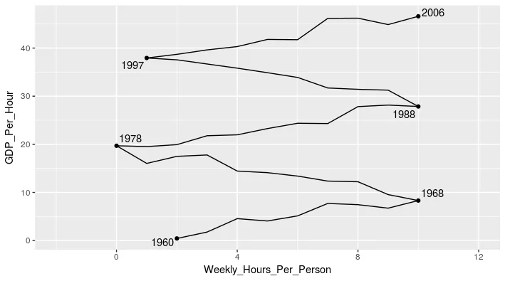
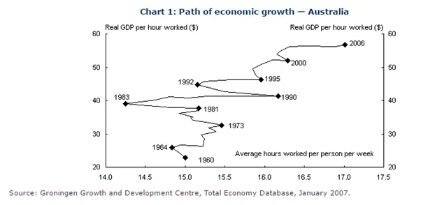
我有一个图表想要复制。它有两个连续变量用于X和Y轴,并通过一条线来展示这两个变量之间的关系随时间的变化。
我的问题有两个部分:
首先,这种类型的图表叫什么?它很不寻常,因为连接点之间的线是由第三个变量(年份)确定的,而不是它们在X轴上的位置。
其次,有人知道是否可以使用ggplot实现这一点吗?到目前为止,我已经创建了一个类似于上面的图表,但没有连接点之间的线。 这段代码
ggplot(data, aes(x = Weekly_Hours_Per_Person, y = GDP_Per_Hour)) + geom_point()已经得到了下面的输出: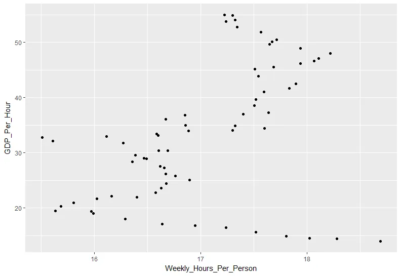 但如何获得跨年的线条?
任何关于这两个问题的帮助都将不胜感激。谢谢!