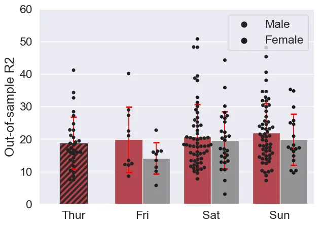
在Matplotlib中更改填充颜色

16

感谢您帮助我正确绘制这张图表!

现在我又遇到了一个问题,希望将填充线的颜色改为灰色。

我使用的是matplotlib版本1.5.3。我尝试过mlp.rcParams['hatch.color'] = 'k',但好像没有起作用...

下面是我已经有的图表代码,再次感谢您的帮助:


import seaborn as sns
import matplotlib.pyplot as plt
mypallet = sns.color_palette([(190/256,7/256, 18/256),(127/256, 127/256, 127/256)])
import itertools
import numpy as np

plt.rcParams['figure.figsize'] = 7, 5
tips = sns.load_dataset("tips")
tips[(tips.day=='Thur') & (tips.sex=='Female') ] = np.nan
print(sns.__version__)
print(tips.head())
# Bigger than normal fonts
sns.set(font_scale=1.5)

ax = sns.swarmplot(x="day", y="total_bill", hue="sex",
                 data=tips, dodge=True, color='k')

#get first patchcollection
c0 = ax.get_children()[0]
x,y = np.array(c0.get_offsets()).T
#Add .2 to x values
xnew=x+.2
offsets = list(zip(xnew,y))
#set newoffsets
c0.set_offsets(offsets)

ax = sns.barplot(x="day", y="total_bill", hue="sex",
                 data=tips, capsize=0.1, alpha=0.8,
                 errwidth=1.25, ci=None, palette=mypallet)
xcentres = [0.2, 1, 2, 3]
delt = 0.2
xneg = [x-delt for x in xcentres]
xpos = [x+delt for x in xcentres]
xvals = xneg + xpos
xvals.sort()
yvals = tips.groupby(["day", "sex"]).mean().total_bill
yerr = tips.groupby(["day", "sex"]).std().total_bill

(_, caps, _)=ax.errorbar(x=xvals, y=yvals, yerr=yerr, capsize=4,
                         ecolor="red", elinewidth=1.25, fmt='none')
for cap in caps:
    cap.set_markeredgewidth(2)


handles, labels = ax.get_legend_handles_labels()
l = ax.legend(handles[0:2], labels[0:2]) # changed based on https://dev59.com/f1gQ5IYBdhLWcg3wcTeH#42768387
#sns.ax.ylim([0,60]) #original
ax.set_ylim([0,60]) # adapted from https://stackoverflow.com/a/49049501/8508004 and change to legend
ax.set_ylabel("Out-of-sample R2") # based on https://dev59.com/D6Xja4cB1Zd3GeqPNTGU#46235777
ax.set_xlabel("") # based on https://dev59.com/D6Xja4cB1Zd3GeqPNTGU#46235777

for i, bar in enumerate(ax.patches):
    hatch = '///'
    bar.set_hatch(hatch)
    bar.set_x(bar.get_x() + bar.get_width()/2)
    break

我希望将图案填充的颜色从黑色改为灰色:(127/256, 127/256, 127/256)


2
嗯...似乎很难分离边缘和填充颜色 https://dev59.com/LFoT5IYBdhLWcg3wxx7g#38169221.. 但是你可以在底部的补丁循环中使用'bar.set_edgecolor('k')'来改变第一个条形图。 - Scott Boston
谢谢,那个有效!那么刻度线的宽度呢? - user1748101
4个回答

8

添加plt.rcParams['hatch.linewidth'] = 3并使用set_edgecolor,认为plt.rcParams['hatch.color'] = 'k'不起作用是一个错误。

import seaborn as sns
import matplotlib.pyplot as plt
import matplotlib as mpl
mypallet = sns.color_palette([(190/256,7/256, 18/256),(127/256, 127/256, 127/256)])
import itertools
import numpy as np

plt.rcParams['figure.figsize'] = 7, 5
plt.rcParams['hatch.linewidth'] = 3
tips = sns.load_dataset("tips")
tips[(tips.day=='Thur') & (tips.sex=='Female') ] = np.nan
print(sns.__version__)
print(tips.head())
# Bigger than normal fonts
sns.set(font_scale=1.5)

ax = sns.swarmplot(x="day", y="total_bill", hue="sex",
                 data=tips, dodge=True, color='k')

#get first patchcollection
c0 = ax.get_children()[0]
x,y = np.array(c0.get_offsets()).T
#Add .2 to x values
xnew=x+.2
offsets = list(zip(xnew,y))
#set newoffsets
c0.set_offsets(offsets)

ax = sns.barplot(x="day", y="total_bill", hue="sex",
                 data=tips, capsize=0.1, alpha=0.8,
                 errwidth=1.25, ci=None, palette=mypallet)


xcentres = [0.2, 1, 2, 3]
delt = 0.2
xneg = [x-delt for x in xcentres]
xpos = [x+delt for x in xcentres]
xvals = xneg + xpos
xvals.sort()
yvals = tips.groupby(["day", "sex"]).mean().total_bill
yerr = tips.groupby(["day", "sex"]).std().total_bill

(_, caps, _)=ax.errorbar(x=xvals, y=yvals, yerr=yerr, capsize=4,
                         ecolor="red", elinewidth=1.25, fmt='none')
for cap in caps:
    cap.set_markeredgewidth(2)


handles, labels = ax.get_legend_handles_labels()
l = ax.legend(handles[0:2], labels[0:2]) # changed based on https://dev59.com/f1gQ5IYBdhLWcg3wcTeH#42768387
#sns.ax.ylim([0,60]) #original
ax.set_ylim([0,60]) # adapted from https://stackoverflow.com/a/49049501/8508004 and change to legend
ax.set_ylabel("Out-of-sample R2") # based on https://dev59.com/D6Xja4cB1Zd3GeqPNTGU#46235777
ax.set_xlabel("") # based on https://dev59.com/D6Xja4cB1Zd3GeqPNTGU#46235777

for i, bar in enumerate(ax.patches):
    hatch = '///'
    bar.set_hatch(hatch)
    bar.set_edgecolor('k')
    bar.set_x(bar.get_x() + bar.get_width()/2)
    break

输出:

在此输入图像描述


(注:此内容为HTML代码,已翻译并保留原格式)

4
据我所知,孵化颜色由edgecolor属性确定,但问题在于它还会影响到您的条形图边框。
顺便说一下,我对您代码末尾的循环感到困惑,我将其重写为:
(...)
ax.set_xlabel("") # based on https://dev59.com/D6Xja4cB1Zd3GeqPNTGU#46235777

bar = ax.patches[0] #  modify properties of first bar (index 0)
hatch = '///'
bar.set_hatch(hatch)
bar.set_x(bar.get_x() + bar.get_width()/2)
bar.set_edgecolor([0.5,0.5,0.5])

如果要更改阴影线的宽度,似乎必须修改rcParams。您可以在脚本顶部附近添加以下内容:

plt.rcParams['hatch.linewidth'] = 3


谢谢!更改边缘颜色已经可以了。现在我正在寻找一种改变边缘宽度的方法。 - user1748101
3
plt.rcParams['hatch.linewidth'] = 3,我已经添加到我的答案中。 - Diziet Asahi
这仍然会改变我阴影线和条形图边缘的颜色。我只想改变阴影线的颜色。 - CGFoX

2
plt.rcParams.update({'hatch.color': 'k'})

7
欢迎来到 Stack Overflow!请编辑您的答案(https://stackoverflow.com/posts/59742525/edit),并包含有关您的代码的解释以及它如何用于解决问题。这将帮助未来可能遇到您答案的其他人,并增加他们发现您的答案有用并给您点赞的可能性 :) - Das_Geek

0

对于那些发现图案未显示或颜色不正确的人,这里有两个额外的提示。

首先,请检查是否在其他地方设置了某些edgecolor。这似乎优先于指定的阴影颜色。 其次,如果您绘制一个Patch,请使用facecolor而不是color。使用color时,图案将不可见:

所以不要这样做:

from matplotlib.patches import Polygon, Patch
fig, ax = plt.subplots()
ax.legend(handles=[Patch(color='red', hatch='///')])  # no hatch visible 
plt.show()

改为:

from matplotlib.patches import Polygon, Patch
fig, ax = plt.subplots()
ax.legend(handles=[Patch(facecolor='red', hatch='///')])  # hatch is now visible 
plt.show()

网页内容由stack overflow 提供, 点击上面的
可以查看英文原文,
原文链接