使用CSS定位导航栏

9

我遇到了一个问题,就是无法将垂直导航栏定位在内容Div的左侧。以下是我目前的情况和我的期望:
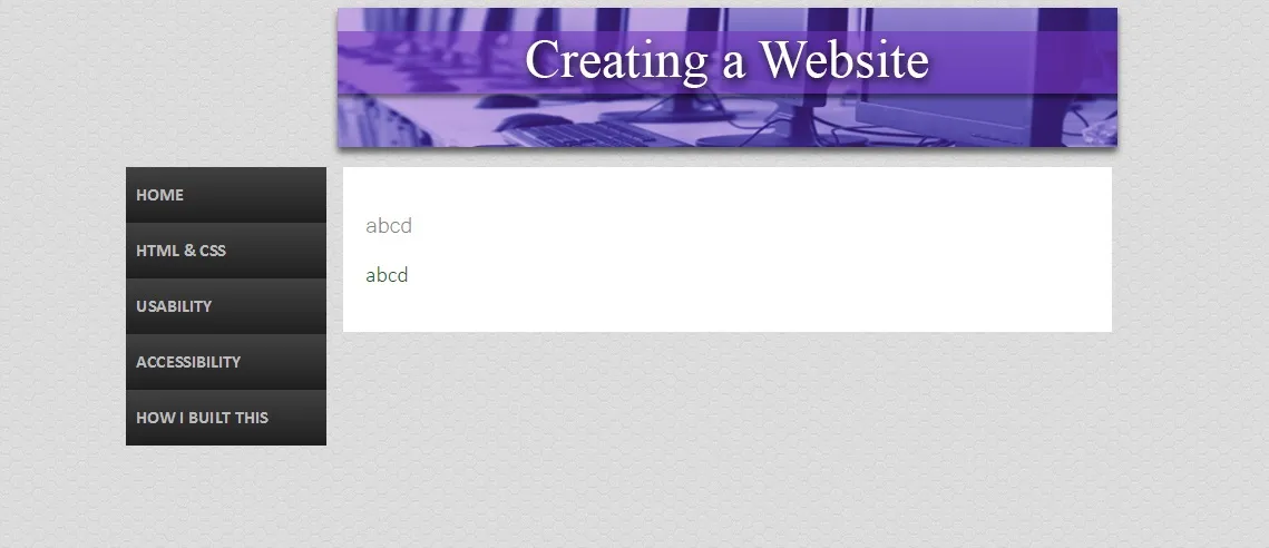
enter image description here

问题是它是固定位置,所以对于不同大小的显示器来说是不同的。因此,我猜我需要相对定位,但我不太确定如何做。
HTML
<!DOCTYPE html>
<html>
<head>
<title> Home Page </title>
<link rel="stylesheet" type="text/css" href= "styles/styling.css" />
</head>

<div class="container">
  <ul class="nav">.....(Just nav bar stuff)


<div class="content">
<h1>abcd</h1>

<p>abcd</p>
</div>

CSS

.content { 
background-color: #FFFFFF; 
width: 650px; 
padding: 20px;
margin: auto; 
word-wrap: break-word 
}

.container {
position: fixed;
top: 151px;
left: 420px;
}

谢谢!


你能否提供一个 jsfiddle 或实时示例? - Alex Char
2个回答

3

如果你希望在滚动页面时保持菜单的可见性,可以使用固定定位。否则,不建议使用。

<div class="container">
  <div class="one-third column">
      <ul class="yourmenu">xxx</ul> 
      <div class="filler"></div>
  </div>
  <div class="two-thirds column">
      Your page content here
  </div>
</div>

<style>
    .container {width:960px;margin:auto;}
    .column {float:left;position:relative;}
    .one-third {width:320px;}
    .two-thirds {width:640px;}
    .filler {width:100%;height:10px;}
    .yourmenu {position:fixed;top:100px;} /* do not define left, because it will fix the screen and not the column div */
</style>

谢谢,这个方法很有效。我不得不更改容器的值和“yourmenu”的顶部对齐方式,以使其适合我的需求,但现在一切都正常工作了。再次感谢 :) - Popcorn727

0

使用百分比(%)代替像素(px)。


什么规则?宽度?高度? - A.L
这取决于您希望页面如何缩放。通常您希望宽度是可缩放的(使用百分比),小部件(例如导航栏)具有固定的高度(以像素为单位)。 - user3693097
所以你应该在你的回答中描述这个。 - A.L
不,我不应该这样做。OP没有问他的页面应该如何设计。Dookie的答案会为将PX更改为%提供逻辑,而我只是给了一个提示。你并没有提供帮助。 - user3693097
请参阅如何撰写好的回答?:简洁明了是可以接受的,但更详尽的解释会更好。 - A.L
显示剩余2条评论

网页内容由stack overflow 提供, 点击上面的
可以查看英文原文,
原文链接