我想在线性图上使用标记突出显示一个单独的点。到目前为止,我已经创建了我的图并在所需位置插入了突出显示。
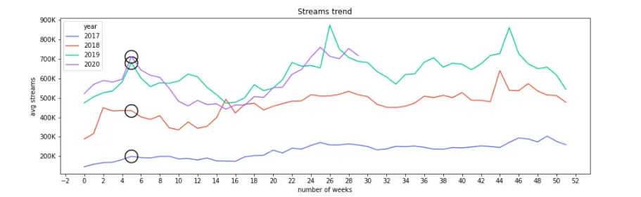
问题是我有4个不同的线性图(4个不同的分类属性),并且我在每个单独的线性图上都放置了标记,如下图所示:
我使用了
问题是我有4个不同的线性图(4个不同的分类属性),并且我在每个单独的线性图上都放置了标记,如下图所示:
import seaborn as sns
import matplotlib.pyplot as plt
import matplotlib.ticker as plticker
import seaborn as sns
import numpy as np
import matplotlib.gridspec as gridspec

fig = plt.figure(figsize=(15,10))
gs0 = gridspec.GridSpec(2,2, figure=fig, hspace=0.2)

ax1 = fig.add_subplot(gs0[0,:]) # lineplot
ax2 = fig.add_subplot(gs0[1,0]) #Used for another plot not shown here
ax3 = fig.add_subplot(gs0[1,1]) #Used for another plot not shown here

flatui = ["#636EFA", "#EF553B", "#00CC96", "#AB63FA"]

sns.lineplot(ax=ax1,x="number of weeks", y="avg streams", hue="year", data=df, palette=flatui, marker = 'o', markersize=20, fillstyle='none', markeredgewidth=1.5, markeredgecolor='black', markevery=[5])

ax1.yaxis.set_major_formatter(ticker.FuncFormatter(lambda x, pos: '{:,.0f}'.format(x/1000) + 'K'))

ax1.set(title='Streams trend')
ax1.xaxis.set_major_locator(ticker.MultipleLocator(2))
我使用了
markevery字段在位置5处放置标记。是否有办法指定在哪一行/类别上放置我的标记?
编辑: 这是我的数据框: avg streams date year number of weeks
0 145502.475 01-06 2017 0
1 158424.445 01-13 2017 1
2 166912.255 01-20 2017 2
3 169132.215 01-27 2017 3
4 181889.905 02-03 2017 4
... ... ... ... ...
181 760505.945 06-26 2020 25
182 713891.695 07-03 2020 26
183 700764.875 07-10 2020 27
184 753817.945 07-17 2020 28
185 717685.125 07-24 2020 29
186 rows × 4 columns
ax1.scatter([5]*df.shape[1], df.loc[5])吗? - Quang Hoangplot == ax1,你可以使用plot = sns.lineplot(...)。 - Guimoutectrl-k)... 不鼓励截屏代码和/或错误 - wwii