直方图条件填充颜色

11
我希望制作一个直方图,其中填充颜色取决于区间的低端。我不想要manual填充。这个answer看起来很有希望,但我无法成功将其转换为直方图和两个值(不是渐变)的颜色方案。我认为解决方案可能是在geom_histogram(fill= )中使用一些ifelse逻辑,但我不知道如何访问区间起始值。
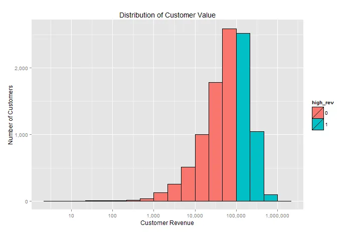
例如,在下面的直方图中,我想用红色着色营收区间超过10万美元,以显示高收入客户。
library(ggplot2)
library(scales)

n <- 10000
cust <- data.frame(cust_id=1:n,cust_rev <- rexp(n,.00001))

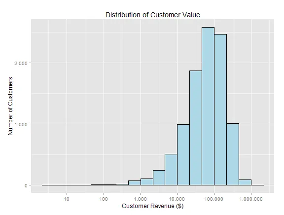
# I want to use a log scale for my tick marks and bin breaks
powers <- function(base,exp) sapply(1:exp, function(exp) base^exp )

ggplot(cust, aes(cust_rev)) + 
  geom_histogram(color="black",fill="light blue", binwidth=1/3) + 
  scale_x_log10(labels=comma, breaks=powers(10,8)) +
  scale_y_continuous(labels=comma) +
  xlab("Customer Revenue") + ylab("Number of Customers") +
  ggtitle("Distribution of Customer Value")

enter image description here

此外,我尝试使用第二个geom_histogram()进行workaround,但没有成功。
ggplot(cust, aes(x=cust_rev)) + 
  geom_histogram(color="black",fill="light blue", binwidth=1/3) + 
  geom_histogram(data=subset(cust,cust_rev>100000),
                 color="black",fill="red", binwidth=1/3) + 
  scale_x_log10(labels=comma, breaks=powers(10,8)) +
  scale_y_continuous(labels=comma) +
  xlab("Customer Revenue ($)") + ylab("Number of Customers") +
  ggtitle("Distribution of Customer Value")
# Error in data.frame(x = c(45291.1377418786, 52770.7004919648, 15748.975193128,
#   : arguments imply differing number of rows: 10000, 3568
2个回答

18

最简单的方法是添加另一列作为条件,然后更新 aes 来包含填充组。

cust$high_rev <- as.factor((cust[,2]>100000)*1)

ggplot(cust, aes(cust_rev, fill=high_rev)) + 
    geom_histogram(color="black", binwidth=1/3) + 
    scale_x_log10(labels=comma, breaks=powers(10,8)) +
    scale_y_continuous(labels=comma) +
    xlab("Customer Revenue") + ylab("Number of Customers") +
    ggtitle("Distribution of Customer Value")

enter image description here

如果你已经想好了一些具体的颜色,你可以使用scale_fill_manual函数。这里有一个用一些有趣、明亮的颜色的例子。

ggplot(cust, aes(cust_rev, fill=high_rev)) + 
    geom_histogram(color="black", binwidth=1/3) + 
    scale_x_log10(labels=comma, breaks=powers(10,8)) +
    scale_y_continuous(labels=comma) +
    scale_fill_manual(values = c("green", "purple")) +
    xlab("Customer Revenue") + ylab("Number of Customers") +
    ggtitle("Distribution of Customer Value")

这里输入图片描述


可以使用 
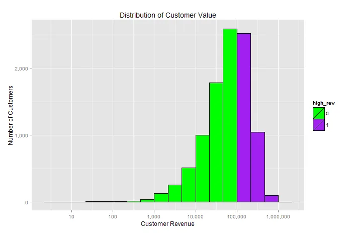
scale_fill_manual()。但是,正如 ziggystar (+1) 在下面建议的那样,我跳过了向 df 添加列,并直接将条件传递给 aes(fill=))。此外,我在图中添加了 guides(fill=FALSE) 来抑制图例。 - C8H10N4O2

4
这个怎么样?
ggplot(cust, aes(cust_rev)) + 
  geom_histogram(aes(fill=cust_rev > 100000),binwidth=1/3) + 
  scale_x_log10()

或者等价地

ggplot(cust, aes(x=cust_rev,fill=cust_rev > 100000)) + 
  geom_histogram(binwidth=1/3) + 
  scale_x_log10()

1
虽然在我看来,这个例子比被接受的答案更简洁、更好,但它不能满足多条件填充... 被接受的答案可以做到这一点... 或者是我漏看了什么? - tjebo
1
如果你能构建一些返回不同值的表达式(例如使用switch或cut),那么你可以这样做。但是这会变得有点混乱,我建议添加一列。 - ziggystar

网页内容由stack overflow 提供, 点击上面的
可以查看英文原文,
原文链接