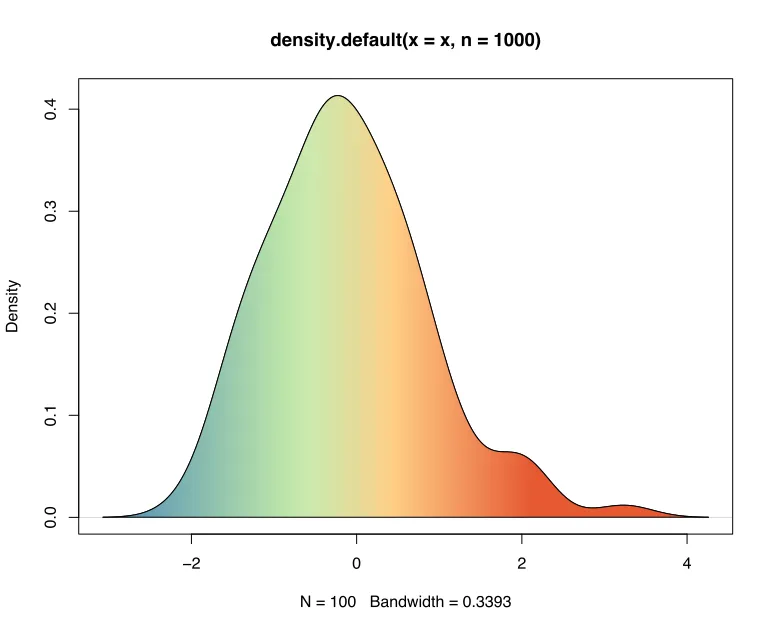
我有一个类似于以下代码: x <- rnorm(100) y <- density(x, n = 1000) plot(y) polygon(y,col="red") 然而,我也想在基本R中为密度图添加颜色渐变,特别是使用像Spectral从蓝色到红色的调色板。这样,输出将会看起来像这样: 我很感激任何帮助!谢谢!
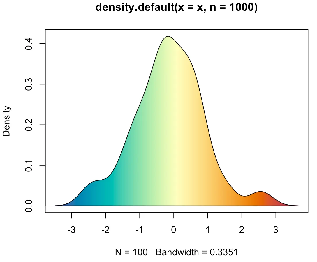
你可以使用segments()函数添加无数个具有渐变颜色的线段。x <- rnorm(100) dens <- density(x, n = 1000) plot(dens) segments(dens$x, 0, dens$x, dens$y, col = hcl.colors(1000, "Spectral", rev = TRUE)) polygon(dens)