我正在尝试让一个div像下图一样有边框:
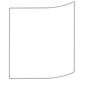
这是我尝试的代码:
div {
    height: 100px;
    width: 100px;
    border-bottom-right-radius:100px 10px;
    border:1px solid #000;
}<div></div>如何有效地完成此任务?
我正在尝试让一个div像下图一样有边框:
这是我尝试的代码:
div {
height: 100px;
width: 100px;
border-bottom-right-radius:100px 10px;
border:1px solid #000;
}<div></div>如何有效地完成此任务?
:before 和 :after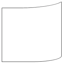
:before 创建顶部边框:它的高度与边框半径相同
用 top 将其定位在外部,并借助于 left 与左边框对齐
用 calc 计算其宽度,以精确定位曲线的顶部
可以用 transform: skewX(-60deg) 精细调整曲线
:after 创建左边框:用 calc 给它一个减去 before 的高度和边框厚度的 100% 高度
div {
  border-bottom-right-radius: 100px 20px;
  border: 1px solid #000;
  border-top: none;
  height: 500px;
  width: 200px;
  position: relative;
  border-left: none;
}
div:before,
div:after {
  content: '';
  display: block;
  position: absolute;
  left: -1px;
}
div:before {
  height: 20px;
  width: 100%;
  width: calc(100% + 1px);
  border-bottom-right-radius: 100px 20px;
  border-bottom: 1px solid #000;
  border-right: solid 1px #000;
  top: -1px;
}
div:after {
  height: calc(100% - 18px);
  border-left: 1px solid #000;
  top: 19px;
}<div></div>div {
border-bottom-right-radius: 100px 20px;
border: 1px solid #000;
border-top: none;
height: 200px;
width: 200px;
position: relative;
border-left: none;
}
div:before,
div:after {
content: '';
display: block;
position: absolute;
left: -1px;
}
div:before {
height: 20px;
width: 100%;
width: calc(100% - 36px);
border-bottom-right-radius: 100px 20px;
border-bottom: 1px solid #000;
border-right: solid 2px #000;
top: 0px;
left: 17px;
transform: skewX(-60deg);
}
div:after {
height: calc(100% - 19px);
border-left: 1px solid #000;
top: 20px;
}<div></div>transform: skewX来平滑处理这个问题。 - misterManSam我可以使用DIV来实现,但我相信有一种更优雅的方式:
    #container {
       border:none;
       height:100px;
       border-right: solid 1px #000;
    }

    #square_top {
       border-bottom-right-radius:100px 10px;
       border:none;
       border-bottom: solid 1px #000;
       height:10px;
    }

    #square_bottom {
       border-bottom-right-radius:100px 10px;
       border:none;
       border-bottom: solid 1px #000;
       border-right:solid 1px #000;
       border-left:solid 1px #000;
       height:10px;
    }

    #square {
       height: 90px;
       border-left:solid 1px #000;
} <div id="container">
<div id="square_top"></div>
<div id="square">TEXT HERE</div>
</div>
<div id="square_bottom"></div>body {background: url('http://lorempixel.com/output/people-q-g-640-480-9.jpg');background-size: cover;}
div {
position: relative;
width: 30%;
padding: 5%;
color: #fff;
text-align: center;
}
svg {
position: absolute;
top: 0; left: 0;
width: 100%; height: 100%;
z-index: -1;
}<div>
<p>Some text</p>
<p>Some text</p>
<p>Some text</p>
<p>Some text</p>
<p>Some text</p>
<p>Some text</p>
<p>Some text</p>
<p>Some text</p>
<p>Some text</p>
<svg viewbox="0 0 50 100" preserveAspectRatio="none">
<path d="M1 9 C49 10 49 1 49 1 V90 C49 91 49 99 1 99z" stroke-width="0.5" stroke="#000" fill-opacity="0.5" />
</svg>
</div>vector-effect="non-scaling-stroke" 属性,可以让描边的宽度固定。但是似乎IE不支持该属性。 - web-tiki