边框弯曲的CSS - 带有弯曲末端的圆形

8

我正在建设一个网站,但在CSS方面遇到了一些困难。

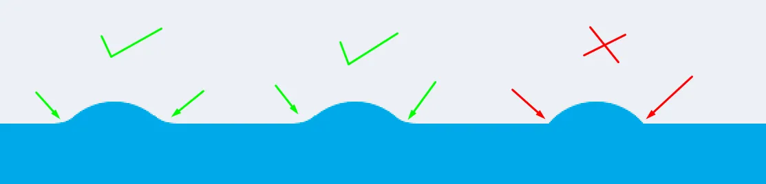
我需要制作一个圆形边框,并且边框末端是弧形的。为了让您更好地理解,我将展示照片并发布我的代码。

这就是我想要的效果(Photoshop):

enter image description here

enter image description here

我希望能够找到一个CSS解决方案,但是我找不到。

以下是我目前拥有的代码:

.bottom-bar {
  background: #29a7e8;
  position: absolute;
  bottom: 0;
  width: 100%;
  height: 50px;
  text-align: center;
}

.circle {
  display: inline-block;
  position: relative;
  top: -10px;
  border-radius: 100%;
  background: #29a7e8;
  width: 60px;
  height: 60px;
  margin: 0 1rem;
}
<div class="bottom-bar">
      <div class="circle"></div>
      <div class="circle"></div>
      <div class="circle"></div>
    </div>


@wazz 展示所有照片的目的是什么?:) 你只需突出显示不必要的部分,我们已经有代码来查看最后一个输出,所以不需要展示... 我们需要专注于代码而不是图片。 - Temani Afif
然后删除它们。我不在乎。 - wazz
@wazz 我已经完成了,但是你撤销了我的编辑.. - Temani Afif
1
时间真是不巧,我以为我的编辑出了什么问题,因为我刚放上去的图片突然不见了,所以我又重新做了一遍。 - wazz
2个回答

5
您可以使用SVG作为背景来实现此功能:

.bottom-bar {
  background: #29a7e8;
  position: absolute;
  bottom: 0;
  width: 100%;
  height: 50px;
  text-align: center;
}

.circle {
  display: inline-block;
  position: relative;
  top: -28px;
  border-radius: 100%;
  background: url("data:image/svg+xml;utf8,<svg xmlns='http://www.w3.org/2000/svg' viewBox='10 10 45 15'  width='64' height='64' fill='%2329a7e8'><path d='M12 24 L52 24 L52 16 C40 16 42 10 32 10 C20 10 22 16 12 16 Z' /></svg>") 0 0/100% 100% no-repeat;
  width: 60px;
  height: 60px;
  margin: 0 1rem;
}
<div class="bottom-bar">
  <div class="circle"></div>
  <div class="circle"></div>
  <div class="circle"></div>
</div>


<svg xmlns='http://www.w3.org/2000/svg'
  viewBox='10 10 45 15'
  width='64' height='64'
  fill='#29a7e8'>
  <path d='M12 24 L52 24 L52 16 C40 16 42 10 32 10 C20 10 22 16 12 16 Z' />
</svg>

对于纯CSS的解决方案,您可以考虑使用径向渐变来创建曲线:

.bottom-bar {
  background: #29a7e8;
  position: absolute;
  bottom: 0;
  width: 100%;
  height: 50px;
  text-align: center;
}

.circle {
  display: inline-block;
  position: relative;
  top: -30px;
  background:
  radial-gradient(circle at top right,transparent 50%,#29a7e8 51%)100% 21px/12px 10px no-repeat,
  radial-gradient(circle at top left,transparent 50%,#29a7e8 51%)0 21px/12px 10px no-repeat,
  radial-gradient(circle at center,#29a7e8 55%, transparent 56%);
  width: 60px;
  height: 60px;
  margin: 0 1rem;
}
<div class="bottom-bar">
  <div class="circle"></div>
  <div class="circle"></div>
  <div class="circle"></div>
</div>


2
一般来说,有四种方法可以创建这种形状,从简单到更复杂:
  • 使用带有radial-gradient的2个伪元素。

    最简单且支持性较好的解决方案。可能是我会选择的一种。

  • 使用带有mask-image的2个伪元素(与上述相同,但支持性较差)。

    在代码上与前一个示例非常相似,但支持性非常差(需要浏览器前缀来支持它)。

    如果您想查看它们的相似之处,请查看此其他类似问题:CSS“反向边框半径”超出元素边界框以创建移动电话刻度设计

  • 使用带有border-radiusbox-shadowbackground: transparent的2个伪元素。

    需要更多的代码,但看起来更加平滑,至少在Chrome Version 78.0.3904.108上是如此,尽管差异很小。无论如何,您可以做的形状不能像之前的替代方案那样复杂,尤其是如果您想使用椭圆而不是圆形,正如您的情况。

  • 使用SVG。

    我认为在这里不值得使用SVG解决方案,但对于更复杂的形状或动画/过渡形状,它将是一个很好的选择。无论如何,Temani Afif已经添加了使用SVG的解决方案。

需要记住的一件事是,由于这看起来像一个导航栏,每个按钮的可悬停/可单击区域应尽可能与用户实际看到的相匹配,这对于Temani Afif的解决方案并非如此。

这就是使用radial-gradient看起来的样子:

body {
  margin: 0;
  font-family: monospace;
  background: #DDD;
}

.bar {
  background: white;
  position: fixed;
  bottom: 0;
  width: 100%;
  height: 60px;
  text-align: center;
}

.circle {
  position: relative;
  top: -10px;
  border-radius: 100%;
  background: white;
  width: 60px;
  height: 60px;
  margin: 0 16px;
  cursor: pointer;
  display: inline-flex;
  justify-content: center;
  align-items: center;
  font-size: 24px;
  font-weight: bold;
  color: black;
  transition: box-shadow ease-in 150ms;
  background: white;
  border: 0;
  outline: none;
}

.circle:hover {
  box-shadow: 0 16px 16px 0 rgba(0, 0, 0, .125);
}

.circle:active {
  box-shadow: 0 8px 8px 0 rgba(0, 0, 0, .125);
}

.circle::before,
.circle::after {
  content: "";
  position: absolute;
  top: 4px;
  width: 32px;
  height: 6px;
  background: white;
  z-index: 1;
}

.circle::before {
  left: -18px;
  background: radial-gradient(ellipse at 0% -25%, transparent 0, transparent 70%, white 70%, white 100%);
}

.circle::after {
  right: -18px;
  background: radial-gradient(ellipse at 100% -25%, transparent 0, transparent 70%, white 70%, white 100%);
}
<nav class="bar">
  <button class="circle"></button>
  <button class="circle"></button>
  <button class="circle"></button>
</nav>

如果你想看一个类似的问题以及所有替代方案的实际效果,请查看这个链接:CSS“反向边框半径”在元素边界框之外创建移动电话缺口设计


网页内容由stack overflow 提供, 点击上面的
可以查看英文原文,
原文链接