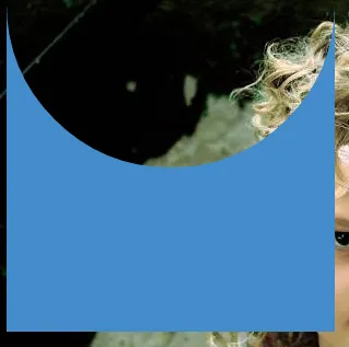
我能用CSS制作一个带有半圆形透明剪切的矩形
吗?半圆应该是透明的,让背景显示出来。
期望的CSS形状:

HTML :
<div></div>
CSS :
div{
    background : #448CCB;
    width:300px;
    height:300px;
}
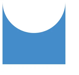
我能用CSS制作一个带有半圆形透明剪切的矩形
期望的CSS形状:
HTML :
<div></div>
CSS :
div{
background : #448CCB;
width:300px;
height:300px;
}
box-shadows来最小化标记。在下面的演示中,形状的蓝色由盒子阴影而不是background-color属性设置。
输出:
这也可以是响应式的:演示
HTML:
<div></div>
CSS(层叠样式表):
div {
  width: 300px;
  height: 300px;
  position: relative;
  overflow: hidden;
}

div::before {
  content: '';
  position: absolute;
  bottom: 50%;
  width: 100%;
  height: 100%;
  border-radius: 100%;
  box-shadow: 0px 300px 0px 300px #448CCB;
}
可以吗?
div{
    width:100px;
    height:100px;
    background:#03b0d5;
    display:block;
    position:relative;
    overflow:hidden;
}
div:after{
    width:100px;
    height:100px;
    border-radius:50%;
    background:#fff;
    display:block;
    position:absolute;
    content:'';
    top:-50px;
    left:0;
 }
这是我的解决方案
HTML:
<div id="shape"></div>
CSS:
#shape {
    width:250px;
    height:250px;
    background:#448ccb;
    position:relative;
}

#shape:before {
    content:" ";
    position:absolute;
    width:250px;
    height:250px;
    background:#fff;
    left:0; top:-50%;
    border-radius:50%;
}
在 jsfiddler 中的链接:demo
使用 box-shadow 的解决方案:
HTML:
<div id="wrap">
    <div id="shape"></div>
</div>
CSS:
#wrap {
    background:#ccc;
    padding:20px;
}
#shape {
    width:250px;
    height:250px;
    position:relative;
    overflow:hidden;
}

#shape:before {
    content:" ";
    position:absolute;
    width:100%;
    height:100%;
    left:0; top:-50%;
    border-radius:50%;
    box-shadow:0 0px 0 250px #448ccb
}
在 jsfiddler 中的链接:demo
如果你不介意“被吃掉”的部分是白色而不是透明的,那么可以:
<div></div>
CSS:
div {
    width: 250px;
    height: 250px;
    margin: 10px;
    background: #448CCB;
}

div:before {
    content:" ";
    background:white;
    display: block;
    width:250px;
    height: 125px;
    border-radius: 0 0 125px 125px;
}