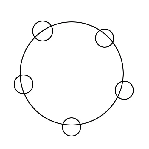
围绕圆形Div的Div

7
我是一个有用的助手,可以进行文本翻译。

我想把5个div放在一个圆形div周围,我该如何实现?

这是我目前的代码:

.main{
 border: 2px dotted #000000;
 border-radius: 50%;
 width: 500px;
 height: 500px;
}
.cirlce1{
 height: 50px;
 width: 50px;
 border: 2px dotted #000000;
 border-radius: 50%;
 top: 50px;
}
.cirlce2{
 height: 50px;
 width: 50px;
 border: 2px dotted #000000;
 border-radius: 50%;
 top: 50px;
}
<div class="main">
 <div class="cirlce1"></div>
 <div class="cirlce2"></div>
</div>

我希望我的输出像这样。

enter image description here

谢谢。

2
如果大圆的大小是静态的,那么尝试将小圆的位置设置为绝对位置。 - Reynald Henryleo
3个回答

19
关键在于将小圆圈绝对定位与大圆相对应。然后可以使用calc()将它们居中。最后,对每个小圆圈应用一系列变换,将它们移动到外边缘,然后将每个小圆圈绕大圆旋转1/5的360度(72度)。如果您正在使用SASS等预处理器,则可以使用循环来完成这最后一步。

.main {
    position: relative;
    border: 2px dotted #000000;
    border-radius: 50%;
    width: 500px;
    height: 500px;
}

.circle {
    position: absolute;
    left: calc(50% - 25px);
    top: calc(50% - 25px);
    height: 50px;
    width: 50px;
    border: 2px dotted #000000;
    border-radius: 50%;
}

.circle:nth-child(1) {
    transform: translateX(250px);
}

.circle:nth-child(2) {
    transform: rotate(72deg) translateX(250px);
}

.circle:nth-child(3) {
    transform: rotate(144deg) translateX(250px);
}

.circle:nth-child(4) {
    transform: rotate(216deg) translateX(250px);
}

.circle:nth-child(5) {
    transform: rotate(288deg) translateX(250px);
}
<div class="main">
    <div class="circle"></div>
    <div class="circle"></div>
    <div class="circle"></div>
    <div class="circle"></div>
    <div class="circle"></div>
</div>


1
哇,不错! - Troyer
如何像太阳系旋转一样制作动画,或者说运动图形 @patrik kunka - Shailesh Gehlot

7

您可以使用position: absolute;设置小圆的位置,然后使用topleftrightbottom来将它们放置在所需位置。

我建议您使用%来设置位置,这样它将是响应式的,但如果大圆的大小是静态的,您可以使用px来设置位置。

.main{
 border: 2px dotted #000000;
 border-radius: 50%;
 width: 500px;
 height: 500px;
}
.cirlce1{
  position: absolute;
 height: 50px;
 width: 50px;
 border: 2px dotted #000000;
 border-radius: 50%;
 top: 50%;
}
.cirlce2{
  position: absolute;
 height: 50px;
 width: 50px;
 border: 2px dotted #000000;
 border-radius: 50%;
  left: 50%;
}
<div class="main">
 <div class="cirlce1"></div>
 <div class="cirlce2"></div>
</div>


如何旋转它,就像太阳系动画一样。 - Shailesh Gehlot

0
    <style type="text/css">
 .main{
  border: 2px dotted #000000;
  border-radius: 50%;
  width: 500px;
  height: 500px;
}
.cirlce1{
  height: 50px;
  width: 50px;
  border: 2px dotted #000000;
  border-radius: 50%;
  top: 50px;
  margin-top: 75px;
}
.cirlce2{
  height: 50px;
  width: 50px;
  border: 2px dotted #000000;
  border-radius: 50%;
  top: 50px;
  margin-top: 240px;
}
.cirlce3{
  height: 50px;
  width: 50px;
  border: 2px dotted #000000;
  border-radius: 50%;
  margin-bottom: 10px;
  margin-left: 400px;
}
.cirlce4{
  height: 50px;
  width: 50px;
  border: 2px dotted #000000;
  border-radius: 50%;
  top: 50px;
  margin-bottom: 750px;
  margin-left: 250px;
}
.cirlce5{
  height: 50px;
  width: 50px;
  border: 2px dotted #000000;
  border-radius: 50%;
  margin-left: 450px;
  margin-top: -1200px;
}
</style>
<div class="main">
  <div class="cirlce1"></div>
  <div class="cirlce2"></div>
  <div class="cirlce3"></div>
  <div class="cirlce4"></div>
  <div class="cirlce5"></div>

</div>

网页内容由stack overflow 提供, 点击上面的
可以查看英文原文,
原文链接