剪裁路径内嵌圆形?

20

能否创建一个内嵌的圆形裁剪路径,以便裁剪路径可以有效地在中心处切出一个洞,而不仅仅显示中心部分?

除了中心部分被切出的洞外,应该显示 div 的所有内容,以创建类似于以下图片的效果:

cut out circle

I would like to use clip path or something similar so that I can have stuff (images and content) behind the div and the clip path will be used to reveal this. So the div (blue div from my jsfiddle) will disappear from the center using a transition to show the content behind it.

div {
  background: blue;
  width: 200px;
  height: 200px;
  -webkit-clip-path: circle(50px at center);
}
<div></div>

https://jsfiddle.net/pm4yvbxn/


2
你能否附上一张图片以准确展示你想要的内容? - Shayan
1
你的确切目标是什么?你想使用clip-path属性的原因是什么? - web-tiki
1
@web-tiki,我想使用剪裁路径或类似的东西,以便我可以在 div 后面放置内容(图像和内容),并且剪裁路径将用于显示这些内容。因此,div(来自我的 jsfiddle 的蓝色 div)将消失在中心,使用转换来显示其后面的内容。 - Rafty
1
你好 - 你能想出一种使用clip-path的方法来实现这个吗? - AshD
7个回答

17

我认为您不能通过clip-path实现这一点,但是您可以使用radial-gradient背景图像在div中切割一个洞。这比clip-path具有更好的浏览器支持。

注意:这种方法(以及box-shadow)只有在遮盖下方内容的元素具有填充颜色时才能起作用。如果需要放置另一个图像而不是sandybrown颜色,则这些方法将无法正常工作,因为它们实际上并没有切割洞口,只是模拟了这种效果。

.div-with-hole {
  height: 100vh;
  background: radial-gradient(circle at center, transparent 25%, sandybrown 25.5%);
  background-size: 100% 100%;
  background-position: 50% 50%;
  transition: all 2s ease;
}
.div-with-hole:hover {
  background-size: 400% 400%; /* should be 100% * (100 / transparent % of radial gradient */
}
body {
  background: url(http://lorempixel.com/800/800/nature/1);
  min-height: 100vh;
  margin: 0;
  padding: 0;
}
<div class='div-with-hole'></div>


1
还有一种混合模式的方法(是的,IE不支持) :) - G-Cyrillus

11

您可以使用这种方法在 clip-path 中创建孔:

let precision = 64;
let radius = 25;
let c = [...Array(precision)].map((_, i) => {
  let a = -i/(precision-1)*Math.PI*2;
  let x = Math.cos(a)*radius + 50;
  let y = Math.sin(a)*radius + 50;
  return `${x}% ${y}%`
})

document.querySelector('div').style.clipPath = 
 `polygon(100% 50%, 100% 100%, 0 100%, 0 0, 100% 0, 100% 50%, ${c.join(',')})`;
div {
  background: blue;
  width: 200px;
  height: 200px;
}
<div></div>

或者简单地使用生成的剪辑字符串:

div {
      background: blue;
      width: 200px;
      height: 200px;
    }
<div style="clip-path: polygon(100% 50%, 100% 100%, 0px 100%, 0px 0px, 100% 0px, 100% 50%, 75% 50%, 74.8758% 47.5108%, 74.5043% 45.0463%, 73.8893% 42.6311%, 73.0369% 40.2891%, 71.9555% 38.0437%, 70.656% 35.917%, 69.1511% 33.9303%, 67.4559% 32.1033%, 65.5872% 30.4542%, 63.5637% 28.9994%, 61.4053% 27.7532%, 59.1335% 26.7282%, 56.771% 25.9344%, 54.3412% 25.3798%, 51.8683% 25.0699%, 49.3767% 25.0078%, 46.8914% 25.194%, 44.437% 25.6268%, 42.0378% 26.3018%, 39.7178% 27.2124%, 37.5% 28.3494%, 35.4064% 29.7015%, 33.4579% 31.2555%, 31.6737% 32.9957%, 30.0717% 34.9049%, 28.6677% 36.9641%, 27.4758% 39.1529%, 26.5077% 41.4495%, 25.7731% 43.8311%, 25.2792% 46.2739%, 25.0311% 48.7539%, 25.0311% 51.2461%, 25.2792% 53.7261%, 25.7731% 56.1689%, 26.5077% 58.5505%, 27.4758% 60.8471%, 28.6677% 63.0359%, 30.0717% 65.0951%, 31.6737% 67.0043%, 33.4579% 68.7445%, 35.4064% 70.2985%, 37.5% 71.6506%, 39.7178% 72.7876%, 42.0378% 73.6982%, 44.437% 74.3732%, 46.8914% 74.806%, 49.3767% 74.9922%, 51.8683% 74.9301%, 54.3412% 74.6202%, 56.771% 74.0656%, 59.1335% 73.2718%, 61.4053% 72.2468%, 63.5637% 71.0006%, 65.5872% 69.5458%, 67.4559% 67.8967%, 69.1511% 66.0697%, 70.656% 64.083%, 71.9555% 61.9563%, 73.0369% 59.7109%, 73.8893% 57.3689%, 74.5043% 54.9537%, 74.8758% 52.4892%, 75% 50%);"></div>
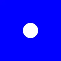

1
非常感谢!它完美无缺地运行。对于其他人的小提示是,记住“半径”必须以%为单位,而不是像素。 - emvaized

9

遮罩可以做到这一点,而且它可以与任何背景一起使用:

div {
  background: linear-gradient(blue, red);
  width: 200px;
  height: 200px;
  -webkit-mask: radial-gradient(50px, #0000 98%, #000);
          mask: radial-gradient(50px, #0000 98%, #000);
}
<div></div>

也可以添加动画效果:

div {
  background: linear-gradient(blue,red);
  width: 200px;
  height: 200px;
  -webkit-mask:
    radial-gradient(farthest-side,#000 98%,#0000) center/50px 50px no-repeat,
    linear-gradient(#000 0 0);
  -webkit-mask-composite:destination-out;
   
  mask:
    radial-gradient(farthest-side,#000 98%,#0000) center/50px 50px no-repeat,
    linear-gradient(#000 0 0);
  mask-composite:exclude;
  transition:0.5s;
}
div:hover {
  -webkit-mask-size:290px 290px,auto;
          mask-size:290px 290px,auto;
}
<div></div>


遮罩在动画方面要好得多!谢谢,伙计 ;) - PalmThreeStudio

6
你也可以使用 :after 伪元素的 box-shadow 来实现这个效果。

div {
  position: relative;
  width: 300px;
  height: 200px;
  overflow: hidden;
  background: url('http://planetcompas.com/live/wp-content/uploads/2013/04/2015-01-Beautiful-Planet-And-Space-4-Cool-Wallpapers-HD.jpg');
  background-size: cover;
  background-position: center;
}
div:after {
  width: 50px;
  height: 50px;
  content: '';
  border-radius: 50%;
  background: transparent;
  position: absolute;
  top: 50%;
  left: 50%;
  transform: translate(-50%, -50%);
  box-shadow: 0px 0px 0px 300px lightblue;
  transition: all 0.3s linear;
}
div:hover:after {
  opacity: 0;
}
<div></div>


1

SVG遮罩方案

使用圆形作为遮罩,其半径进行动画处理。

点击图像后将启动动画

<svg id="svg1" version="1.1" xmlns="http://www.w3.org/2000/svg" 
    xmlns:xlink="http://www.w3.org/1999/xlink"  width="300" height="300" viewBox="0 0 600 600" >  
     <defs>
         <!-- Multicolor radial gradient -->
     <radialGradient id="grad" x1="0" y1="0" x2="100%" y2="0">

        <stop offset="10%" stop-color="#48afc1" />
        <stop offset="10%" stop-color="#b4c63b" />
       <stop offset="20%" stop-color="#ef5b2b" />
       <stop offset="20%" stop-color="#503969" />
        <stop offset="30%" stop-color="#ab6294" />
        <stop offset="30%" stop-color="#1cb98f" />
        <stop offset="40%" stop-color="#48afc1" />
        <stop offset="40%" stop-color="#b4c63b" />
        <stop offset="50%" stop-color="#ef5b2b" />
        <stop offset="50%" stop-color="#503969" />  
        <stop offset="60%" stop-color="#ab6294" />
        <stop offset="60%" stop-color="#1cb98f" />
       <stop offset="70%" stop-color="#48afc1" />
        <stop offset="70%" stop-color="#b4c63b" />
        <stop offset="80%" stop-color="#ef5b2b" />
        <stop offset="80%" stop-color="#503969" />
        <stop offset="90%" stop-color="#ab6294" />
        <stop offset="90%" stop-color="#1cb98f" />
        <stop offset="100%" stop-color="#48afc1" />
     </radialGradient>
         <!-- Mask -->
     <mask id="msk1" > 
            <rect  width="100%" height="100%"  fill="black" /> 
             
       <circle cx="300" cy="300"  r="0" fill="white" >
            <!-- Animation of a mask cutting through the image of a dragon and showing a radial gradient  -->
         <animate attributeName="r" begin="svg1.click" dur="8s" values="0;300;300;0;0" fill="freeze" repeatCount="3" />
        </circle>
     </mask>
     </defs> 
               <!-- Radial gradient background image  -->
      <circle  cx="300" cy="300"  r="300"  fill="url(#grad)"  />  
                 
          <image xlink:href="https://istack.dev59.com/6kywq.webp" x="-140" y="-60" mask="url(#msk1)" width="800" height="780" />  

</svg>


0

基于Stranger in the Q的答案,我为这个问题创建了一个动态解决方案。

我的方法可以使用rem、em、px百分比,同时还可以在元素上使用属性。

function parseUnitsToPercent(str, divider){
  var match = str.match(/^calc\((.+)\);?$/);
  if(match){
    var val = [...match[1].matchAll(/((?:\d(?:\.\d)?)+(?:px|rem|em|%)?)(?:\s([\+|\-|\*|\/])\s)?/g)].map(e=>e.slice(1)).flat().filter(e=>!!e);
    val = val.map(e=>{
      if(['+','-','*','/'].includes(e)){
        return e;
      }
      return convertUnitsToPercent(e, divider);
    });
    try {
      str = eval(val.join(' '));
    } catch(e){
      str = 0;
    }
  }
  return convertUnitsToPercent(str, divider); 
}
function convertUnitsToPercent(str, divider){
  if(str.toString().endsWith('rem')) {
    str = parseFloat(str) * parseFloat(getComputedStyle(document.documentElement).fontSize) + 'px';
  }
  if(str.toString().endsWith('em')) {
    str = parseFloat(str) * parseFloat(getComputedStyle(elem).fontSize) + 'px';
  }
  if(str.toString().endsWith('px')) {
    str = parseFloat(str)/divider*100;
  }
  if(str.toString().endsWith('%')) {
    str = parseFloat(str);
  }
  return str;
}
document.querySelectorAll('[clip-x][clip-y][clip-size]').forEach(elem=>{
  if(elem.getAttribute('width')) elem.style.width = elem.getAttribute('width') + 'px';
  if(elem.getAttribute('height')) elem.style.height = elem.getAttribute('height') + 'px';
  var x = elem.getAttribute('clip-x');
  var y = elem.getAttribute('clip-y');
  var size = elem.getAttribute('clip-size');
  var elem_size = elem.getBoundingClientRect();
  x = parseUnitsToPercent(x, elem_size.width);
  y = parseUnitsToPercent(y, elem_size.height);
  var radius_x = parseUnitsToPercent(size, elem_size.width);
  var radius_y = parseUnitsToPercent(size, elem_size.height);
  var precision = parseFloat(elem.getAttribute('clip-precision') || 64);
  var c = [...Array(precision)].map((_, i) => {
    var a = -i/(precision-1)*Math.PI*2;
    var _x = Math.cos(a)*radius_x + x;
    var _y = Math.sin(a)*radius_y + y;
    return `${_x}% ${_y}%`
  });
  elem.style.clipPath = `polygon(100% 50%, 100% 100%, 0 100%, 0 0, 100% 0, 100% 50%, ${c.join(',')})`;
});
div {
  background: blue;
}
<div clip-x="50%" clip-y="calc(50% + 20px)" clip-size="50px" clip-precision="64" width="400" height="200"></div>

我知道这个问题很老了,但我发现它非常有用,所以我对它进行了修改。我决定与你分享我的结果。

我的代码也支持calc()(请注意:它使用eval(),这使得它对于用户输入的代码不安全!)


-2

你可以通过在 <div> 中添加元素来实现它。

我使用了 <span>。这是代码:

HTML

<div>
  <span></span>
</div>

CSS

div{
  background: blue;
  width: 200px;
  height: 200px;
  -webkit-clip-path: circle(50px at center);
  position:relative;
}
div span{
  position:absolute;
  display:block;
  width:30px;
  height:30px;
  border-radius:100%;
  background:#fff;
  top:50%;
  left:50%;
  transform:translate(-50%,-50%)
}

示例:https://jsfiddle.net/pm4yvbxn/2/

您还可以在 div 中使用 border-radius 来实现圆角边框。


抱歉,我可能没有表达清楚,我已经更新了问题,并附上了我所寻找的内容的图像。它是为了使剪辑路径在中心处打一个洞,而不仅仅显示div的中心部分。 - Rafty
这不是我的意思。我想要的是,剪辑路径不仅应该显示 div 的中心圆,而且还应该从 div 的中心剪切一个圆,以便除了中心圆之外的所有内容都可以显示出来。 - Rafty

网页内容由stack overflow 提供, 点击上面的
可以查看英文原文,
原文链接