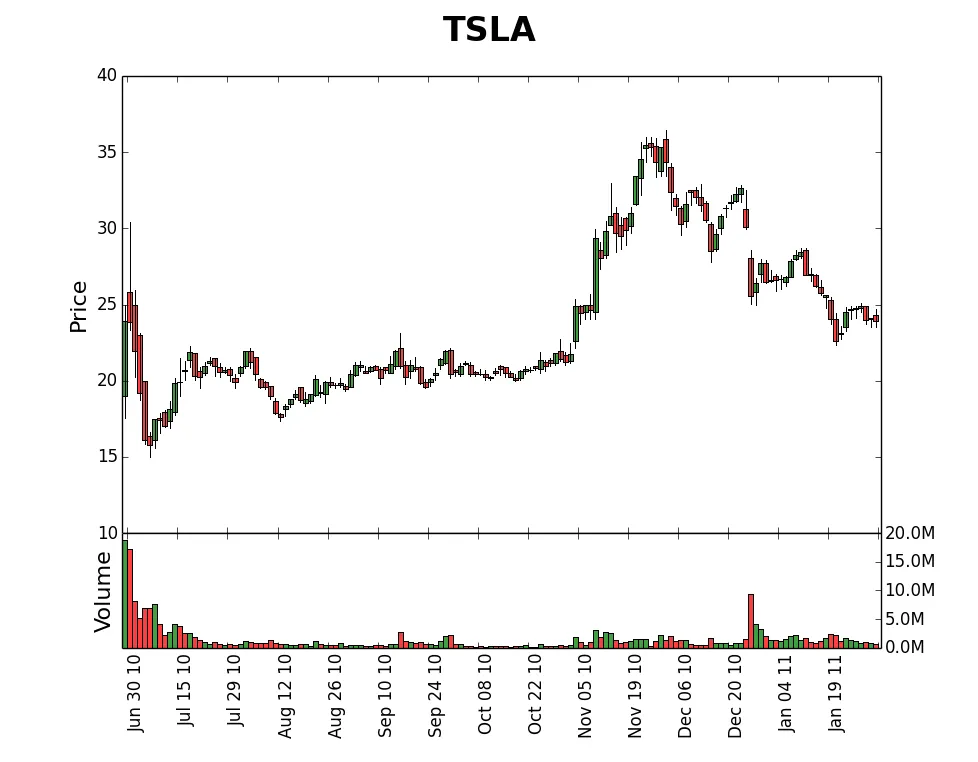
我尝试按照matplotlib文档创建股票价格-成交量图表。 我有一个问题,如何将主要刻度设置为每个月的第一天,将次要刻度设置为每天。我尝试了http://matplotlib.org/examples/pylab_examples/date_demo2.html,但是无法使其正常工作。 以下是我现在能够得到的最佳结果。有什么帮助吗?!
#!/usr/bin/env python

import matplotlib.pyplot as plt
from matplotlib.dates import DateFormatter, WeekdayLocator, MonthLocator, DayLocator, MONDAY
from matplotlib.finance import quotes_historical_yahoo, candlestick2, volume_overlay
from matplotlib import gridspec
from matplotlib.dates import num2date, IndexDateFormatter
from matplotlib.ticker import  IndexLocator, FuncFormatter

from operator import itemgetter

# (Year, month, day) tuples suffice as args for quotes_historical_yahoo
date1 = (2010, 2, 1)
date2 = (2011, 2, 1)

symbol = 'TSLA'

quotes = quotes_historical_yahoo(symbol, date1, date2)

if len(quotes) == 0:
    raise SystemExit

ds, opens, closes, highs, lows, volumes = zip(*quotes)

def get_locator():
    """
    the axes cannot share the same locator, so this is a helper
    function to generate locators that have identical functionality
    """
    return IndexLocator(10, 1)

formatter =  IndexDateFormatter(ds, '%b %d %y')

def millions(x, pos):
    'The two args are the value and tick position'
    return '%1.1fM' % (x*1e-6)

def thousands(x, pos):
    'The two args are the value and tick position'
    return '%1.1fK' % (x*1e-3)

millionformatter = FuncFormatter(millions)
thousandformatter = FuncFormatter(thousands)

#fig = plt.figure(figsize=(8, 6))

fig = plt.figure()
fig.subplots_adjust(bottom=0.15)
fig.subplots_adjust(hspace=0)
fig.suptitle(symbol, fontsize=24, fontweight='bold')

gs = gridspec.GridSpec(2, 1, height_ratios=[4, 1])

ax0 = plt.subplot(gs[0])

#candlestick(ax0, quotes, width=0.6)
candles = candlestick2(ax0, opens, closes, highs, lows, width=1, colorup='g')

ax0.xaxis.set_major_locator( get_locator() )
ax0.xaxis.set_major_formatter(formatter)
ax0.set_ylabel('Price', fontsize=16)

#ax0.xaxis_date()
#ax0.autoscale_view()

ax1 = plt.subplot(gs[1], sharex=ax0)

#vc = volume_overlay3(ax1, quotes, colorup='k', colordown='r', width=4, alpha=1.0)
#volume_overlay(ax1, opens, closes, volumes, colorup='g', alpha=0.5, width=1)
#ax1.set_xticks(ds)

vc = volume_overlay(ax1, opens, closes, volumes, colorup='g', alpha=0.5, width=1)
ax1.add_collection(vc)

#ax1.format_xdata = DateFormatter('%Y-%m-%d')

#maxvolume = max(quotes,key=itemgetter(5))[5]

#ax1.set_ylim([0, maxvolume])

ax1.xaxis.set_major_locator(get_locator())
ax1.xaxis.set_major_formatter(formatter)
ax1.yaxis.set_major_formatter(millionformatter)
ax1.yaxis.tick_right()
ax1.set_ylabel('Volume', fontsize=16)

#ax1.xaxis_date()
#ax1.autoscale_view()

plt.setp(ax0.get_xticklabels(), visible=False)
plt.setp(ax1.get_xticklabels(), rotation=90, horizontalalignment='left')

plt.show()
我得到的图片如下所示: