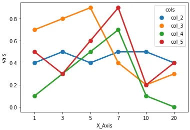
- 一些 seaborn 绘图可以接受宽形式的数据框,例如
sns.pointplot(data=df, x='X_Axis', y='col_2'),但不支持 sns.pointplot(data=df, x='X_Axis', y=['col_2', 'col_3']),因此最好将 DataFrame 转换为长形式。
- 使用
pandas.DataFrame.melt 将 DataFrame 从宽形式转换为长形式。
- 在
python 3.8.12、pandas 1.3.4、matplotlib 3.4.3、seaborn 0.11.2 版本中测试通过。
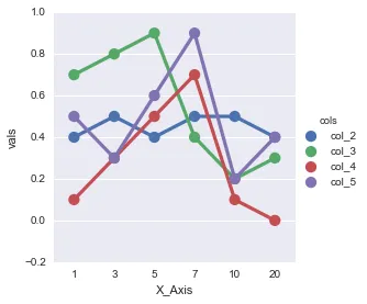
示例数据框
import pandas as pd
import seaborn as sns
df = pd.DataFrame({'X_Axis':[1,3,5,7,10,20],
'col_2':[.4,.5,.4,.5,.5,.4],
'col_3':[.7,.8,.9,.4,.2,.3],
'col_4':[.1,.3,.5,.7,.1,.0],
'col_5':[.5,.3,.6,.9,.2,.4]})
X_Axis col_2 col_3 col_4 col_5
0 1 0.4 0.7 0.1 0.5
1 3 0.5 0.8 0.3 0.3
2 5 0.4 0.9 0.5 0.6
3 7 0.5 0.4 0.7 0.9
4 10 0.5 0.2 0.1 0.2
5 20 0.4 0.3 0.0 0.4
dfm = df.melt('X_Axis', var_name='cols', value_name='vals')
X_Axis cols vals
0 1 col_2 0.4
1 3 col_2 0.5
2 5 col_2 0.4
3 7 col_2 0.5
4 10 col_2 0.5
当前的绘图方法
catplot: 图级别
使用seaborn.catplot和kind=(例如:kind='point'来复制FactorPlot的默认设置):
g = sns.catplot(x="X_Axis", y="vals", hue='cols', data=dfm, kind='point')
sns.pointplot(x="X_Axis", y="vals", hue='cols', data=dfm)
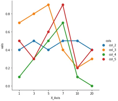
原始内容
factorplot: 在v0.9.0(2018年7月)被重命名为catplot
新版本的 seaborn 会有警告:
factorplot 函数已被改名为 catplot。原名称将在将来的版本中移除。请更新您的代码。请注意,catplot 中默认的 kind('strip')已替换factorplot中的'point'。
g = sns.factorplot(x="X_Axis", y="vals", hue='cols', data=dfm)