使用matplotlib从CSV文件创建多行图表

9

我已经尝试了几周,想要在同一张图上绘制来自一个.csv文件的3组(x, y)数据,但是一无所获。我的数据最初是一个Excel文件,我将它转换为了一个.csv文件,并使用pandas按照以下代码将其读入IPython中:

from pandas import DataFrame, read_csv
import pandas as pd
# define data location
df = read_csv(Location)
df[['LimMag1.3', 'ExpTime1.3', 'LimMag2.0', 'ExpTime2.0', 'LimMag2.5','ExpTime2.5']][:7]

我的数据格式如下:

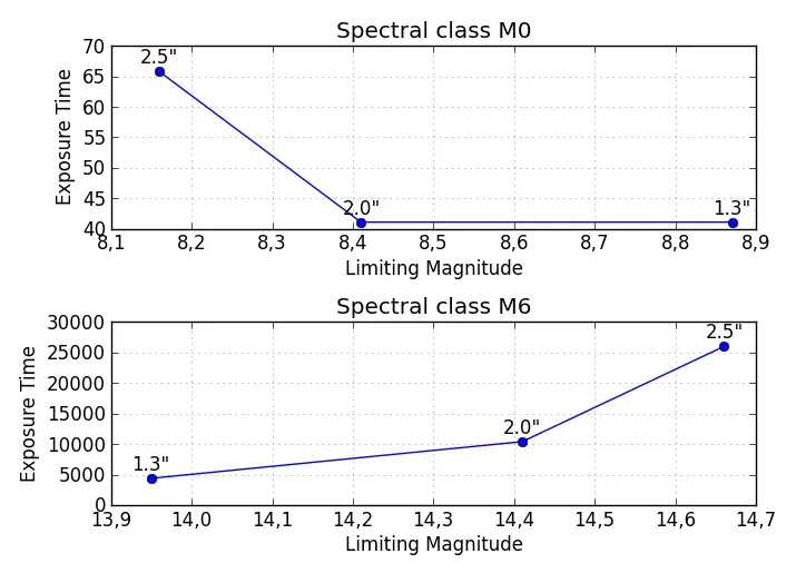
Type    mag1    time1   mag2    time2   mag3    time3

M0      8.87    41.11   8.41    41.11   8.16    65.78;

...

M6     13.95  4392.03  14.41 10395.13  14.66 25988.32

我想在同一张图上绘制 time1 vs mag1time2 vs mag2time3 vs mag3,但是实际上我得到的是 time.. vs Type 的图像。以下是代码:

df['ExpTime1.3'].plot()
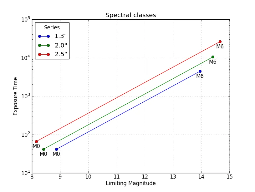
我希望在x轴上显示M0M6,在y轴上显示'ExpTime1.3''LimMag1.3'的关系。如何将这三个数据集合并为同一张图并进行绘制?

如何将M0M6标签应用到'LimMag..'值(也在x轴上)上?

尝试askewchan的解决方案后,未知原因没有返回任何绘图结果。我发现,如果我将数据框索引(df.index)更改为x轴的值(LimMag1.3),就可以得到ExpTimeLimMag的关系图像: df ['ExpTime1.3'] .plot() 。然而,这似乎意味着我必须通过手动输入所需x轴的所有值来将每个所需的x轴转换为数据框索引,以使其成为数据索引。我的数据非常多,这种方法太慢了,而且我只能一次绘制一个数据集,而我需要在同一张图上绘制每个数据集的所有3个系列。有没有办法解决这个问题?或者有人能提供一个原因和解决方案,解释为什么askewchan的解决方案没有任何绘图结果?

当我尝试代码的第一个版本时,没有产生任何绘图结果,甚至没有空白的图形。每次我输入其中一个ax.plot命令时,都会得到一种输出类型:[<matplotlib.lines.Line2D at 0xb5187b8>],但是当我输入命令plt.show()时就没有反应了。当我在askewchan的第二个解决方法的循环后输入plt.show()时,我会收到一个错误消息,说AttributeError:'function' object has no attribute 'show'

我对原始代码进行了一些微调,现在可以通过将索引设置为x轴(LimMag1.3),使用代码df['ExpTime1.3'][:7].plot()来绘制ExpTime1.3LimMag1.3之间的图表,但我无法将另外两组数据绘制在同一个图表上。我会感激您提供进一步的建议。我正在使用Anaconda 1.5.0 (64位)和Windows 7 (64位)上的spyder,python版本是2.7.4。


只是一个想法;在这种情况下,将M0-M6作为x轴标签没有实际意义,因为每个M..标签有三个不同的 LimMag..值,这意味着每个标签都必须在轴上放置三个不同的位置。这最终看起来会非常混乱,而不是信息丰富。 - sodd
plt被定义为什么?它不应该是一个“函数”对象。你熟悉使用matplotlib和pyplot吗? - askewchan
你好nordev,使用对数x轴的解决方案可能是最好的,减去末尾标签,因为它们不正确,即M0不是最低价值的光谱类。然而,当我尝试运行它时,我会收到一个关于范围的错误消息,因为“期望整数,但得到浮点数”。数据是小数,但我不知道如何修复它,以便它将期望浮点数,因为我不理解你的代码。 - user2324693
将您的.csv文件加载为变量df中的DataFrame后,在控制台中输入df,复制输出并粘贴到上面的问题中,这样我们就可以看到您的DataFrame是否被正确格式化(M0-M6是索引,而不是单独的列)。 - sodd
此外,在控制台中输入 df.columns,复制输出并粘贴到您的问题上方。 - sodd
显示剩余2条评论
2个回答

12

如果我理解你的问题正确,无论是从这个问题还是你在同一主题上的之前的问题中,以下内容应该是基本解决方案,您可以根据需要进行自定义。

多个子图:

请注意,此解决方案将在同一图中垂直输出与光谱类别(M0、M1等)数量相同的子图。如果您希望将每个光谱类别的绘图保存在单独的图中,则需要对代码进行一些修改。

import pandas as pd
from pandas import DataFrame, read_csv
import numpy as np
import matplotlib.pyplot as plt

# Here you put your code to read the CSV-file into a DataFrame df

plt.figure(figsize=(7,5)) # Set the size of your figure, customize for more subplots

for i in range(len(df)):
    xs = np.array(df[df.columns[0::2]])[i] # Use values from odd numbered columns as x-values
    ys = np.array(df[df.columns[1::2]])[i] # Use values from even numbered columns as y-values
    plt.subplot(len(df), 1, i+1)
    plt.plot(xs, ys, marker='o') # Plot circle markers with a line connecting the points
    for j in range(len(xs)):
        plt.annotate(df.columns[0::2][j][-3:] + '"', # Annotate every plotted point with last three characters of the column-label
                     xy = (xs[j],ys[j]),
                     xytext = (0, 5),
                     textcoords = 'offset points',
                     va = 'bottom',
                     ha = 'center',
                     clip_on = True)
    plt.title('Spectral class ' + df.index[i])
    plt.xlabel('Limiting Magnitude')
    plt.ylabel('Exposure Time')
    plt.grid(alpha=0.4)

plt.tight_layout()
plt.show()

enter image description here

同一坐标轴中按行分组(M0, M1, ...)

这是另一种解决方案,可以在同一坐标轴上绘制所有不同的谱类型,并使用图例标识不同的类别。 plt.yscale('log') 是可选的,但考虑到值跨越如此大范围,建议使用。

import pandas as pd
from pandas import DataFrame, read_csv
import numpy as np
import matplotlib.pyplot as plt

# Here you put your code to read the CSV-file into a DataFrame df

for i in range(len(df)):
    xs = np.array(df[df.columns[0::2]])[i] # Use values from odd numbered columns as x-values
    ys = np.array(df[df.columns[1::2]])[i] # Use values from even numbered columns as y-values
    plt.plot(xs, ys, marker='o', label=df.index[i])
    for j in range(len(xs)):
        plt.annotate(df.columns[0::2][j][-3:] + '"', # Annotate every plotted point with last three characters of the column-label
                     xy = (xs[j],ys[j]),
                     xytext = (0, 6),
                     textcoords = 'offset points',
                     va = 'bottom',
                     ha = 'center',
                     rotation = 90,
                     clip_on = True)

plt.title('Spectral classes')
plt.xlabel('Limiting Magnitude')
plt.ylabel('Exposure Time')

plt.grid(alpha=0.4)    
plt.yscale('log')
plt.legend(loc='best', title='Spectral classes')
plt.show()

按列分组放在同一坐标轴上 (1.3", 2.0", 2.5")

第三种解决方案如下所示,数据按系列(列1.3"、2.0"、2.5")分组而不是按光谱类型(M0, M1, ...)分组。这个例子很类似于@askewchan的解决方案。一个不同之处是这里的y轴是一个对数轴,使得线条几乎平行。

import pandas as pd
from pandas import DataFrame, read_csv
import numpy as np
import matplotlib.pyplot as plt

# Here you put your code to read the CSV-file into a DataFrame df

xs = np.array(df[df.columns[0::2]]) # Use values from odd numbered columns as x-values
ys = np.array(df[df.columns[1::2]]) # Use values from even numbered columns as y-values

for i in range(df.shape[1]/2): 
    plt.plot(xs[:,i], ys[:,i], marker='o', label=df.columns[0::2][i][-3:]+'"') 
    for j in range(len(xs[:,i])):
        plt.annotate(df.index[j], # Annotate every plotted point with its Spectral class
                     xy = (xs[:,i][j],ys[:,i][j]),
                     xytext = (0, -6),
                     textcoords = 'offset points',
                     va = 'top',
                     ha = 'center',
                     clip_on = True)

plt.title('Spectral classes')
plt.xlabel('Limiting Magnitude')
plt.ylabel('Exposure Time')

plt.grid(alpha=0.4)    
plt.yscale('log')
plt.legend(loc='best', title='Series')
plt.show()

在这里输入图片描述


你好nordev,如上所述,我想使用第三个选项,但不需要M标签。省略'j'循环后,我使用'i'循环获得了一个线性图。然而,当我运行'plt.title'时,我的图形消失了,只剩下一个空框。运行其余代码会导致错误消息:C:\Anaconda\lib\site-packages\matplotlib\axes.py:4601: UserWarning: No labeled objects found. Use label='...' kwarg on individual plots.warnings.warn("No labeled objects found. ",尽管在'i'循环运行后有数据的线性图中,却呈现出一个漂亮格式的网格,但没有数据。 - user2324693
关于我的图表最终没有数据的评论,我认为问题可能与代码(label=df.columns [0 :: 2] [i] [-3]+ '"')有关,因为如果我省略它,就不会出现“找不到标记对象”的错误,但是一旦我输入标题和x,y标签或将y轴更改为对数,仍然没有数据。然而,我不知道问题可能是什么,也不知道如何解决。 - user2324693
@user2324693 关于你所说的情节被“擦除”:上述代码必须被“保存为脚本”,然后运行,因为该代码使用状态机接口而不是面向对象接口。为了仅将绘图限制在M0-M6中,请将 plt.plot(xs[:,i], ys[:,i]...) 更改为 plt.plot(xs[0:6,i], ys[0:6,i]...) - sodd
关于“df.shape [1]”的索引错误:我确实会得到一个错误“轴1的索引3超出了大小为3的范围”。 我不知道这是什么意思,但似乎并没有造成任何问题,因为代码的其余部分运行良好,并且在Python控制台中生成的图表看起来很好。 如果我改为“df.shape [1] / 2”,则会出现“期望整数,而得到浮点数”的错误,并且当我运行您的脚本的其余部分时,图表中没有数据。 无论我使用哪种形式的“df.shape”,在ipython控制台中最终图表中都没有数据。 - user2324693
你的 DataFrame 格式可能有问题。请查看我在你的帖子下面的评论。 - sodd
显示剩余14条评论

3

你可以在同一个图中三次调用pyplot.plot(time,mag)。最好给它们加上标签,就像这样:

import matplotlib.pyplot as plt

...
fig = plt.figure()
ax = fig.add_subplot(111)
ax.plot(df['LimMag1.3'], df['ExpTime1.3'], label="1.3")
ax.plot(df['LimMag2.0'], df['ExpTime2.0'], label="2.0")
ax.plot(df['LimMag2.5'], df['ExpTime2.5'], label="2.5")
plt.show()

如果你想循环执行它,可以这样做:
fig = plt.figure()
ax = fig.add_subplot(111)
for x,y in [['LimMag1.3', 'ExpTime1.3'],['LimMag2.0', 'ExpTime2.0'], ['LimMag2.5','ExpTime2.5']]:
    ax.plot(df[x], df[y], label=y)
plt.show()

嗨,askewchan,非常感谢你的帮助,但仍然似乎有问题。我运行了你提供的两个代码,尽管没有返回任何错误,但没有显示图表。是否缺少一行代码,即在ax.plot命令和plt.show()命令之间应该插入一些代码?我强烈感觉ipython正在等待其他输入,但我完全不知道那可能是什么。 - user2324693
@user2324693 如果您的DataFrame“df”格式正确,则@askewchan的代码应该完美运行。至少我使用他的代码(pandas 0.11.0和matplotlib 1.2.1)创建图表没有任何问题。 - sodd
@askewchan,你的图表是“反向”的,也就是说,'ExpTime..' 应该在 y 轴上,而 'LimMag..' 应该在 x 轴上。 - sodd
@user2324693 我不确定是什么原因导致的。由于nordev似乎能够使其正常工作,我不知道如何重现这个问题(我没有pandas)。 - askewchan
1
谢谢@nordev,我习惯于时间在x轴上:P - askewchan
显示剩余8条评论

网页内容由stack overflow 提供, 点击上面的
可以查看英文原文,
原文链接