如何在R中为每一列绘制密度曲线?

8

我有一个数据框 w,像这样:

>head(w,3)
         V1        V2         V3        V4 V5        V6         V7        V8        V9       V10 V11        V12        V13        V14
1 0.2446884 0.3173719 0.74258410 0.0000000  0 0.0000000 0.01962759 0.0000000 0.0000000 0.5995647   0 0.30201691 0.03109935 0.16897571
2 0.0000000 0.0000000 0.08592243 0.2254971  0 0.7381867 0.11936323 0.2076167 0.0000000 1.0587742   0 0.50226734 0.51295661 0.01298853
3 8.4293893 4.9985040 2.22526463 0.0000000  0 3.6600283 0.00000000 0.0000000 0.2573714 0.8069288   0 0.05074886 0.00000000 0.59403855
         V15       V16      V17       V18      V19       V20       V21      V22         V23        V24       V25       V26       V27
1 0.00000000 0.0000000 0.000000 0.1250837 0.000000 0.5468143 0.3503245 0.000000 0.183144204 0.23026538 6.9868429 1.5774150 0.0000000
2 0.01732732 0.8064441 0.000000 0.0000000 0.000000 0.0000000 0.0000000 0.000000 0.015123385 0.07580794 0.6160713 0.7452335 0.0740328
3 2.66846151 0.0000000 1.453987 0.0000000 1.875298 0.0000000 0.0000000 0.893363 0.004249061 0.00000000 1.6185897 0.0000000 0.7792773
        V28 V29     V30       V31        V32        V33       V34       V35 V36        V37        V38       V39        V40    refseq
1 0.5543028   0 0.00000 0.0000000 0.08293075 0.18261450 0.3211127 0.2765295   0 0.04230929 0.05017316 0.3340662 0.00000000 NM_000014
2 0.0000000   0 0.00000 0.0000000 0.00000000 0.03531411 0.0000000 0.4143325   0 0.14894716 0.58056304 0.3310173 0.09162460 NM_000015
3 0.8047882   0 0.88308 0.7207709 0.01574767 0.00000000 0.0000000 0.1183736   0 0.00000000 0.00000000 1.3529881 0.03720155 NM_000016

dim(w)
[1] 37126    41

我尝试在一页中绘制每列(最后一列除外)的密度曲线。看起来ggplot2可以实现这个目标。

我按照这篇帖子的方法进行了尝试:

ggplot(data=w[,-41], aes_string(x=colnames)) + geom_density()

但是像这样抱怨是没有用的:
Error in as.character(x) : 
  cannot coerce type 'closure' to vector of type 'character'

我不确定如何将这个数据框的格式转换为ggplot2可以接受的格式。或者在R中有其他方法可以完成这项工作吗?
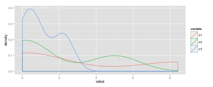

2
你需要将数据使用 melt() 函数转换为长格式,这里的问题展示了如何实现:https://dev59.com/zG035IYBdhLWcg3wVuh1#5481187 - Chase
4个回答

9

ggplot需要您的数据以长格式呈现,如下所示:

variable  value
1 V1  0.24468840
2 V1  0.00000000
3 V1  8.42938930
4 V2  0.31737190

一旦它被融合成一个长数据框,您可以按变量对所有密度图进行分组。在下面的代码片段中,ggplot使用w.plot数据框进行绘图(不需要省略最后一个refseq变量)。您可以修改它以使用不同的颜色、填充等外观效果。
w <- as.data.frame(cbind(
  c(0.2446884, 0.0000000, 8.4293893), 
  c(0.3173719, 0.0000000, 4.9985040), 
  c(0.74258410, 0.08592243, 2.22526463)))
w$refseq <- c("NM_000014", "NM_000015", "NM_000016")

library(ggplot2)
library(reshape2)
w.plot <- melt(w) 

p <- ggplot(aes(x=value, colour=variable), data=w.plot)
p + geom_density()

Example plot


我有一个类似的问题。在我的情况下,我有1000列没有标题名称(所以在R中它们被称为“X1”,“X2”等)。如果我执行melt(df),我会得到一个错误Using X404, X755, X974 as id variables Error in match.names(clabs, names(xi)) : names do not match previous names。我该如何解释这个错误? - Sander W. van der Laan
啊!我使用read_table2来加载数据 - 非常快的解决方案。但它将数据转换为tibble,而不是data.frame。因此,如果我将其转换为data.frame,它就可以工作了! - Sander W. van der Laan

5
使用“reshape”包中的“melt”函数(也可以使用基本的reshape函数,但它是一个更复杂的调用)。
require (reshape)
require (ggplot2)
long = melt(w, id.vars= "refseq")

ggplot(long, aes (value)) +
    geom_density(color = variable)

# or maybe you wanted separate plots on the same page?

ggplot(long, aes (value)) +
    geom_density() +
    facet_wrap(~variable)

还有很多其他的绘图方法可以在ggplot中使用:请参见http://docs.ggplot2.org/0.9.3.1/geom_histogram.html了解示例。


1
你在这里使用的“refseq”是什么意思? - kira
@kira 在OP的数据集中,这是第41列,唯一不是数字的列(看起来像是NCBI参考序列数据库http://www.ncbi.nlm.nih.gov/refseq/上的基因接入号,但作为ID列也是一个很好的猜测)。 - janattack

2
这里有一个使用plot函数和一个简单循环的解决方案。
调用你的图表:
plot(density(df[,1]), type = "n")

然后运行以下命令以添加这些行

n = dim(df)[2]-1
for(i in 1:n){
lines(density(c(df[,i])))
}

0

这将创建一个 8 x 5 的密度图网格,每个图上有多条线,颜色由变量 refseq 决定...

library(tidyverse)

w_density <- w[,1:40]  # columns you want densities for
w_density$refseq <- w$refseq  # maybe you have a variable to group by

w_density %>%
    pivot_longer(!refseq, names_to = "variable", values_to = "value") %>%
    ggplot(aes(x = value, colour = refseq)) +
    geom_density(show.legend = TRUE) + 
    facet_wrap(~variable, scales = "free", ncol = 5) + 
    ggtitle("Title goes here")

如果网格不是正确的大小,并且您正在使用Rmd,则可以调整块的大小...
```{r, fig.height=20, fig.width=11}

网页内容由stack overflow 提供, 点击上面的
可以查看英文原文,
原文链接