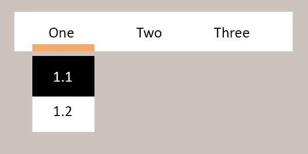
CSS菜单和子菜单之间的间距

12

我想要做的是:

在这里输入图片描述

如果你注意到菜单和子菜单之间有空格。

问题在于这种方式子菜单不起作用,因为当鼠标指针离开菜单时,子菜单会消失。

只有以下方式才能正常工作:

在这里输入图片描述

如何保留菜单和子菜单之间的空格并使其正常工作?

我的代码:

JSFIDDLE 代码

HTML:

<body>
<nav>
    <ul>
        <li><a href="#">One</a>
            <ul>
                <li><a href="1.html">1.1</a></li>
                <li><a href="2.html">1.2</a>
            </ul>
        </li>
        <li><a href="#">Two</a>
            <ul>
                <li><a href="3.html">2.1</a></li>
                <li><a href="4.html">2.2</a></li>
                <li><a href="5.html">2.3</a></li>
            </ul>
        </li>
        <li><a href="#">Three</a>
            <ul>
                <li><a href="6.html">3.1</a></li>
                <li><a href="7.html">3.2</a></li>
            </ul>
        </li>
        <li><a href="8.html">Four</a></li>
    </ul>
</nav>
</body>

CSS:

body {
    background-color: #cac3bc
}
nav {
    float: left;
}
nav ul ul {
    display: none;
}
nav ul li:hover > ul {
    display: block;
}
nav ul {
    background-color: #fff;
    margin-top: 10px;
    padding: 0 20px;  
    list-style: none;
    position: relative;
    display: inline-table;
    margin-right: -80px;
}
nav ul li {
    float: left;
}
nav ul li:hover {
    border-bottom: 5px solid #f5aa65;
    color: #fff;
}
nav ul li a:hover {
    color: #000;
}

nav ul li a {
    display: block; 
    padding: 15px 15px;
    font-family: 'PT Sans', sans-serif;
    color: #000; 
    text-decoration: none;
}
nav ul ul {
    background-color:#fff;
    border-radius: 0px; 
    padding: 0;
    position: absolute;
    top: 100%;
    box-shadow: 0px 0px 9px rgba(0,0,0,0.15);
}
nav ul ul li {
    float: none; 
    position: relative;
}
nav ul ul li a {
    padding: 15px 40px;
    color: #000;
}

这些答案有帮助到您吗?请通过点赞或选择正确答案来告诉我们。 - Fillip Peyton
2个回答

29

您可以使用:before来扩大“可悬停”区域:

nav ul ul:before {
    content: "";
    display: block;
    height: 20px;
    position: absolute;
    top: -20px;
    width: 100%;
}

查看这个演示。


0

接受的答案非常简单而完美。然而,我想为像我这样不得不使用上面答案变体的其他人添加一个替代方案。在我的情况下,我的子菜单是全宽的,所以我对我的子菜单进行绝对定位,从主菜单下方开始 - 我引入:before元素来增加100px的间隙。因此,我的:before代码是

// Define the 100px gap between menu and submenu.
        &:hover ul.sub-menu:before {
            content: "";
            display: block;
            //Note: This height starts at the top:100% of the position absolute for the ul.sub-menu below, 
            //pushing the sub-menu down by the height defined here.
            height: 100px;
            width: 100%;
            background-color: transparent;
        }

将子菜单放在主菜单下方并且占满宽度的代码是:

   &:hover ul.sub-menu {
            background-color: transparent;
            display: block;
            position: absolute;
            border-top: 10px solid red;
            top: 100%;
            left: 0;
            width: 100%;
            // Sub-menu appears on top of main menu.
            z-index: 1;
enter code here

网页内容由stack overflow 提供, 点击上面的
可以查看英文原文,
原文链接