在网格图像中使用精灵表的CSS动画(而不是行)

10
我正在尝试给一个精灵图像添加动画效果,找到了这个很棒的例子:

博客:http://simurai.com/blog/2012/12/03/step-animation/ (已经失效)
Wayback Machine:http://web.archive.org/web/20140208085706/http://simurai.com/blog/2012/12/03/step-animation/
代码演示:https://codepen.io/simurai/pen/tukwj

JSFiddle:http://jsfiddle.net/simurai/CGmCe/

.hi {
width: 50px;
height: 72px;
background-image: url("http://s.cdpn.io/79/sprite-steps.png");

-webkit-animation: play .8s steps(10) infinite;
   -moz-animation: play .8s steps(10) infinite;
    -ms-animation: play .8s steps(10) infinite;
     -o-animation: play .8s steps(10) infinite;
        animation: play .8s steps(10) infinite; }

@-webkit-keyframes play { from { background-position: 0px; } to { background-position: -500px; } }

@-moz-keyframes play { from { background-position: 0px; } to { background-position: -500px; } }

@-ms-keyframes play { from { background-position: 0px; } to { background-position: -500px; } }

@-o-keyframes play { from { background-position: 0px; } to { background-position: -500px; } }

@keyframes play { from { background-position: 0px; } to { background-position: -500px; } }

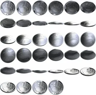
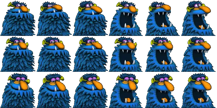
我想做同样的事情,但是使用一个方形(2的幂大小)图像集而不是动画带。例如,这个:

square image atlas

3个回答

32

由于这可能是一项难以调试的任务,我想从同样的问题开始,但在更易于调试的环境中进行。

我选择将其作为整个图像上的矩形动画来完成。

.hi {
    width: 320px;
    height: 315px;
    background-image: url("http://i.stack.imgur.com/CjMscm.jpg");
    position: relative;
    border: solid 1px black;
}

.hi:before {
    content: "";
    position: absolute;
    width: 100%;
    height: 53px;
    left: 0px;
    top: 0px;
    border: solid 1px red;
    -webkit-animation: playv 18s steps(6) infinite; 
}

@-webkit-keyframes playv {
     0% { top:   0px; }
   100% { top: 315px; }
}

.hi:after {
    content: "";
    position: absolute;
    width: 53px;
    height: 100%;
    left: 266px;
    top: 0px;
    border: solid 1px red;
    -webkit-animation: playh 3s steps(6) infinite; 
}

@-webkit-keyframes playh {
     0% { left:   0px; }
   100% { left: 320px; }
}
<div class="hi">
</div>

在图片上,我展示了两个伪元素,一个是行选择器,另一个是列选择器。然后我调整动画,直到它们完美。


现在,让我们验证同时设置两个动画是否有效:

.hi {
    width: 320px;
    height: 315px;
    background-image: url("http://i.stack.imgur.com/CjMscm.jpg");
    position: relative;
    border: solid 1px black;
}

.hi:before {
    content: "";
    position: absolute;
    width: 53px;
    height: 53px;
    left: 0px;
    top: 0px;
    border: solid 1px red;
    -webkit-animation: playv 18s steps(6) infinite, playh 3s steps(6) infinite; 
}

@-webkit-keyframes playv {
     0% { top:   0px; }
   100% { top: 315px; }
}

@-webkit-keyframes playh {
     0% { left:   0px; }
   100% { left: 320px; }
}
<div class="hi">
</div>


现在是最终项目:

.hi {
  width: 53px;
  height: 53px;
  background-image: url("http://i.stack.imgur.com/CjMscm.jpg");
  position: relative;
  border: solid 1px black;
  -webkit-animation: playv 1s steps(6) infinite, playh 0.1667s steps(6) infinite;
  animation: playv 1s steps(6) infinite, playh 0.1667s steps(6) infinite;
}

@-webkit-keyframes playv {
  0% {
    background-position-y: 0px;
  }
  100% {
    background-position-y: -315px;
  }
}

@-webkit-keyframes playh {
  0% {
    background-position-x: 0px;
  }
  100% {
    background-position-x: -320px;
  }
}

@keyframes playv {
  0% {
    background-position-y: 0px;
  }
  100% {
    background-position-y: -315px;
  }
}

@keyframes playh {
  0% {
    background-position-x: 0px;
  }
  100% {
    background-position-x: -320px;
  }
}
<div class="hi">
</div>

所有这些都是针对Webkit浏览器的,需要删除IE和FF的前缀。 此外,在这种方法中,无法避免在左下角显示2个空白图像。如果您没有完整的网格,并且不想显示空白图像,则需要逐一指定所有关键帧。


1
请问您能告诉我们如何逐一指定所有关键帧吗? - Alex Stanese
这个解决方案在Firefox中不起作用,因为它不支持background-position-xbackground-position-y - Daniel Batalla
谢谢您提供的好主意@vals。我只有显示空白空间的空框架。而且在IE 11中动画效果不同,有什么想法吗? - Ana DEV
我注意到所有的样式都是用-webkit-前缀来完成的。所以,IE可能会有问题。我已经修改了最后一段代码; 现在应该可以工作了。 - vals
非常好的回答,附带实用的例子,帮助我正确地达成了我的目标...非常感谢你的实验性红色移动网格...你绝对是一个非常棒的程序员,具有很强的技术感。 - Usman Arshad
显示剩余4条评论

6
请使用background-position-x和background-position-y属性代替。
对于这张图片。

preview

大小为710px × 355px

精灵帧大小为118.333px X 118.333px,我们需要水平移动6个帧和垂直移动3个帧。

这意味着我们需要创建两个单独的关键帧动画来遍历每个方向。当x方向动画播放时,其他方向必须冻结,直到它完成。

此外,y动画的持续时间必须是3倍。

以下是代码

<div class="hi"></div>


.hi {
  width: 118.333px;
  height: 118.333px;
  background-image: url("http://www.fore6.com/wp-content/uploads/2011/09/henson11-hp-1g.png");
  animation: playX 1s steps(6) infinite,
             playY 3s steps(3) infinite;
}

@keyframes playX {
  from {background-position-x: 0px;}
  to {background-position-x: -710px;}
}

@keyframes playY {
  from {background-position-y: 0px;}
  to {background-position-y: -355px;}
}

在这里弄个小提琴


非常感谢您提供的精彩示例。我在使用IE 11打开时对动画有不同的看法。有什么想法吗?似乎它不会动画x或y坐标。感谢@Uday Hiwarale。 - Ana DEV

0
为了帮助理解它的工作原理,这里提供一个通用的 SCSS 解决方案,除了 @vals 给出的答案之外:jsfiddle link SCSS:
// Variables to edit
$imgUrl: 'https://mrbubblewand.files.wordpress.com/2009/08/magic_001.png';
$imageWidth: 960px;
$imageHeigth: 1152px;
$itemNbColumns: 5;
$itemNbLines: 6;
$spriteAnimationTime: 1s;


// =======================================

$squareWidth: $imageWidth / $itemNbColumns;
$squareHeigth: $imageHeigth / $itemNbLines;

// ========================================

.square {
    width: $squareWidth;
    height: $squareHeigth;
    background-image: url($imgUrl);
    position: relative;
    border: solid 1px black;
    -webkit-animation: playvsquare $spriteAnimationTime*$itemNbColumns*$itemNbLines steps($itemNbLines) infinite, playhsquare $spriteAnimationTime*$itemNbColumns steps($itemNbColumns) infinite; 
}

@-webkit-keyframes playvsquare {
     0% { background-position-y:   0px; }
   100% { background-position-y: -$imageHeigth; }
}

@-webkit-keyframes playhsquare {
     0% { background-position-x:   0px; }
   100% { background-position-x: -$imageWidth; }
}

// =======================================

.sprite {
    width: $imageWidth;
    height: $imageHeigth;
    background-image: url($imgUrl);
    position: relative;
    border: solid 1px black;
}

.sprite:before {
    content: "";
    position: absolute;
    width: 100%;
    height: $squareHeigth; /* taille du carré */
    left: 0px;
    top: 0px;
    border: solid 1px red;
    -webkit-animation: playvsprite$spriteAnimationTime*$itemNbColumns*$itemNbLines steps($itemNbLines) infinite; 
}

.sprite:after {
    content: "";
    position: absolute;
    width: $squareWidth;
    height: 100%;
    left: $squareWidth;
    top: 0px;
    border: solid 1px red;
    -webkit-animation: playhsprite $spriteAnimationTime*$itemNbColumns steps($itemNbColumns) infinite; 
}

// Déplacement
@-webkit-keyframes playvsprite {
     0% { top:   0px; }
   100% { top: $imageHeigth; }
}
// Déplacement
@-webkit-keyframes playhsprite {
     0% { left:   0px; }
   100% { left: $imageWidth; }
}

HTML:

<p>Square :</p>
<div class="square"></div>
<p>Entire sprite :</p>
<div class="sprite"></div>

网页内容由stack overflow 提供, 点击上面的
可以查看英文原文,
原文链接