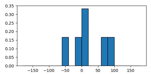
我正在为一个研究项目尝试使用Seaborn制作一些直方图。我希望y轴是相对频率,x轴从-180到180运行。
这是我用于其中一个直方图的代码:
import pandas as pd
from matplotlib import pyplot as plt
%matplotlib inline
import seaborn as sns

df = pd.read_csv('sample.csv', index_col=0)

x = df.Angle
sns.distplot(x, kde=False);
这将输出:
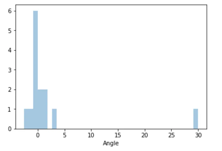 我无法弄清如何将输出转换为频率而不是计数。我尝试了许多不同类型的图表来获得频率输出,但一无所获。我也看到了这个问题,它似乎在countplot with frequencies(但使用另一个函数)的要求。我尝试使用它作为指南,但失败了。任何帮助将不胜感激。我非常新手,对这个软件和Python也不熟悉。
我的数据看起来像下面这样,可以下载:
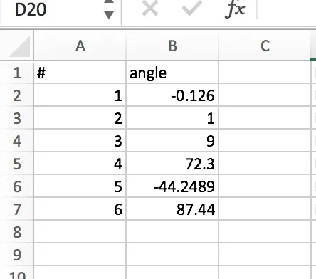
df = pd.DataFrame({'number': [1,2,3,4,5,6], 'angle': [-0.126, 1, 9, 72.3, -44.2489, 87.44]})。 - 3novak