“时间模式”解释了所有网格中时间序列的主要时间变化,它由PCA的“主成分”(PCs,一系列时间序列)表示。在R中,对于最重要的PC PC1,可以使用
prcomp(data)$x[,'PC1']。
“空间模式”解释了PCs如何依赖某些变量(在您的情况下是地理位置),并且它由每个主成分的“载荷”表示。例如,对于PC1,它是
prcomp(data)$rotation[,'PC1']。
以下是使用您的数据在R中构建时空数据的PCA并显示时间变化和空间异质性的示例。
首先,必须将数据转换为带有变量(空间网格)和观测值(yyyy-mm)的数据框。
加载和转换数据:
load('spei03_df.rdata')
str(spei03_df) # the time dimension is saved as names (in yyyy-mm format) in the list
lat <- spei03_df$lat # latitude of each values of data
lon <- spei03_df$lon # longitude
rainfall <- spei03_df
rainfall$lat <- NULL
rainfall$lon <- NULL
date <- names(rainfall)
rainfall <- t(as.data.frame(rainfall)) # columns are where the values belong, rows are the times
为了理解数据,需要在地图上绘制1950年1月份的数据:
library(mapdata)
library(ggplot2)
drawing <- function(data, map, lonlim = c(-180,180), latlim = c(-90,90)) {
major.label.x = c("180", "150W", "120W", "90W", "60W", "30W", "0",
"30E", "60E", "90E", "120E", "150E", "180")
major.breaks.x <- seq(-180,180,by = 30)
minor.breaks.x <- seq(-180,180,by = 10)
major.label.y = c("90S","60S","30S","0","30N","60N","90N")
major.breaks.y <- seq(-90,90,by = 30)
minor.breaks.y <- seq(-90,90,by = 10)
panel.expand <- c(0,0)
drawing <- ggplot() +
geom_path(aes(x = long, y = lat, group = group), data = map) +
geom_tile(data = data, aes(x = lon, y = lat, fill = val), alpha = 0.3, height = 2) +
scale_fill_gradient(low = 'white', high = 'red') +
scale_x_continuous(breaks = major.breaks.x, minor_breaks = minor.breaks.x, labels = major.label.x,
expand = panel.expand,limits = lonlim) +
scale_y_continuous(breaks = major.breaks.y, minor_breaks = minor.breaks.y, labels = major.label.y,
expand = panel.expand, limits = latlim) +
theme(panel.grid = element_blank(), panel.background = element_blank(),
panel.border = element_rect(fill = NA, color = 'black'),
axis.ticks.length = unit(3,"mm"),
axis.title = element_text(size = 0),
legend.key.height = unit(1.5,"cm"))
return(drawing)
}
map.global <- fortify(map(fill=TRUE, plot=FALSE))
dat <- data.frame(lon = lon, lat = lat, val = rainfall["1950-01",])
sample_plot <- drawing(dat, map.global, lonlim = c(-180,180), c(-90,90))
ggsave("sample_plot.png", sample_plot,width = 6,height=4,units = "in",dpi = 600)
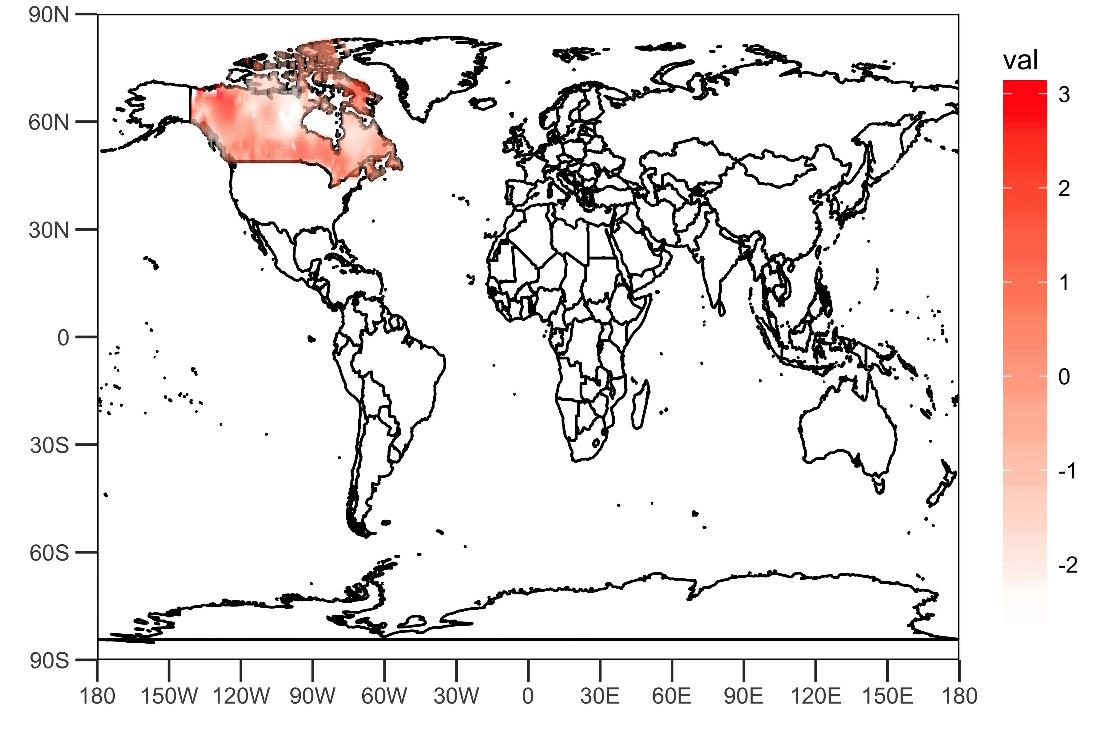
如上图所示,该链接提供的网格化数据包含代表加拿大降雨(某些指数?)的值。
主成分分析:
PCArainfall <- prcomp(rainfall, scale = TRUE)
summaryPCArainfall <- summary(PCArainfall)
summaryPCArainfall$importance[,c(1,2)]
这表明前两个主成分解释了降雨数据方差的10.5%和9.2%。
我提取了前两个主成分的载荷和PC时间序列本身:
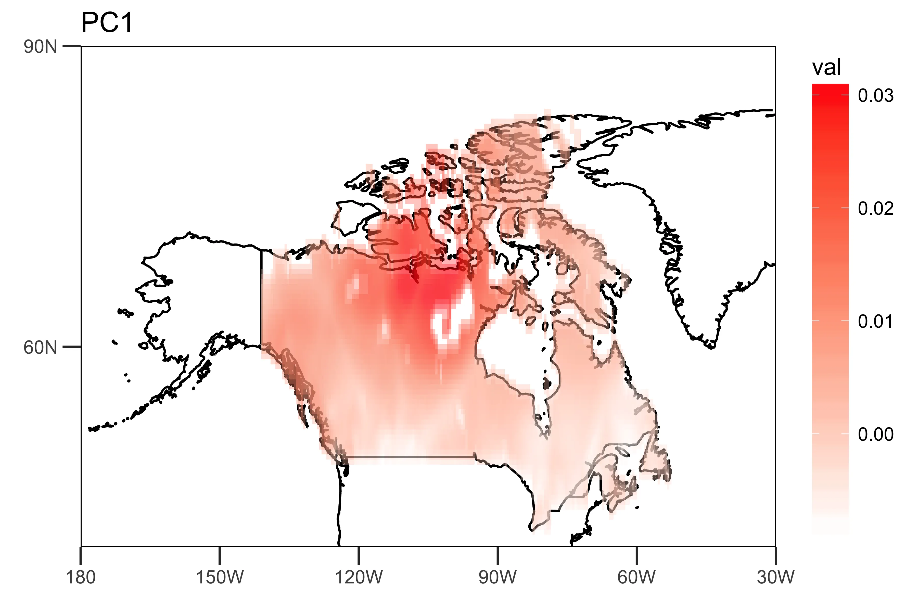
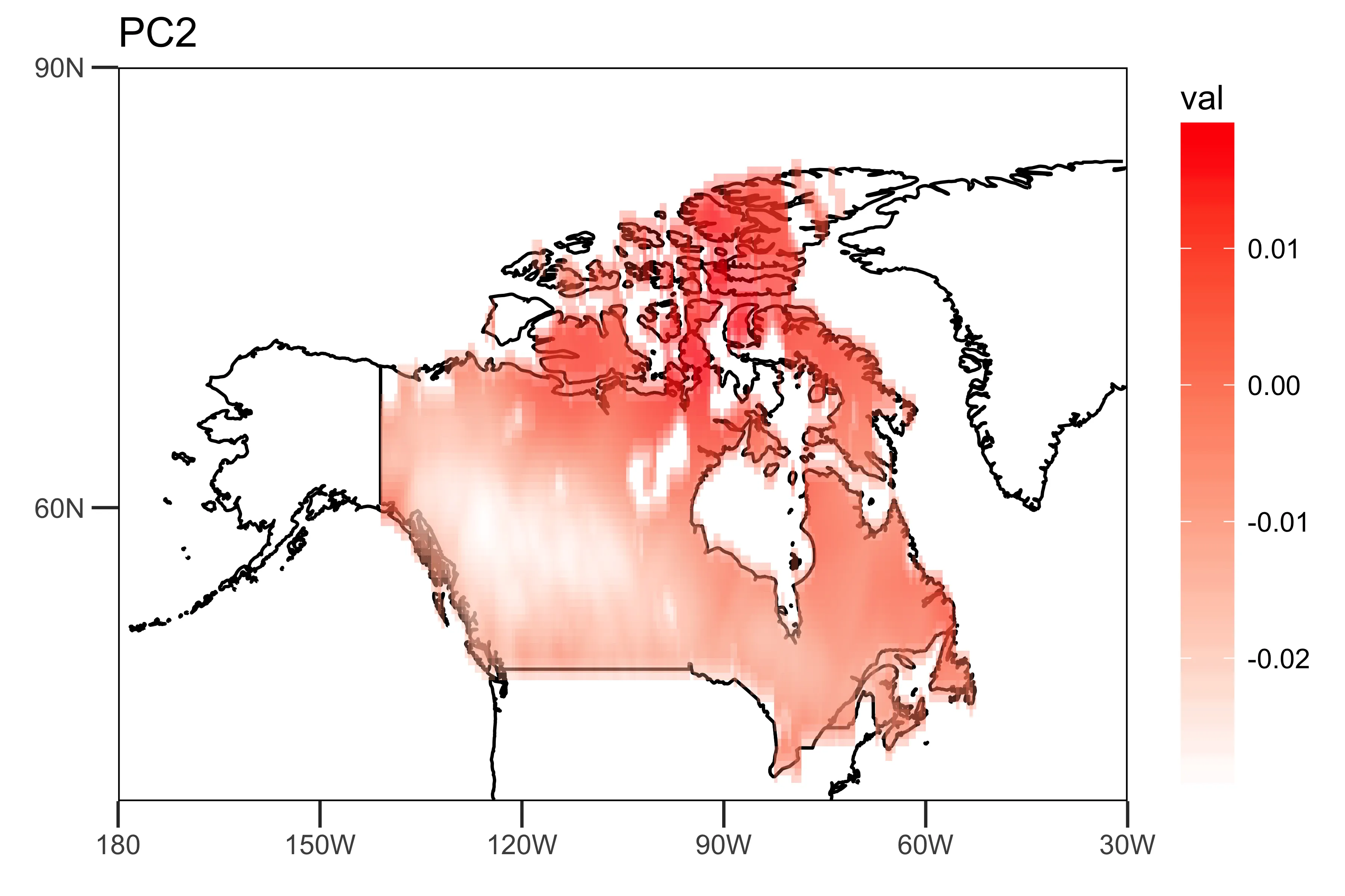
“空间模式”(载荷)显示趋势强度的空间异质性(PC1和PC2)。
loading.PC1 <- data.frame(lon=lon,lat=lat,val=PCArainfall$rotation[,'PC1'])
loading.PC2 <- data.frame(lon=lon,lat=lat,val=PCArainfall$rotation[,'PC2'])

drawing.loadingPC1 <- drawing(loading.PC1,map.global, lonlim = c(-180,-30), latlim = c(40,90)) + ggtitle("PC1")
drawing.loadingPC2 <- drawing(loading.PC2,map.global, lonlim = c(-180,-30), latlim = c(40,90)) + ggtitle("PC2")

ggsave("loading_PC1.png",drawing.loadingPC1,width = 6,height=4,units = "in",dpi = 600)
ggsave("loading_PC2.png",drawing.loadingPC2,width = 6,height=4,units = "in",dpi = 600)
“时间模式”,即前两个主成分的时间序列,显示了数据的主要时间趋势。
library(xts)
PC1 <- ts(PCArainfall$x[,'PC1'],start=c(1950,1),end=c(2014,12),frequency = 12)
PC2 <- ts(PCArainfall$x[,'PC2'],start=c(1950,1),end=c(2014,12),frequency = 12)
png("PC-ts.png",width = 6,height = 4,res = 600,units = "in")
plot(as.xts(PC1),major.format = "%Y-%b", type = 'l', ylim = c(-100, 100), main = "PC")
lines(as.xts(PC2),col='blue',type="l")
dev.off()
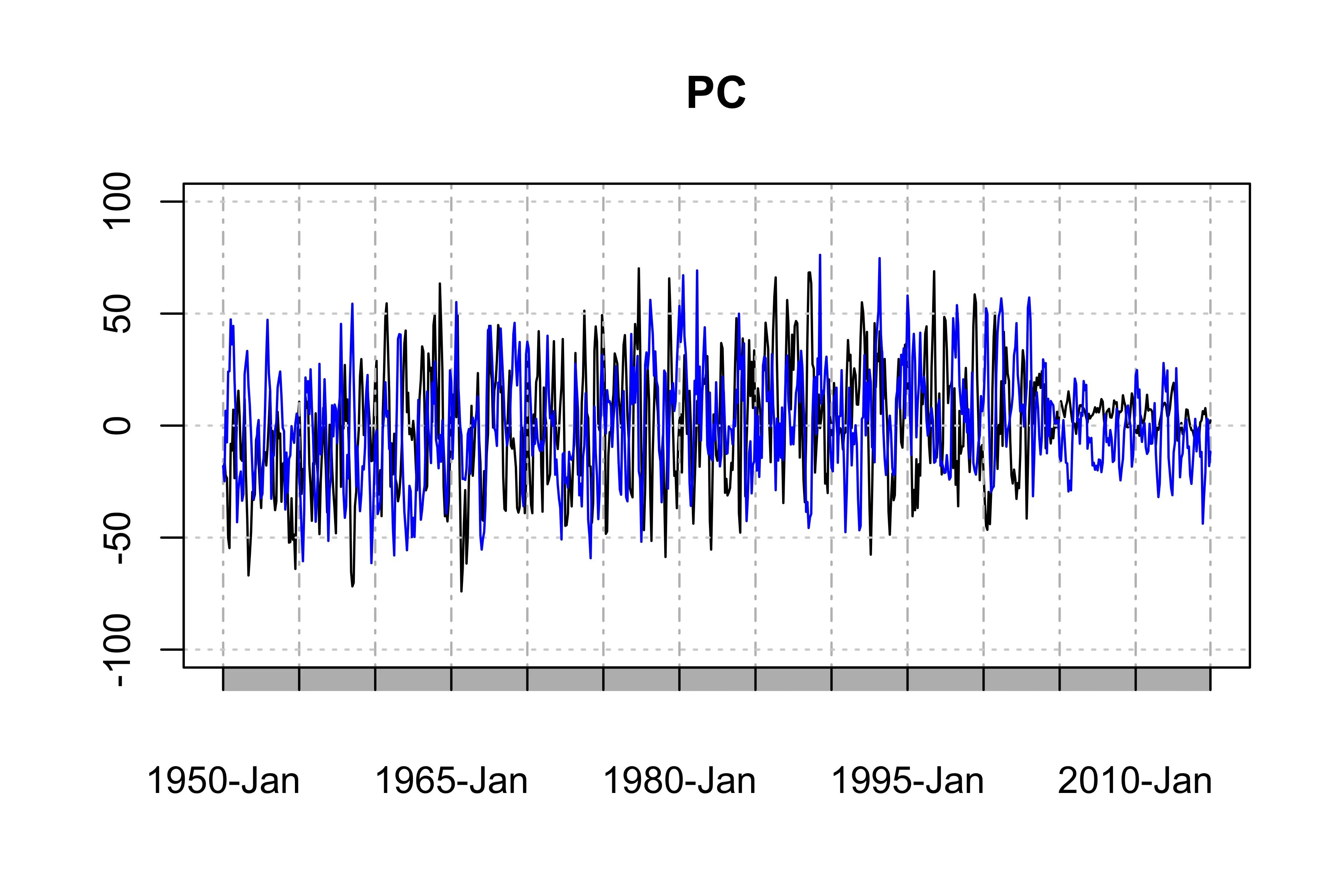
然而,这个例子并不是适用于您的数据的最佳主成分分析(PCA)方法,因为PC1和PC2具有严重的季节性和年度变化(当然,夏天下雨更多,而PC尾部也较弱)。
您可以通过去除数据的季节性或使用回归去除年度趋势来改善PCA分析结果,正如文献中所建议的那样。但这已经超出了我们的讨论范围。