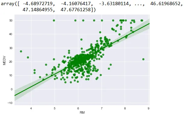
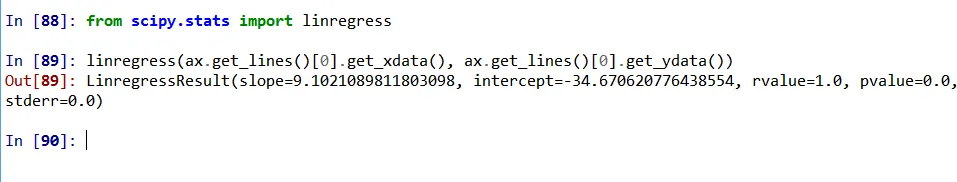
我尝试使用OLS拟合波士顿数据集。我的图表如下所示。
如何在直线上方或图表的某个位置注释线性回归方程?如何在Python中打印方程?
我对这个领域还比较新。目前正在探索Python。如果有人能帮助我,将加快我的学习曲线。
如何在直线上方或图表的某个位置注释线性回归方程?如何在Python中打印方程?
我对这个领域还比较新。目前正在探索Python。如果有人能帮助我,将加快我的学习曲线。
import seaborn as sns
import matplotlib.pyplot as plt
from scipy import stats

tips = sns.load_dataset("tips")

# get coeffs of linear fit
slope, intercept, r_value, p_value, std_err = stats.linregress(tips['total_bill'],tips['tip'])

# use line_kws to set line label for legend
ax = sns.regplot(x="total_bill", y="tip", data=tips, color='b',
 line_kws={'label':"y={0:.1f}x+{1:.1f}".format(slope,intercept)})

# plot legend
ax.legend()

plt.show()
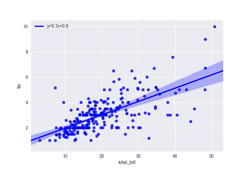
如果你使用更复杂的拟合函数,你可以使用 LaTeX 公式:https://matplotlib.org/users/usetex.html
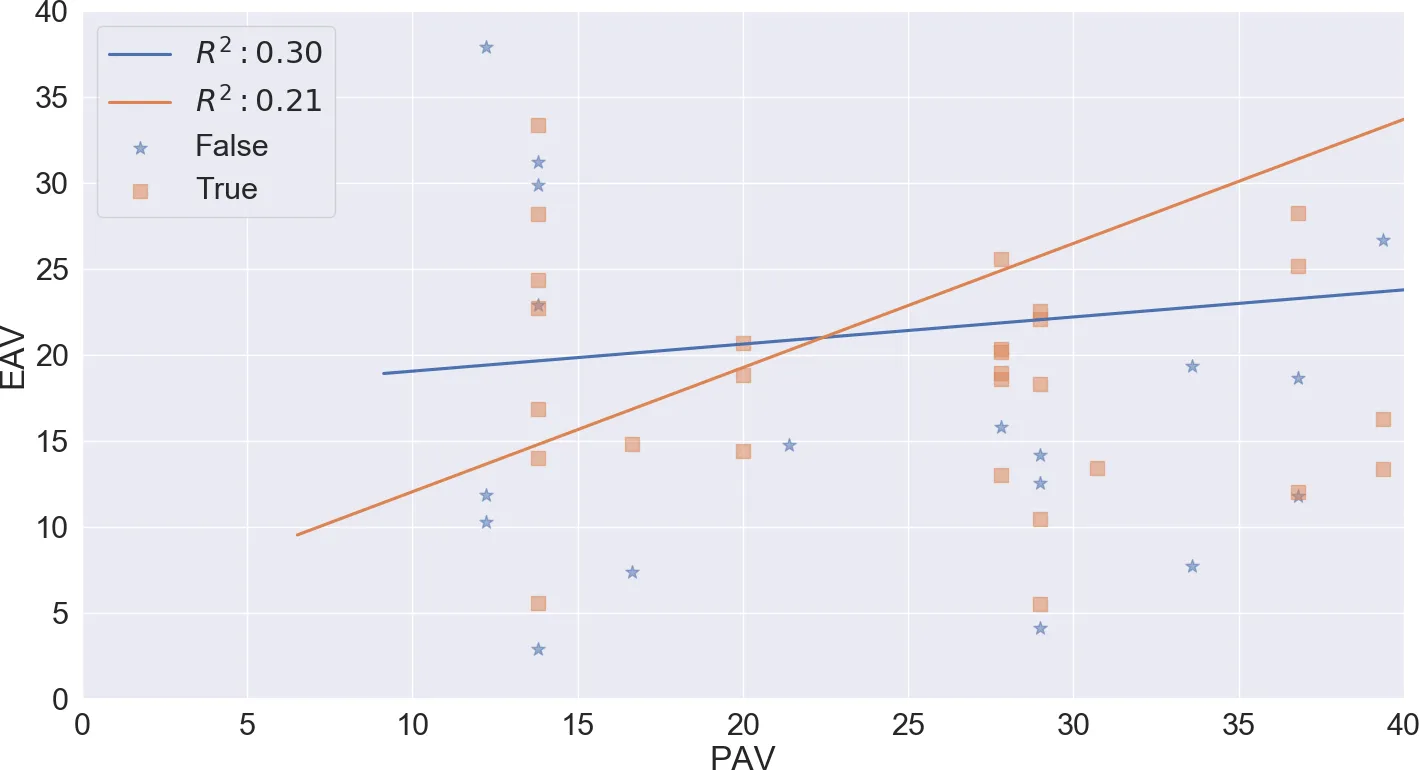
如果使用 seaborn 的 lmplot,要注释多个线性回归线,可以采取以下方法。
 import pandas as pd
 import seaborn as sns
 import matplotlib.pyplot as plt

df = pd.read_excel('data.xlsx')
# assume some random columns called EAV and PAV in your DataFrame
# assume a third variable used for grouping called "Mammal" which will be used for color coding
p = sns.lmplot(x=EAV, y=PAV,
        data=df, hue='Mammal',
        line_kws={'label':"Linear Reg"}, legend=True)

ax = p.axes[0, 0]
ax.legend()
leg = ax.get_legend()
L_labels = leg.get_texts()
# assuming you computed r_squared which is the coefficient of determination somewhere else
slope, intercept, r_value, p_value, std_err = stats.linregress(df['EAV'],df['PAV'])
label_line_1 = r'$y={0:.1f}x+{1:.1f}'.format(slope,intercept)
label_line_2 = r'$R^2:{0:.2f}$'.format(0.21) # as an exampple or whatever you want[!
L_labels[0].set_text(label_line_1)
L_labels[1].set_text(label_line_2)
    import seaborn as sns
    import matplotlib.pyplot as plt
    from scipy import stats

    slope, intercept, r_value, pv, se = stats.linregress(df['alcohol'],df['magnesium'])

    sns.regplot(x="alcohol", y="magnesium", data=df,
      ci=None, label="y={0:.1f}x+{1:.1f}".format(slope, intercept)).legend(loc="best")
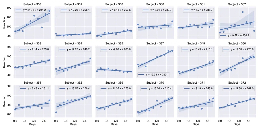
我扩展了@RMS的解决方案,使其适用于多面板lmplot示例(使用睡眠剥夺研究(Belenky等人,J Sleep Res 2003)中的数据,在pydataset中可用)。这样可以在不使用例如regplot和plt.subplots的情况下具有轴特定的图例/标签。
编辑:根据这里Marcos的答案建议,添加了使用FacetGrid()的map_dataframe()方法的第二种方法。
import numpy as np
import scipy as sp
import pandas as pd
import seaborn as sns
import pydataset as pds
import matplotlib.pyplot as plt

# use seaborn theme
sns.set_theme(color_codes=True)

# Load data from sleep deprivation study (Belenky et al, J Sleep Res 2003)
#  ['Reaction', 'Days', 'Subject'] = [reaction time (ms), deprivation time, Subj. No.]
df = pds.data("sleepstudy")
# convert integer label to string
df['Subject'] = df['Subject'].apply(str)

# perform linear regressions outside of seaborn to get parameters
subjects = np.unique(df['Subject'].to_numpy())
fit_str = []
for s in subjects:
    ddf = df[df['Subject'] == s]
    m, b, r_value, p_value, std_err = \
        sp.stats.linregress(ddf['Days'],ddf['Reaction'])
    fs = f"y = {m:.2f} x + {b:.1f}"
    fit_str.append(fs)

method_one = False
method_two = True
if method_one:
    # Access legend on each axis to write equation
    #
    # Create 18 panel lmplot with seaborn
    g = sns.lmplot(x="Days", y="Reaction", col="Subject",
                   col_wrap=6, height=2.5, data=df,
                   line_kws={'label':"Linear Reg"}, legend=True)
    # write string with fit result into legend string of each axis
    axes = g.axes # 18 element list of axes objects
    i=0
    for ax in axes:
        ax.legend()  # create legend on axis
        leg = ax.get_legend()
        leg_labels = leg.get_texts()
        leg_labels[0].set_text(fit_str[i])
        i += 1
elif method_two:
    # use the .map_dataframe () method from FacetGrid() to annotate plot
    #  https://dev59.com/cl8e5IYBdhLWcg3wlbTx (answer by @Marcos)
    #
    # Create 18 panel lmplot with seaborn
    g = sns.lmplot(x="Days", y="Reaction", col="Subject",
                   col_wrap=6, height=2.5, data=df)
    def annotate(data, **kws):
        m, b, r_value, p_value, std_err = \
            sp.stats.linregress(data['Days'],data['Reaction'])
        ax = plt.gca()
        ax.text(0.5, 0.9, f"y = {m:.2f} x + {b:.1f}",
                horizontalalignment='center',
                verticalalignment='center',
                transform=ax.transAxes)
    g.map_dataframe(annotate)

# write figure to pdf
plt.savefig("sleepstudy_data_w-fits.pdf")
输出结果(方法1):
输出结果(方法2):
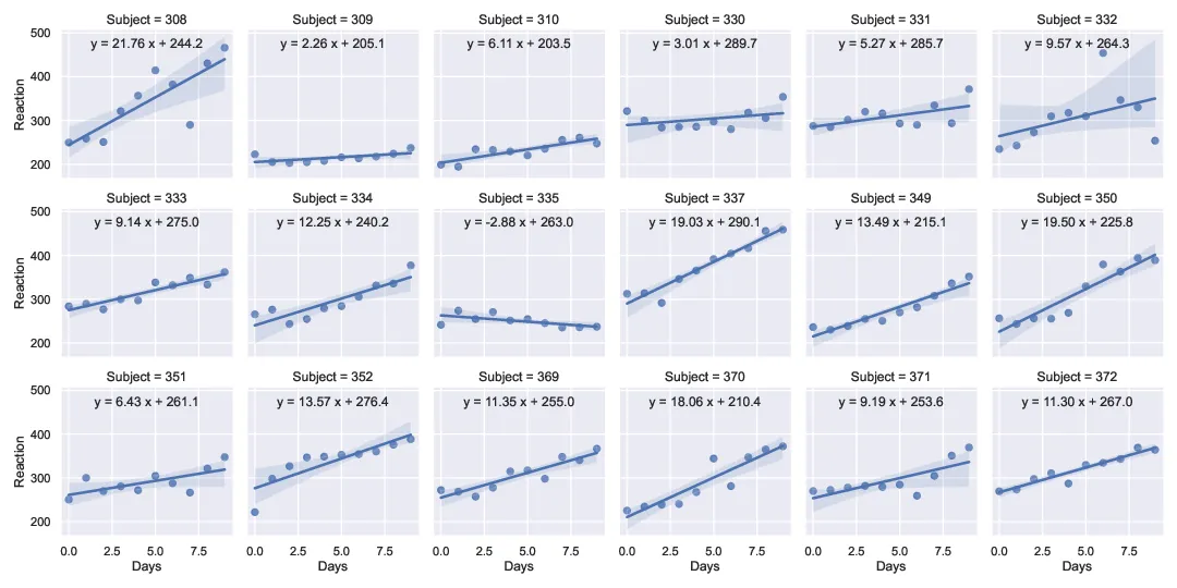
更新于2022-05-11:与绘图技术无关,事实证明这些数据的解释是错误的(例如在原始R存储库中提供的解释)。请参见此处报告的问题。适合进行的拟合应该是从第2到第9天,对应于零到七天的睡眠剥夺(每晚3小时睡眠)。前三个数据点对应于训练和基线天数(每晚8小时睡眠)。