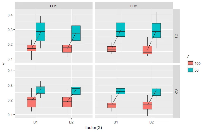
我想在我的箱线图中的“mean”之间添加线条。
我的代码:
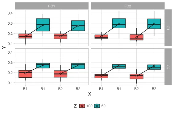
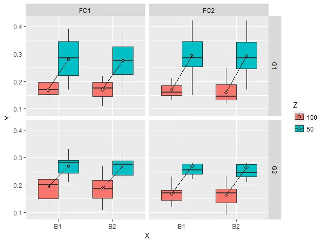
我有以下内容:
我的代码:
library(ggplot2)
library(ggthemes)
Gp=factor(c(rep("G1",80),rep("G2",80)))
Fc=factor(c(rep(c(rep("FC1",40),rep("FC2",40)),2)))
Z <-factor(c(rep(c(rep("50",20),rep("100",20)),4)))
Y <- c(0.19 , 0.22 , 0.23 , 0.17 , 0.36 , 0.33 , 0.30 , 0.39 , 0.35 , 0.27 , 0.20 , 0.22 , 0.24 , 0.16 , 0.36 , 0.30 , 0.31 , 0.39 , 0.33 , 0.25 , 0.23 , 0.13 , 0.16 , 0.18 , 0.20 , 0.16 , 0.15 , 0.09 , 0.18 , 0.21 , 0.20 , 0.14 , 0.17 , 0.18 , 0.22 , 0.16 , 0.14 , 0.11 , 0.18 , 0.21 , 0.30 , 0.36 , 0.40 , 0.42 , 0.26 , 0.23 , 0.25 , 0.30 , 0.27 , 0.15 , 0.29 , 0.36 , 0.38 , 0.42 , 0.28 , 0.23 , 0.26 , 0.29 , 0.24 , 0.17 , 0.24 , 0.14 , 0.17 , 0.16 , 0.15 , 0.21 , 0.19 , 0.15 , 0.16 , 0.13 , 0.25 , 0.12 , 0.15 , 0.15 , 0.14 , 0.21 , 0.20 , 0.13 , 0.14 , 0.12 , 0.29 , 0.29 , 0.29 , 0.24 , 0.21 , 0.23 , 0.25 , 0.33 , 0.30 , 0.27 , 0.31 , 0.27 , 0.28 , 0.25 , 0.22 , 0.23 , 0.23 , 0.33 , 0.29 , 0.28 , 0.12 , 0.28 , 0.22 , 0.19 , 0.22 , 0.14 , 0.15 , 0.15 , 0.21 , 0.25 , 0.11 , 0.27 , 0.22 , 0.17 , 0.21 , 0.15 , 0.16 , 0.15 , 0.20 , 0.24 , 0.24 , 0.25 , 0.36 , 0.24 , 0.34 , 0.22 , 0.27 , 0.26 , 0.23 , 0.28 , 0.24 , 0.23 , 0.36 , 0.23 , 0.35 , 0.21 , 0.25 , 0.26 , 0.23 , 0.28 , 0.24 , 0.23 , 0.09 , 0.16 , 0.16 , 0.14 , 0.18 , 0.18 , 0.18 , 0.12 , 0.22 , 0.23 , 0.09 , 0.17 , 0.15 , 0.13 , 0.17 , 0.19 , 0.17 , 0.11)
X <- factor(c(rep(c(rep("B1",10),rep("B2",10)),8)))
DATA=data.frame(Y,X,Z,Fc,Gp)
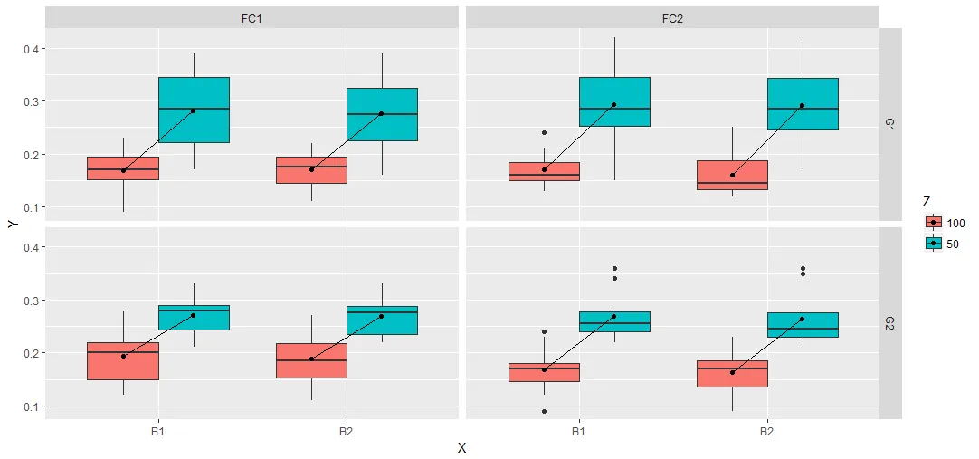
p <- qplot(X, Y, data=DATA, geom="boxplot", fill=Z, na.rm = TRUE,
outlier.size = NA, outlier.colour = NA) +
facet_grid(Gp ~ Fc)+ theme_light()+scale_colour_gdocs()+
theme(legend.position="bottom") +
stat_summary(fun.y=mean, geom="point", shape=23, position = position_dodge(width = .75))
我有以下内容:
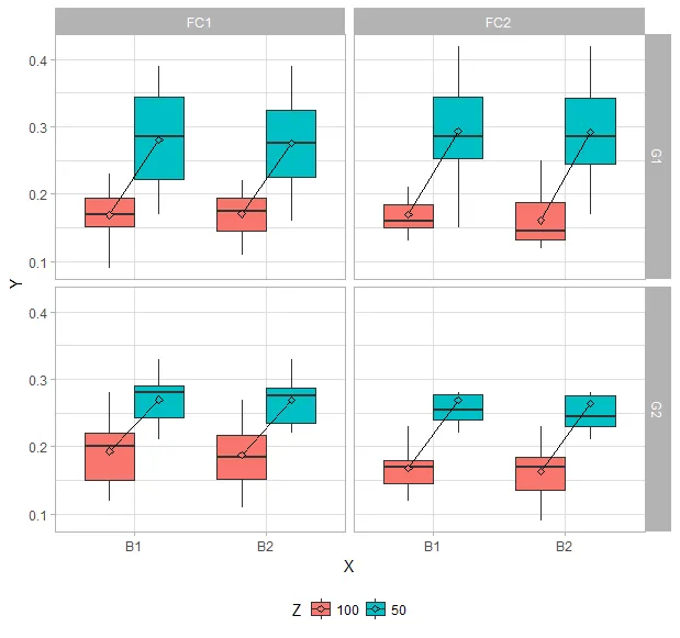
我期望的图表是:
我尝试过这个方法:
p + stat_summary(fun.y=mean, geom="line", aes(group = factor(Z)))
并且这个
p + stat_summary(fun.y=mean, geom="line", aes(group = factor(X)))
但是以上方法都没有奏效。相反,我收到了以下错误提示信息:
geom_path: 每个组仅包含一个观察值。您是否需要调整组的美学风格? geom_path: 每个组仅包含一个观察值。您是否需要调整组的美学风格? geom_path: 每个组仅包含一个观察值。您是否需要调整组的美学风格? geom_path: 每个组仅包含一个观察值。您是否需要调整组的美学风格?
感谢您的帮助!