如何在Matplotlib中制作四向对数图?

11

四向对数图是用于振动控制和地震保护的常用图形。我很感兴趣知道如何在 Matplotlib 中绘制这个图形,而不是在 Inkscape 中添加轴。一个 Four-way 对数图的样例在此处 Four-way logarithmic plot

一个简单但不完美的 Python 代码可以生成图形的主要部分,但我无法在图中添加两个轴。这个链接http://matplotlib.org/examples/axes_grid/demo_curvelinear_grid.html提供了一个关于如何添加轴的例子,但我试了没成功。有没有人有类似的经验可以在 Matplotlib 图形上添加轴?

from pylab import *
from  mpl_toolkits.axisartist.grid_helper_curvelinear import GridHelperCurveLinear
from mpl_toolkits.axisartist import Subplot
beta=logspace(-1,1,500)
Rd={}
for zeta in [0.01,0.1,0.2,0.7,1]:
    Rd[zeta]=beta/sqrt((1-beta*beta)**2+(2*beta*zeta)**2)
    loglog(beta,Rd[zeta])
ylim([0.1,10])
xlim([0.1,10])
grid('on',which='minor')

我的绘图

更新:谢谢大家!我用Inkscape修改了上面的图。我认为结果还不错。然而,我仍在寻找使用Matplotlib绘制此图的方法。 Inkscape修改


你是想生成特定的图形,还是想绘制数据并获得这种输出(刻度标签样式、网格线、轴范围、对角轴刻度上的文本标签等),或者你正在寻找一些自动创建漂亮的图形的工具,无论你要绘制什么数据? - Noah Hafner
我正在寻找如何自由地操纵坐标轴、刻度和标签的方法。我对Matplotlib默认生成的坐标轴不是很满意,特别是Axes3D。实际上,我曾经在Matplotlib中问过一个关于3D坐标轴的问题,但似乎没有人对这个话题感兴趣。这个问题只是操纵Matplotlib中坐标轴的一个例子。 - Kattern
在这个问题的背景下,您希望使用额外的轴来绘图吗? - Noah Hafner
是的,从去年的pycon大会上,我看到他们正在玩坐标轴。因此,我认为我也可以使其工作。但实际上,要完成这些事情仍然非常棘手。 - Kattern
2个回答

2

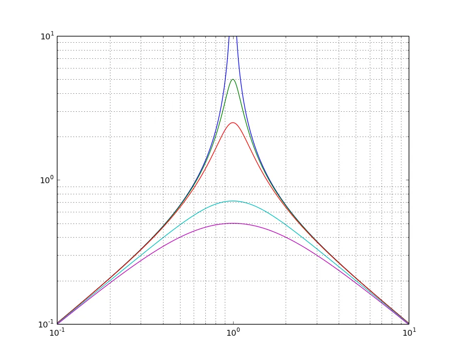
这里有一个部分的解决方案。我仍在研究如何在自然的loglog()图中完成所有操作,而不是缩放数据。(要完成此示例,您需要定义自定义刻度标签,以便它们显示10**x而不是x。)

%matplotlib inline                   # I am doing this in an IPython notebook.
from matplotlib import pyplot as plt
import numpy as np
from numpy import log10

# Generate the data
beta = np.logspace(-1, 1, 500)[:, None]
zeta = np.array([0.01,0.1,0.2,0.7,1])[None, :]
Rd = beta/np.sqrt((1 - beta*beta)**2 + (2*beta*zeta)**2)

def draw(beta=beta, Rd=Rd):
    plt.plot(log10(beta), log10(Rd))
    plt.ylim([log10(0.1), log10(10)])
    plt.xlim([log10(0.1), log10(10)])
    plt.grid('on',which='minor')
    ax = plt.gca()
    ax.set_aspect(1)

from mpl_toolkits.axisartist import GridHelperCurveLinear
from matplotlib.transforms import Affine2D
from mpl_toolkits.axisartist import SubplotHost
from mpl_toolkits.axisartist import Subplot

#tr = Affine2D().rotate(-np.pi/2)
#inv_tr = Affine2D().rotate(np.pi/2)

class Transform(object):
    """Provides transforms to go to and from rotated grid.

    Parameters
    ----------
    ilim : (xmin, xmax, ymin, ymax)
       The limits of the displayed axes (in physical units)
    olim : (xmin, xmax, ymin, ymax)
       The limits of the rotated axes (in physical units)
    """
    def __init__(self, ilim, olim):
        # Convert each to a 3x3 matrix and compute the transform
        # [x1, y1, 1] = A*[x0, y0, 1]
        x0, x1, y0, y1 = np.log10(ilim)
        I = np.array([[x0, x0, x1],
                      [y0, y1, y1],
                      [ 1,  1,  1]])

        x0, x1, y0, y1 = np.log10(olim)
        x_mid = (x0 + x1)/2
        y_mid = (y0 + y1)/2
        O = np.array([[   x0, x_mid, x1],
                      [y_mid,    y1, y_mid],
                      [    1,     1,     1]])
        self.A = np.dot(O, np.linalg.inv(I))
        self.Ainv = np.linalg.inv(self.A)

    def tr(self, x, y):
        """From "curved" (rotated) coords to rectlinear coords"""
        x, y = map(np.asarray, (x, y))
        return np.dot(self.A, np.asarray([x, y, 1]))[:2]

    def inv_tr(self, x, y):
        """From rectlinear coords to "curved" (rotated) coords"""
        x, y = map(np.asarray, (x, y))
        return np.dot(self.Ainv, np.asarray([x, y, 1]))[:2]
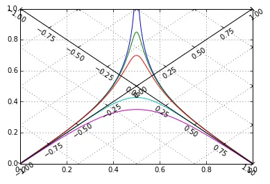
ilim = (0.1, 10)
olim = (0.01, 100)
tr = Transform(ilim + ilim, olim + olim)

grid_helper = GridHelperCurveLinear((tr.tr, tr.inv_tr))

fig = plt.gcf()
ax0 = Subplot(fig, 1, 1, 1)
ax1 = Subplot(fig, 1, 1, 1, grid_helper=grid_helper, frameon=False)
ax1.set_xlim(*np.log10(olim))
ax1.set_ylim(*np.log10(olim))
ax1.axis["left"] = ax1.new_floating_axis(0, 0.)
ax1.axis["bottom"] = ax1.new_floating_axis(1, 0.0)
fig.add_subplot(ax0)
fig.add_subplot(ax1)
ax0.grid('on', which='both')
ax1.grid('on', which='both')

plt.plot(log10(beta), log10(Rd))
plt.ylim(np.log10(ilim))
plt.xlim(np.log10(ilim))

Output


2

这似乎比应该的要麻烦一些。有方法可以将脊柱(轴线)居中,还有方法可以旋转它们,但这两者不能同时使用。在线上添加一个普通轴(a la mpl demos)会导致曲线轴(因为它是对数的)。这里是一个[不好的]示例,显示如何绘制--如同您使用Inkscape绘制额外的一对轴脊柱,并附上示例数据。

import matplotlib.pyplot as plt
import numpy as np

#data
b = np.logspace(-1, 1, 500)
Rd = {}
for zeta in [0.01, 0.1, 0.2, 0.7, 1]:
    Rd[zeta] = b / np.sqrt((1 - b * b) ** 2 + (2 * b * zeta) ** 2)

#plot
fig = plt.figure()   
ax1 = fig.add_subplot(111)

for z in Rd:  
    ax1.loglog(b, Rd[z])

ax1.set_xlim([0.1, 10])
ax1.set_ylim([0.1, 10])
ax1.set_aspect(1.)

#draw lines to look like diagonal spines (axes)
xmin, xmax = ax1.get_xlim()  # xlim == ylim

a = np.log10(xmin)
b = np.log10(xmax)
span = b - a
period_points = 3  # number of points/ticks per decade
npts = (span * period_points) + 1  # +1 for even powers of 10
x1 = np.logspace(a, b, num=npts)
x2 = np.logspace(b, a, num=npts)

ax1.plot(x1, x1, color='k', marker='x', ms='9')
ax1.plot(x1, x2, color='k', marker='x', ms='9')
#NOTE: v1.2.1 lacks 'TICKUP' and similar - these may be
#   a better choice in v1.3x and beyond

ax1.text(0.97, 0.9,
         "axis label: A",
         size='large',
         horizontalalignment='right',
         verticalalignment='top',
         rotation=45,
         transform=ax1.transAxes,
         #bbox={'facecolor': 'white', 'alpha': 0.5, 'pad': 10},
         )

ax1.text(0.03, 0.9,
         "axis label: B",
         size='large',
         horizontalalignment='left',
         verticalalignment='top',
         rotation=-45,
         transform=ax1.transAxes,
         #bbox={'facecolor': 'white', 'alpha': 0.5, 'pad': 10},
         )

plt.savefig("example.pdf")

是的,我同意。Matplotlib 相对于 Matlab 来说还不够成熟,你总会发现一些意料之外的问题。也许直接使用 Inkscape 添加两个轴是这张图表最好的选择。 - Kattern
根据您创建此类图表的频率,这可能比获取更通用的功能来在matplotlib中漂亮地绘制轴线更好的想法。 - Noah Hafner

网页内容由stack overflow 提供, 点击上面的
可以查看英文原文,
原文链接