在R中可视化两个连续变量和一个分类变量之间的三元交互作用

8

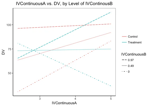
我在R中有一个模型,其中包括两个连续自变量IVContinuousA和IVContinuousB、一个分类变量IVCategorical之间的重要的三方交互作用,以及一个分类变量(具有两个水平:控制组和治疗组)。因变量是连续的(DV)。

model <- lm(DV ~ IVContinuousA * IVContinuousB * IVCategorical)

你可以在这里找到数据:这里 我正在尝试找出一种在R中可视化它以便于我的解释(也许在ggplot2中?)。
这篇博客文章的启发,我想将IVContinuousB分成高值和低值(因此它本身就是一个两级因素:
IVContinuousBHigh <- mean(IVContinuousB) + sd (IVContinuousB) 
IVContinuousBLow <- mean(IVContinuousB) - sd (IVContinuousB)

我计划绘制DV和IVContinuousA之间的关系图,并拟合代表不同IVCategorical和我的新二分IVContinuousB斜率的线:

IVCategoricalControlIVContinuousBHigh
IVCategoricalControlIVContinuousBLow
IVCategoricalTreatmentIVContinuousBHigh
IVCategoricalTreatmentIVContinuousBLow

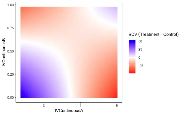
我的第一个问题是,这是否是产生可解释的三路相互作用图的可行解决方案?如果可能的话,我想避免3D图,因为我不觉得它们直观...或者是否有其他方法可以解决?也许对上面不同组合使用facet plots?

如果这是一个可以接受的解决方案,那么我的第二个问题是如何生成数据来预测代表以上不同组合的拟合线?

第三个问题-是否有任何建议如何在ggplot2中编写此代码?

我在Cross Validated上发布了一个非常类似的问题,但因为它与代码相关,所以我想在这里尝试一下(如果这篇文章与社区更相关,我将删除CV帖子:))

提前感谢您的帮助,

Sarah

请注意,在DV列中有NA(留空),并且设计不平衡-控制组和IVCategorical变量的治疗组中的数据点略有不同。

顺便说一句,我有可视化IVContinuousA和IVCategorical之间二元交互作用的代码:

A<-ggplot(data=data,aes(x=AOTAverage,y=SciconC,group=MisinfoCondition,shape=MisinfoCondition,col=MisinfoCondition,))+geom_point(size = 2)+geom_smooth(method ='lm',formula=y〜x)

但我想绘制在IVContinuousB条件下的这种关系....


在我看来,您需要在特定的分位数(也许是另一个变量和分类变量的0.25、0.5、0.75)上绘制每个连续变量。展示这种关系的“正确”方式是使用3D图形,但可惜的是ggplot2不支持3D。 - IRTFM
1
sjPlot这里这里)有许多方便的模型绘图函数。很多不错的文档,例如关于三方交互作用的部分 在这里。另请参见 effects package - Henrik
谢谢@Henrik!您提供的有关三方交互作用的小样似乎不能使用 - 您能再发布一次吗? - Sarah
1
好的!我尝试粘贴“原始”链接:https://cran.r-project.org/web/packages/sjPlot/vignettes/plot_interactions.html - Henrik
完美!谢谢!!! - Sarah
2个回答

11

以下是两种将模型输出在二维平面上可视化的方法。我假设您的目标是比较 TreatmentControl

library(tidyverse)
  theme_set(theme_classic() +
          theme(panel.background=element_rect(colour="grey40", fill=NA))

dat = read_excel("Some Data.xlsx")  # I downloaded your data file

mod <- lm(DV ~ IVContinuousA * IVContinuousB * IVCategorical, data=dat)

# Function to create prediction grid data frame
make_pred_dat = function(data=dat, nA=20, nB=5) {
  nCat = length(unique(data$IVCategorical))
  d = with(data, 
           data.frame(IVContinuousA=rep(seq(min(IVContinuousA), max(IVContinuousA), length=nA), nB*2),
                      IVContinuousB=rep(rep(seq(min(IVContinuousB), max(IVContinuousB), length=nB), each=nA), nCat),
                      IVCategorical=rep(unique(IVCategorical), each=nA*nB)))

  d$DV = predict(mod, newdata=d)

  return(d)
}

IVContinuousB的水平下,IVContinuousADV的比较

当然,IVContinuousAIVContinuousB的角色可以互换。

ggplot(make_pred_dat(), aes(x=IVContinuousA, y=DV, colour=IVCategorical)) + 
  geom_line() +
  facet_grid(. ~ round(IVContinuousB,2)) +
  ggtitle("IVContinuousA vs. DV, by Level of IVContinousB") +
  labs(colour="")

enter image description here

您可以不使用分面(faceting)制作类似的绘图,但是随着 IVContinuousB 级别数量的增加,解释起来会变得困难:

ggplot(make_pred_dat(nB=3), 
       aes(x=IVContinuousA, y=DV, colour=IVCategorical, linetype=factor(round(IVContinuousB,2)))) + 
  geom_line() +
  #facet_grid(. ~ round(IVContinuousB,2)) +
  ggtitle("IVContinuousA vs. DV, by Level of IVContinousB") +
  labs(colour="", linetype="IVContinuousB") +
  scale_linetype_manual(values=c("1434","11","62")) +
  guides(linetype=guide_legend(reverse=TRUE))

在这里输入图片描述

模型预测的差异热图,DV处理-DV对照在IVContinuousAIVContinuousB值网格上的表现

下面我们将查看每对IVContinuousAIVContinuousB之间的处理和对照之间的差异。

ggplot(make_pred_dat(nA=100, nB=100) %>% 
         group_by(IVContinuousA, IVContinuousB) %>% 
         arrange(IVCategorical) %>% 
         summarise(DV = diff(DV)), 
       aes(x=IVContinuousA, y=IVContinuousB)) + 
  geom_tile(aes(fill=DV)) +
  scale_fill_gradient2(low="red", mid="white", high="blue") +
  labs(fill=expression(Delta*DV~(Treatment - Control)))

在此输入图片描述


非常感谢 - 这绝对太棒了。当我自己尝试时,唯一缺少的是每个面板周围的黑色边框(如果有意义的话!)。有没有办法添加这些?如果您需要澄清,我可以在原始问题中粘贴输出图像 :) 再次非常感谢。 - Sarah
抱歉 - 再问一次!我尝试将预测函数的代码和 facets 图形应用于相同的数据,但是我使用的是 IVContinuousC 而不是 IVContinuousB(我更新了共享数据以包括 IVContinuousC!)。然而,当我尝试这样做时,在调用 ggplot 函数后,我会收到错误代码“Error in seq.default(min(IVContinuousC), max(IVContinuousC), : 'from' must be a finite number”的错误消息 - 您能想到解决此错误的任何方法吗?再次感谢您! - Sarah
对于第二个问题,IVContinuousC 中是否存在缺失值?如果有,minmax 函数将返回 NA,这会导致您遇到的错误。例如,运行 seq(NA, 10, 5)。为了避免这种情况,请在 minmax 中添加 na.rm=TRUE 作为参数。 - eipi10
1
对于您的第一个问题:黑色边框不是theme_classic()主题的一部分。我在实际运行的代码中使用了额外的主题语句将它们添加回来,但是忘记在发布的代码中包含它们(对此感到抱歉)。请参见我的答案中更新的theme_set语句,它将边框添加回绘图面板中。 - eipi10
1
请注意,轴线与面板边框是分开的(在我的答案中,请注意面板边框线比轴线略浅且细)。您可以使用 axis.line 主题元素更改轴线(例如,axis.line=element_line(colour="red", size=2))。输入 ?theme 以获取有关设置主题元素的更多信息。 - eipi10

5

如果你真的想避免3D绘图,你可以将其中一个连续变量转化为分类变量以进行可视化展示。

为了回答这个问题,我使用了来自car包的Duncan数据集,因为它和你描述的数据集形式相同。

library(car)
# the data
data("Duncan")

# the fitted model; education and income are continuous, type is categorical
lm0 <- lm(prestige ~ education * income * type, data = Duncan)

# turning education into high and low values (you can extend this to more 
# levels)
edu_high <- mean(Duncan$education)  + sd(Duncan$education)
edu_low <- mean(Duncan$education)  - sd(Duncan$education)

# the values below should be used for predictions, each combination of the 
# categories must be represented:
prediction_mat <- data.frame(income = Duncan$income, 
                         education = rep(c(edu_high, edu_low),each = 
                         nrow(Duncan)),
                         type = rep(levels(Duncan$type), each = 
                         nrow(Duncan)*2))


predicted <- predict(lm0, newdata = prediction_mat)


# rearranging the fitted values and the values used for predictions
df <- data.frame(predicted,
             income = Duncan$income,
             edu_group =rep(c("edu_high", "edu_low"),each = nrow(Duncan)),
             type = rep(levels(Duncan$type), each = nrow(Duncan)*2))


# plotting the fitted regression lines
ggplot(df, aes(x = income, y = predicted, group = type, col = type)) + 
geom_line() + 
facet_grid(. ~ edu_group)

enter image description here


网页内容由stack overflow 提供, 点击上面的
可以查看英文原文,
原文链接