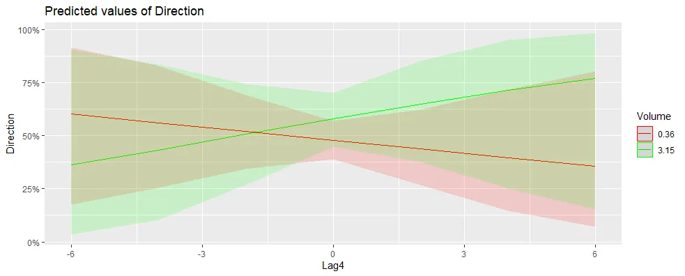
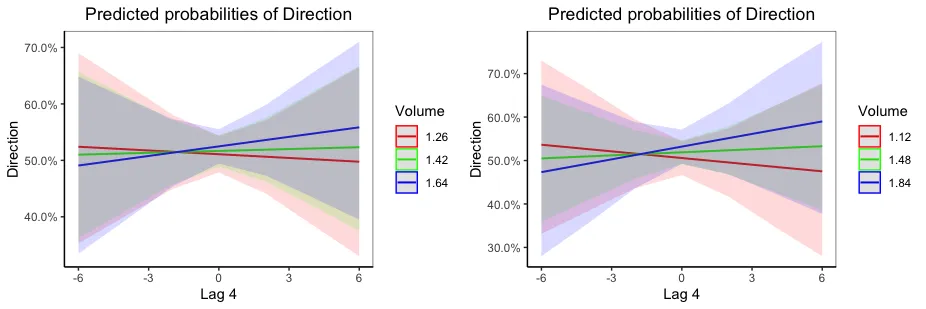
交互作用发生在两个连续变量之间。该图使用
Lag4 作为 x 轴变量,然后选择一些
Volume 的值来展示在不同
Volume 值下,
Direction 和
Lag4 之间的关系如何变化。默认情况下,选择
Volume 的最小值和最大值。您可以使用
mdrt.values 参数来显示
Volume 的中位数和四分位数或
Volume 的均值和标准差(请参阅帮助以获取其他选项)。例如:
theme_set(theme_classic())
plot_model(m1, type="int", colors=rainbow(3), mdrt.values="quart")
plot_model(m1, type="int", colors=rainbow(3), mdrt.values="meansd")
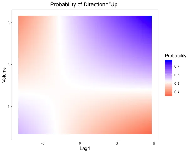
另一种选择是热力图,它允许您在x和y轴上绘制交互变量,并使用颜色表示“Direction”等于“Up”的概率。例如:
pred.dat = expand.grid(Lag1 = median(Smarket$Lag1),
Lag4 = seq(min(Smarket$Lag4), max(Smarket$Lag4), length=100),
Volume = seq(min(Smarket$Volume), max(Smarket$Volume), length=100))
pred.dat$Direction = predict(m1, newdata=pred.dat, type="response")
ggplot(pred.dat, aes(Lag4, Volume, fill=Direction)) +
geom_tile() +
scale_fill_gradient2(low="red", mid="white", high="blue",
midpoint=median(pred.dat$Direction)) +
labs(title='Probability of Direction="Up"',
fill="Probability")
上面的图表代表了下面热力图中等值线的
Volume。例如,当
Volume为1.12(上图左侧的红线)时,您可以在下面的热力图中看到颜色从蓝色变为白色再到红色,表示随着
Lag4的增加,
Direction="Up"的概率逐渐减小,就像我们在上面的图中看到的一样。