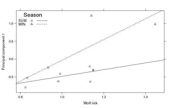
我一直在使用Car包中的scatterplot命令创建数据图,并尝试对其进行修改以便于出版。因此,需要将彩色线条更改为实线和虚线以便于黑白打印。我认为
我已经写了这段代码:
lty是执行此操作的正确命令。在scatterplot的帮助文件中,它有一个名为by.groups的函数,我认为这会干扰我在代码中使用legend的lty = c(1,2)或lty = 1:2的想法。如果人们愿意,我不知道如何在ggplot中做到这一点,所以建议在那里进行。以下是一些示例数据:structure(list(ID = structure(c(1L, 1L, 1L, 1L, 1L, 32L, 33L,
33L, 34L, 34L, 34L), .Label = c("F07001", "F07002", "F07003",
"F07004", "F07005", "F07006", "F07008", "F07009", "F07010", "F07011",
"F07014", "F07015", "F07017", "F07018", "F07019", "F07020", "F07021",
"F07022", "F07023", "F07024", "F10001", "F10004", "F10008", "F10009",
"F10010", "F10012", "F10013", "F98015", "M07007", "M07012", "M07013",
"M07016", "M10007", "M10011", "M10015"), class = "factor"), Season = structure(c(1L,
1L, 1L, 2L, 2L, 2L, 1L, 1L, 1L, 1L, 2L), .Label = c("SUM", "WIN"
), class = "factor"), Time = structure(c(1L, 2L, 1L, 2L, 1L,
2L, 1L, 2L, 1L, 2L, 1L), .Label = c("day", "night"), class = "factor"),
Repro = structure(c(2L, 2L, 2L, 2L, 2L, 3L, 3L, 3L, 3L, 3L,
3L), .Label = c("f", "fc", "m"), class = "factor"), Comp1 = c(-0.524557195,
-0.794214153, -0.408247216, -0.621285004, -0.238828585, 0.976634392,
-0.202405922, -0.633821539, -0.306163898, -0.302261589, 1.218779672
), ln1wr = c(0.833126490613386, 0.824526258616325, 0.990730077688989,
0.981816265754353, 0.933462450382474, 1.446048015519, 1.13253050687157,
1.1349442179155, 1.14965388471562, 1.14879830358128, 1.14055365645628
)), .Names = c("ID", "Season", "Time", "Repro", "Comp1",
"ln1wr"), row.names = c(1L, 2L, 3L, 4L, 5L, 220L, 221L, 222L,
223L, 224L, 225L), class = "data.frame")
我已经写了这段代码:
这是我迄今为止编写的代码:
par(bty="l",las=1)
scatterplot(Comp1~ln1wr|Season, moose,
            xlab = "Wolf risk", ylab = "Principal component 1",
            labels= row.names(moose),
            by.groups=TRUE, smooth=FALSE, boxplots=FALSE,
            grid=FALSE, lty = 1:2,
            legend.plot=FALSE)
legend("bottomright", title="Season",
       legend=levels(moose$Season), bty="n",
       pch=1:2, col=1:2, lty=c(1,2))