I have a question for you please :
My data :
    Nb_obs <- as.vector(c( 2,  0,  6,  2,  7,  1,  8,  0,  2,  1,  1,  3, 11,  5,  9,  6,  4,  0,  7,  9))
    Nb_obst <- as.vector(c(31, 35, 35, 35, 39, 39, 39, 39, 39, 41, 41, 42, 43, 43, 45, 45, 47, 48, 51, 51))
    inf20 <- as.vector(c(2, 2, 2, 2, 3, 3, 3, 3, 3, 3, 3, 3, 3, 4, 3, 4, 4, 3, 5, 4))
    sup20 <- as.vector(c(3, 4, 4, 4, 5, 4, 4, 5, 4, 4, 5, 5, 5, 6, 5, 6, 6, 5, 7, 6))
    inf40 <- as.vector(c(1, 2, 2, 2, 2, 2, 2, 2, 2, 2, 2, 2, 2, 3, 2, 3, 3, 3, 4, 3))
    sup40 <- as.vector(c(4, 5, 5, 5, 6, 5, 5, 6, 5, 5, 6, 6, 6, 7, 6, 7, 7, 7, 9, 7))
    inf60 <- as.vector(c(1, 1, 1, 1, 2, 1, 1, 1, 1, 1, 1, 1, 2, 2, 2, 2, 2, 2, 3, 2))
    sup60 <- as.vector(c(5, 6, 6,  6,  8,  7,  7,  7,  7,  7,  7,  7,  8,  9,  8,  9,  9,  9, 11,  9))
    inf90 <- as.vector(c(0, 0, 0, 0, 0, 0, 0, 0, 0, 0, 0, 0, 0, 1, 0, 0, 1, 0, 1, 1))
    sup90 <- as.vector(c(10, 11, 11, 11, 15, 13, 13, 14, 12, 13, 13, 13, 14, 17, 15, 17, 17, 16, 21, 18))

data <- cbind.data.frame(Nb_obs, Nb_obst, inf20, sup20, inf40, sup40, inf60 , sup60, inf90 , sup90)
我的任务:
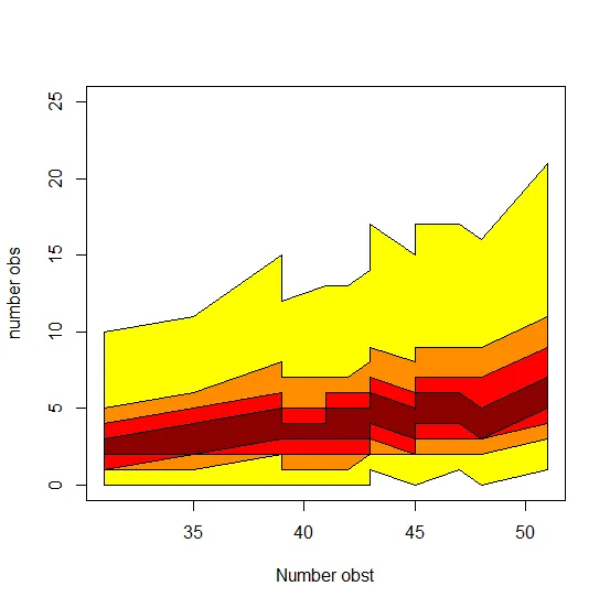
plot(data$Nb_obst, data$Nb_obs, type = "n",  xlab = "Number obst", ylab = "number obs", ylim = c(0, 25))

lines(data$Nb_obst, data$inf20, col = "dark red")
lines(data$Nb_obst, data$sup20, col = "dark red")

lines(data$Nb_obst, data$inf40, col = "red")
lines(data$Nb_obst, data$sup40, col = "red")

lines(data$Nb_obst, data$inf60, col = "dark orange")
lines(data$Nb_obst, data$sup60, col = "dark orange")

lines(data$Nb_obst, data$inf90, col = "yellow")
lines(data$Nb_obst, data$sup90, col = "yellow")
我的问题:
我想做两件事情(我认为可以通过ggplot来实现):
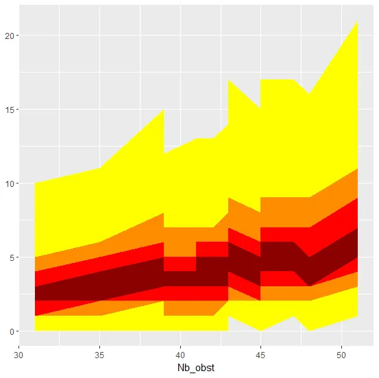
在顶部图表的概念中,“inf”和“sup”是IC 20%、40%、60%和90%模型的限制。我希望先使每条曲线平滑,然后将同一个IC的两条曲线之间的表面着色,例如将“data$inf90”和“data$sup90”的表面着成黄色,“data$inf60”和“data$60”的区域是橙色等。并且我想要叠加每个有色表面 +请放置好合适的图例。
感谢您的帮助!


as.vector(c(...))和c(...)是identical()的。 - Rui Barradas