我有一个在Excel中的热力图,我正在尝试在R中重新创建它。它基本上是RFM分割的数据,在Excel中颜色范围很棒,但我无法在R中得到如此漂亮的平滑颜色渐变,并且已经尝试了很多方法,但无法达到相同的平滑渐变效果。
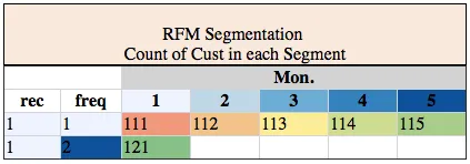
我的Excel热力图如下所示:
如何使用
我无法在此处发布我的数据集,因为它有30,000条记录。我正在使用dput(head(df))将我的数据集头部转储如下:
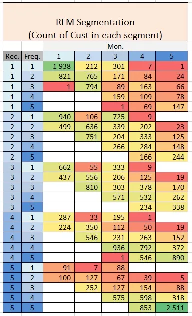
我的Excel热力图如下所示:
我的 R 热图如下所示:
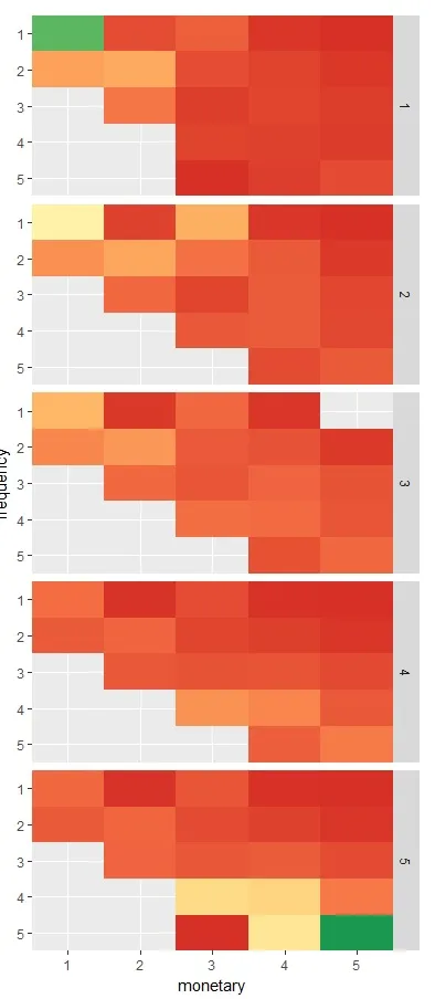
我的 R 代码是:
cols <- brewer.pal(9, 'RdYlGn')

ggplot(xxx)+
  geom_tile(aes(x= mon, y = reorder(freq, desc(freq)), fill = n)) +

facet_grid(rec~.) +
#  geom_text(aes(label=n)) +

# scale_fill_gradient2(midpoint = (max(xxx$n)/2), low = "red", mid =
"yellow", high = "darkgreen") +
# scale_fill_gradient(low = "red", high = "blue") +
scale_fill_gradientn(colours = cols) +
# scale_fill_brewer() +

labs(x = "monetary", y= "frequency") +
scale_x_discrete(expand = c(0,0)) +
scale_y_discrete(expand = c(0,0)) +
coord_fixed(ratio= 0.5) +
theme(legend.position = "none")
如何使用
ColorRampPalette来实现与Excel中相同的平滑颜色渐变,或者其他任何可以给我更平滑渐变的方法?R中的渐变不太好看。我无法在此处发布我的数据集,因为它有30,000条记录。我正在使用dput(head(df))将我的数据集头部转储如下:
structure(list(rfm_score = c(111, 112, 113, 114, 115, 121), n = c(2624L,
160L, 270L, 23L, 5L, 650L), rec = structure(c(1L, 1L, 1L, 1L,
1L, 1L), .Label = c("1", "2", "3", "4", "5"), class = "factor"),
    freq = structure(c(1L, 1L, 1L, 1L, 1L, 2L), .Label = c("1",
    "2", "3", "4", "5"), class = "factor"), mon = structure(c(1L,
    2L, 3L, 4L, 5L, 1L), .Label = c("1", "2", "3", "4", "5"), class =
"factor")), row.names = c(NA,
6L), class = "data.frame")