如何为 ggplot 添加次坐标轴的图例

3
我正在尝试在以下代码中为第二坐标轴添加图例
library(ggplot2)
library(dplyr)
library(reshape2)

df = data.frame(period = seq(as.POSIXct("2017-01-01"),as.POSIXct("2017-12-01"), by = "month"), 
                b = c(100, 110, 105, 200, 210, 190, 180, 170, 165, 175, 140, 145),
                c = c(120, 130, 150, 170, 250, 160, 130, 120, 110, 130, 120, 170),
                d = c(1060, 1180, 1050, 2070, 2150, 1900, 1850, 1070, 1605, 1750, 1460, 1250)) %>% 
             mutate(period = factor(period))

df_bar = melt(df, id.vars = "period", measure.vars = c("b", "c", "d")) %>% filter(variable != "d")

df_line = df %>% select(period, d)

ggplot(data = df_bar, aes(x = period, y = value, fill = variable)) + 
 geom_bar(stat = "identity", position = "dodge") +
 theme(axis.text.x = element_text(angle = 90, hjust = 1)) +
 theme(axis.text=element_text(size=9), 
 axis.title=element_text(size=14,face="bold")) +
 ylab("primary axis") +
 geom_line(data = df_line, aes(x = period, y = (d)/10, group = 1), inherit.aes = FALSE) + 
 geom_point(data = df_line, aes(x = period, y = (d)/10, group = 1), inherit.aes = FALSE) +
 scale_y_continuous(sec.axis = sec_axis(~.*10, name = "secondary axis"))
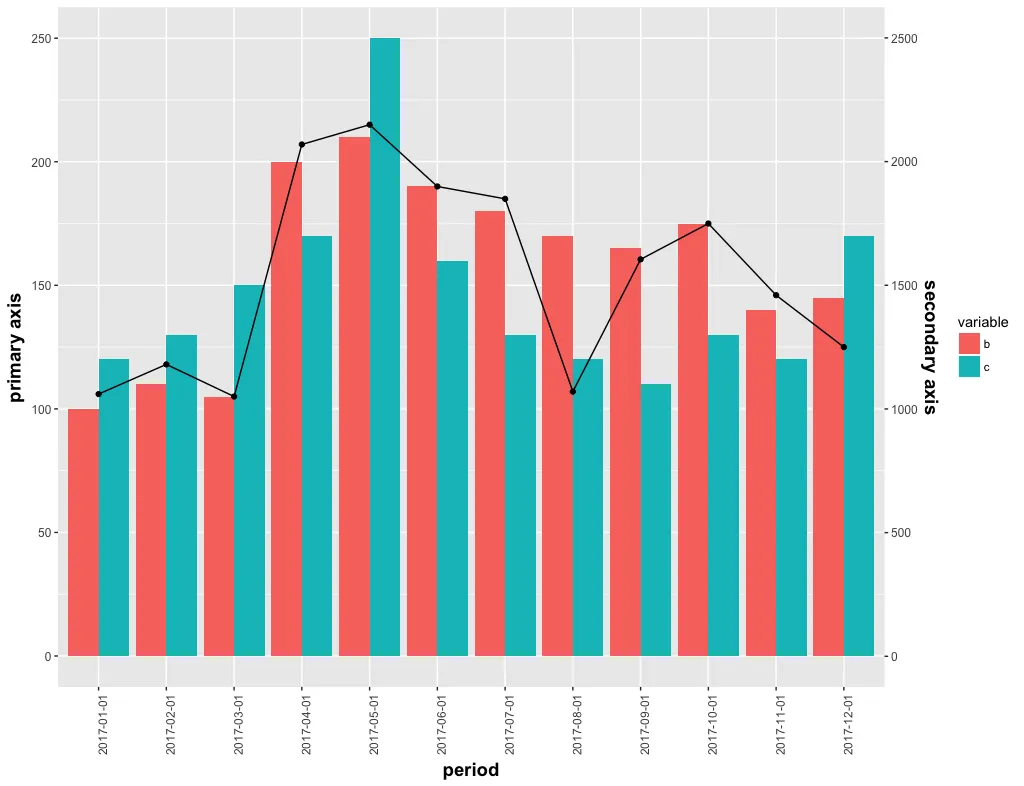
plot

我希望这条线图也有一个图例。


仅供参考,使用两个Y轴不是一个好的实践方法,因此不建议使用。请阅读Hadley的这篇回答以获取更多信息:(https://dev59.com/V3A75IYBdhLWcg3wy8br#3101876) - TC Zhang
@TCZhang,我在搜索“如何添加第二个轴”时发现了这个问题,但这是客户的要求,不能更改。 - Devaraj Phukan
1个回答

7
你可以在geom_line调用中的aes中添加linetype来创建一个单独的线条图例,然后将其图例移动到fill图例附近。
另请参阅答案
library(reshape2)
library(tidyverse)

ggplot(data = df_bar, aes(x = period, y = value, fill = variable)) +
  geom_bar(stat = "identity", position = "dodge") +
  theme(axis.text.x = element_text(angle = 90, hjust = 1)) +
  theme(
    axis.text = element_text(size = 9),
    axis.title = element_text(size = 14, face = "bold")
  ) +
  ylab("primary axis") +
  geom_line(data = df_line, aes(x = period, y = (d) / 10, group = 1, linetype = "My line"), inherit.aes = FALSE) +
  scale_linetype_manual(NULL, values = 1) +
  geom_point(data = df_line, aes(x = period, y = (d) / 10, group = 1), inherit.aes = FALSE) +
  scale_y_continuous(sec.axis = sec_axis(~. * 10, name = "secondary axis")) +
  theme(legend.background = element_rect(fill = "transparent"), 
      legend.box.background = element_rect(fill = "transparent", colour = NA),
      legend.key = element_rect(fill = "transparent"), 
      legend.spacing = unit(-1, "lines"))

为了在同一图例中获取点和线,我们可以将color映射到aes并使用scale_color_manual
ggplot(data = df_bar, aes(x = period, y = value, fill = variable)) +
  geom_bar(stat = "identity", position = "dodge") +
  theme(axis.text.x = element_text(angle = 90, hjust = 1)) +
  theme(
    axis.text = element_text(size = 9),
    axis.title = element_text(size = 14, face = "bold")
  ) +
  ylab("primary axis") +
  geom_line(data = df_line, aes(x = period, y = (d) / 10, group = 1, color = "My line"), inherit.aes = FALSE) +
  scale_color_manual(NULL, values = "black") +
  geom_point(data = df_line, aes(x = period, y = (d) / 10, group = 1, color = "My line"), inherit.aes = FALSE) +
  scale_y_continuous(sec.axis = sec_axis(~. * 10, name = "secondary axis")) +
  theme(legend.background = element_rect(fill = "transparent"), 
        legend.box.background = element_rect(fill = "transparent", colour = NA),
        legend.key = element_rect(fill = "transparent"), 
        legend.spacing = unit(-1, "lines"))

这是由reprex包(v0.2.0.9000)于2018-07-21创建的。


谢谢,它运作良好,你可以在图例中添加一个点,使其看起来更像图表中的线和点吗? - Devaraj Phukan

网页内容由stack overflow 提供, 点击上面的
可以查看英文原文,
原文链接