在R中为热图中相连的单元格绘制轮廓线

6

我有一组数据,其中包含两个时间轴和每个单元的测量值。基于此,我创建了一个热图。我也知道每个单元格的测量值是否显著。

我的问题是在所有显著单元格周围绘制等高线。如果单元格形成具有相同显著性值的聚类,则需要在聚类周围绘制等高线,而不是在每个单独单元格周围绘制。

数据格式如下:

   x_time y_time    metric signif
1       1      1 0.3422285  FALSE
2       2      1 0.6114085  FALSE
3       3      1 0.5381621  FALSE
4       4      1 0.5175120  FALSE
5       1      2 0.6997991  FALSE
6       2      2 0.3054885  FALSE
7       3      2 0.8353888   TRUE
8       4      2 0.3991566   TRUE
9       1      3 0.7522728   TRUE
10      2      3 0.5311418   TRUE
11      3      3 0.4972816   TRUE
12      4      3 0.4330033   TRUE
13      1      4 0.5157972   TRUE
14      2      4 0.6324151   TRUE
15      3      4 0.4734126   TRUE
16      4      4 0.4315119   TRUE

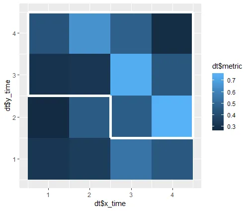
以下代码生成以下数据,其中度量是随机的(dt$metrics),重要性是逻辑的(dt$signif)。
# data example
dt <- data.frame(x_time=rep(seq(1, 4), 4), 
                 y_time=rep(seq(1, 4), each=4),
                 metric=(rnorm(16, 0.5, 0.2)),
                 signif=c(rep(FALSE, 6), rep(TRUE, 10)))

仅使用ggplot2的geom_tile命令就可以生成热力图。

# Generate heatmap using ggplot2's geom_tile
library(ggplot2)
p <- ggplot(data = dt, aes(x = x_time, y = y_time))
p <- p + geom_tile(aes(fill = metric))

根据这个问题,我成功地绘制了每个单元格周围具有不同颜色的等高线,根据其显著性值进行区分。

# Heatmap with lines around each significant cell
p <- ggplot(data = dt, aes(x = x_time, y = y_time))
p <- p + geom_tile(aes(fill = metric, color = signif), size = 2)
p <- p + scale_color_manual(values = c("black", "white"))

这张图显示了这种方法的结果。

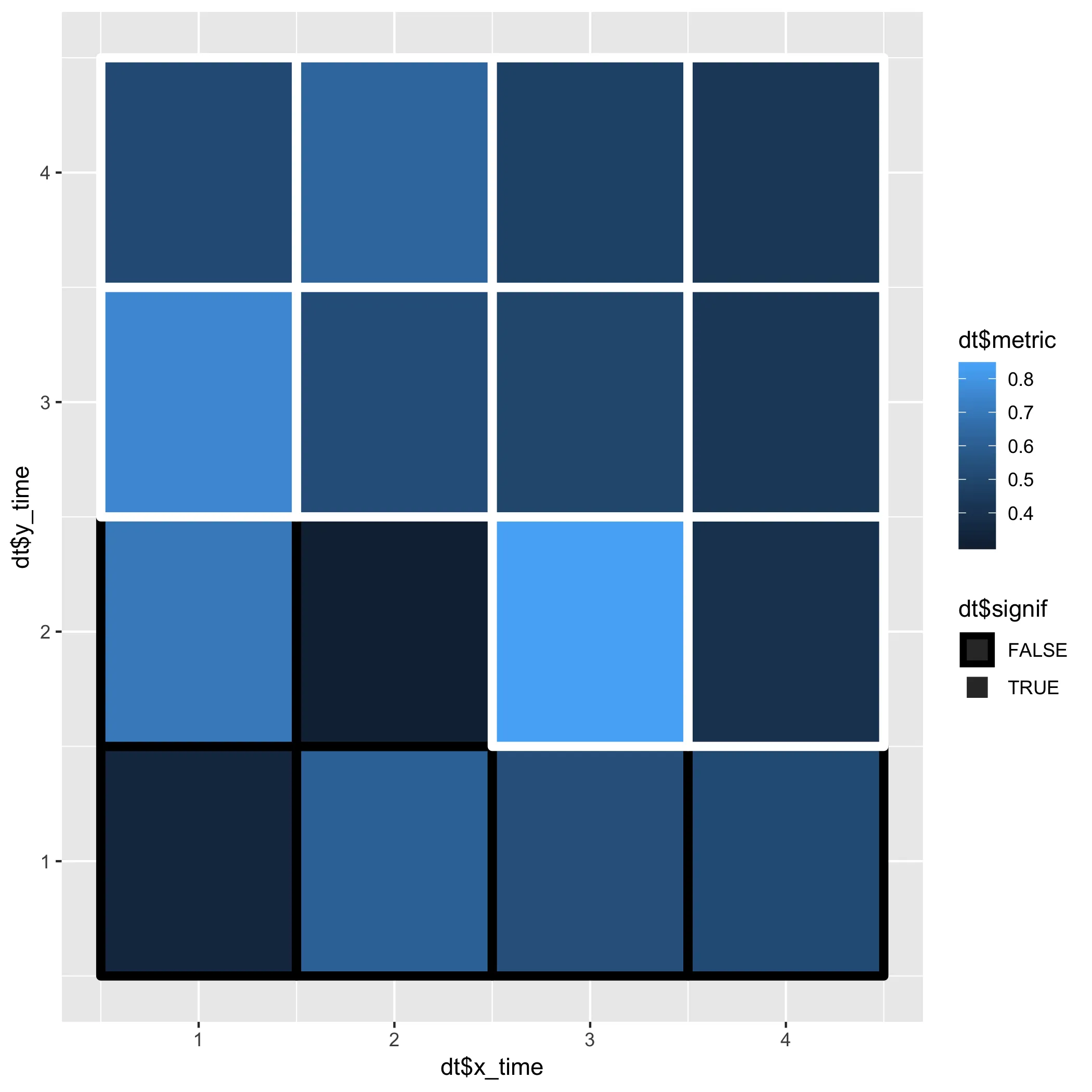
然而,这种方法不能通过在整个组周围绘制轮廓来将相邻的显著细胞聚集在一起(正如我链接到的问题中所讨论的那样)。

正如这个问题所展示的那样,可以在指定区域周围绘制框,但我认为这不可能扩展到所有可能的细胞团簇。


1
使用 raster::clump 相当简单。例如,请参阅 如何在 R-raster 中获取网格周围的等高线? - Henrik
2个回答

4

本答案基于 如何在R-raster中获取网格周围的轮廓线?

library(data.table)
library(raster)

需要注意的是,clump 需要安装 igraph 包,而在 rasterToPolygons 中设置 dissolve = TRUE 需要 rgeos

# convert data.frame to data.table
# not strictly necessary, but enables use of convenient functions: dcast and rbindlist.
setDT(d)

# reshape to wide 
d2 <- dcast(d, y ~ x, value.var = "sig")

# reverse order of rows to match raster order
# remove first column
# convert to matrix and then to raster
r <- raster(as.matrix(d2[ , .SD[.N:1, -1]]),
            xmn = 0, xmx = ncol(d2) - 1, ymn = 0, ymx = ncol(d2) - 1)

# detect clumps of connected cells of the value TRUE
# convert raster to polygons
# dissolve polygons into multi-polygons
polys <- rasterToPolygons(clump(r), dissolve = TRUE)

# grab coordinates of individual polygons and convert to a data.table
# use idcol = TRUE to enable grouping of paths when plotting
d_poly <- rbindlist(lapply(polys@polygons,
                           function(x) as.data.table(x@Polygons[[1]]@coords)),
                    idcol = TRUE)

# plot an outline around each 'patch of significant values' using geom_path 
ggplot(d, aes(x = x, y = y)) +
  geom_tile(aes(fill = z)) +
  geom_path(data = d_poly, aes(x = x + 0.5, y = y + 0.5, group = .id),
            size = 2, color = "red")

在此输入图片描述


数据:

d <- structure(list(x = c(1L, 1L, 1L, 1L, 2L, 2L, 2L, 2L,
                          3L, 3L, 3L, 3L, 4L, 4L, 4L, 4L),
                    y = c(1L, 2L, 3L, 4L, 1L, 2L, 3L, 4L,
                          1L, 2L, 3L, 4L, 1L, 2L, 3L, 4L),
                    sig = c(FALSE, FALSE, FALSE, TRUE, FALSE, FALSE, TRUE, TRUE,
                            TRUE, FALSE, FALSE, FALSE, TRUE, FALSE, FALSE, TRUE),
                    z = c(0.96, 0.76, 0.14, 0.93, 0.39, 0.06, 0.99, 0.77,
                          0.7, 0.72, 0.08, 0.94, 0.98,  0.83, 0.12, 0.42)),
               row.names = c(NA, -16L), class = "data.frame")

这是对我起作用并且我认为最适合扩展到大矩阵的解决方案。我想指出,在“lapply”语句中传递给函数的“x”可能是另一个多边形列表。我将其重写为for循环,并按顺序检查每个元素以收集完整的坐标集。 - Christoph Aurnhammer
感谢您的反馈。很高兴听到它起作用了。是的,我认为SpatialPolygonsDataFrame等对象的结构可能有点混乱,需要仔细查看。最初,我希望制作一个sf解决方案,其中对象更加清晰,但失败了。干杯。 - Henrik

2
当你需要创建很多热图时,这可能会有点繁琐(尽管从你的数据中创建具有必要值的数据框可能是可能的),但除此之外,你可以使用geom_segment进行操作。"最初的回答"
p + geom_segment(aes(x = .5, xend = 4.5, y = 4.5, yend = 4.5), colour = "white", size = 2) +
  geom_segment(aes(x = .5, xend = 2.5, y = 2.5, yend = 2.5), colour = "white", size = 2) +
  geom_segment(aes(x = 2.5, xend = 4.5, y = 1.5, yend = 1.5), colour = "white", size = 2) +
  geom_segment(aes(x = .5, xend = .5, y = 2.5, yend = 4.5), colour = "white", size = 2) +
  geom_segment(aes(x = 2.5, xend = 2.5, y = 1.5, yend = 2.5), colour = "white", size = 2) +
  geom_segment(aes(x = 4.5, xend = 4.5, y = 1.5, yend = 4.5), colour = "white", size = 2)

enter image description here


网页内容由stack overflow 提供, 点击上面的
可以查看英文原文,
原文链接