这种类型的问题以前已经被问过,但是没有得到任何正确、有效的解决方案,所以我再次发布这个问题。很抱歉再次提问并浪费了您的时间。 请给出一些有效的解决方案。或者让我知道如果我做错了什么。 提前谢谢。
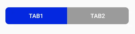
期望的标签:
但实际上却是如下:
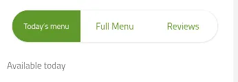
当前标签

在页面加载时,选项卡会像“期望的标签”图像一样出现,但在选择后会变成“当前标签”图像。 MainXML 代码:
 <android.support.design.widget.TabLayout
                android:id="@+id/tabs"
                style="@style/MyCustomTabLayout"
                android:layout_width="match_parent"
                android:layout_height="wrap_content"
                android:background="@drawable/background_img_jpeg"
                android:minHeight="10dp"
                android:padding="10dp"
                app:tabGravity="fill"
                app:tabIndicatorColor="@color/TRANSPARENT"
                app:tabMode="fixed"
                app:tabTextColor="@color/blue" />
@style/MyCustomTabLayout
<style name="MyCustomTabLayout" parent="Widget.Design.TabLayout">
        <item name="tabBackground">@drawable/tab_bg</item>
    </style>
@drawable/tab_bg
<selector xmlns:android="http://schemas.android.com/apk/res/android">
    <item android:state_selected="true"
        android:drawable="@drawable/tab_bgselected" />
    <item android:drawable="@drawable/tab_bgnotselected" />
    </selector>
@drawable/tab_bgselected
<?xml version="1.0" encoding="utf-8"?>
<layer-list xmlns:android="http://schemas.android.com/apk/res/android">

    <item android:bottom="0dp"  android:top="0dp"
          android:left="0dp" android:right="0dp" >
        <shape android:shape="rectangle">
            <solid android:color="@color/blue" />
            <corners
                android:topLeftRadius="10dp"
                android:bottomLeftRadius="10dp">
            </corners>
        </shape>
    </item>
</layer-list>
就像这样 @drawable/tab_bgnotselected
在代码后面,我已经写了:
tabLayout.setOnTabSelectedListener(new TabLayout.OnTabSelectedListener() {
            @Override
            public void onTabSelected(TabLayout.Tab tab) {
                try {
                    mViewPager.setCurrentItem(tab.getPosition());
                    TabPosition = tab.getPosition();
                    TabCount = tabLayout.getTabCount();

                    try {
                        if (TabPosition == 0) {
                            GradientDrawable drawable = (GradientDrawable) getResources().getDrawable(R.drawable.policy_tab_blue);
                            drawable.setCornerRadii(new float[]{10,10,0,0,0,0,10,10}); // this will create the corner radious to left side

                        } else {
                            GradientDrawable drawable = (GradientDrawable) getResources().getDrawable(R.drawable.policy_tab_white);
                            drawable.setCornerRadii(new float[]{0,0,10,10,10,10,0,0}); // this will create the corner radious to right side

                        }
                    } catch (Exception e) {
                        e.printStackTrace();
                    }
                    Log.i("TabPosition:--->", TabPosition + "");
                    Log.i("TabCount:--->", TabCount + "");

                } catch (Exception e) {
                    e.printStackTrace();
                }
            }

            @Override
            public void onTabUnselected(TabLayout.Tab tab) {
                try {

                } catch (Exception e) {
                    e.printStackTrace();
                }
            }

            @Override
            public void onTabReselected(TabLayout.Tab tab) {

            }
        });